Blog
Posts about making technology work for humans, such as new web standards features, digital accessibility and tech ethics.
All 245 of them. For shorter writings, follow @hdv@front-end.social (@hdv RSS).
Categories
- books (10)
- events (47)
- front-end (25)
- industry (9)
- security (2)
- CSS (17)
- performance (1)
- Web Components (3)
- design systems (2)
- accessibility (44)
- elsewhere (3)
- personal (19)
- ethics (6)
- UX (1)
- ai (17)
- meta (7)
- primers (2)
- web platform (2)
- privacy (2)
- workflow (2)
- standards (13)
- media (3)
- sustainability (4)
- travel (1)
- music (1)
-
 Notes from “AI & the Future of Sustainability Reporting”
Notes from the “AI and the future of sustainability reporting” event, where I learned about why reporting matters, the sustainability of AI and various aspects of doing sustainability reporting with AI.
-
WCAG-EM 2.0 lets you report on accessibility of more than just websites
There's a new version of WCAG-EM.
-
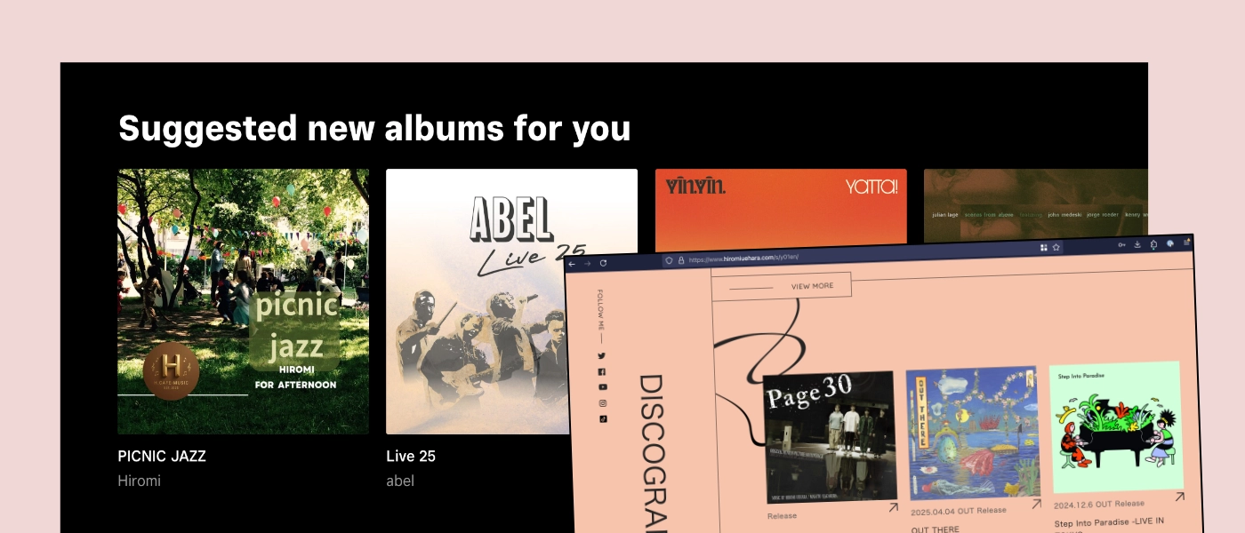 I'm back to building my own digital music collection
Over the past months, I realised it was about time I moved away from music streaming, to keeping a personal music collection that I control.
-
Dear Mozilla, I don't want an “AI kill switch”, I want a more responsible approach for all
My concern is that Mozilla is _too_ excited about a technology that has inherent downsides and ethical problems, and I would like to see better defaults and clearer risk mitigations.
-
My 2025 review
Some highlights from my 2025.
-
Who wins when we filter the open web through an opaque system?
I would like it to be mostly the people, not mostly the tech companies.
-
Reflections from TPAC 2025
Some reflections of my TPAC 2025.
-
Yes, let's teach LLMs accessibility, but also provide the companies using them with better strategies
Some thoughts on teaching LLMs accessibility.
-
Time saving / time wasting
LLM vendors promise huge time savings, while many people experience these tools cost them time. Can both be true at the same time? Yes, when it saves some, but costs others.
-
Another AI reading list: these books are worth your time
Lots of great books about AI came out recently, here are some I found useful.
-
The writer, the text and the audience
Meaning in art comes from more than the artifact.
-
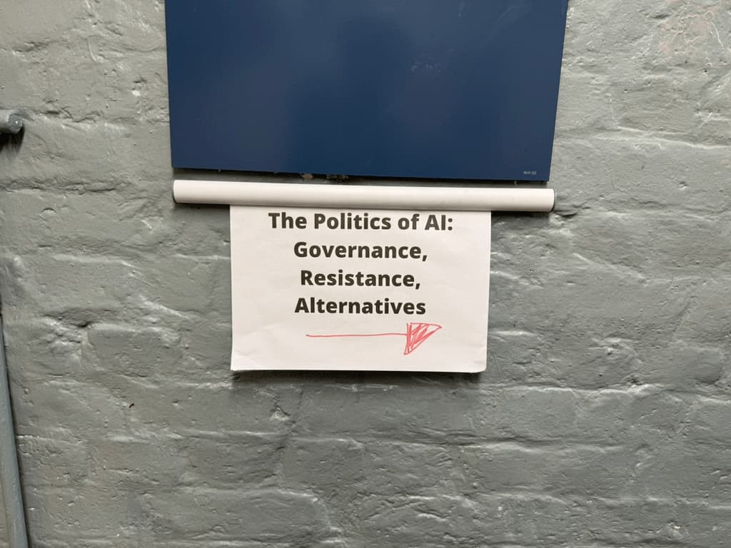 The politics of AI: we'll need more sustainability, community and democracy
Last week I attended a symposium called ”The Politics of AI: governance, resistance, alternatives” at Goldsmiths in London. In this post, I will share some takeaways.
-
Can components conform to WCAG?
Here's why they technically can't, and why that makes sense to me.
-
Conformance vs compliance, accessibility standards edition
What's the difference between compliance and conformance?
-
We should listen to the philosophers more
A few thoughts on the philosophical perspective.
-
How to avoid that your post about AI helps the hype
If we're not cautious, we may accidentally feed the AI hype by talking about it in specific ways.
-
Running for the AB (2): meet the candidates
My answers to the “Meet the candidates” questions for candidates in the W3C's Advisory Board election.
-
Running for the AB
I'm running for the W3C's Advisory Board. This is my nomination statement.
-
Is “ethical AI” an oxymoron?
The current wave of generative AI has unpleasant side effects: large-scale copyright infringements, environmental impact and bias. For most uses today, it makes sense to me to default to not using AI.
-
Tag, you're it
Answers to questions about blogging.
-
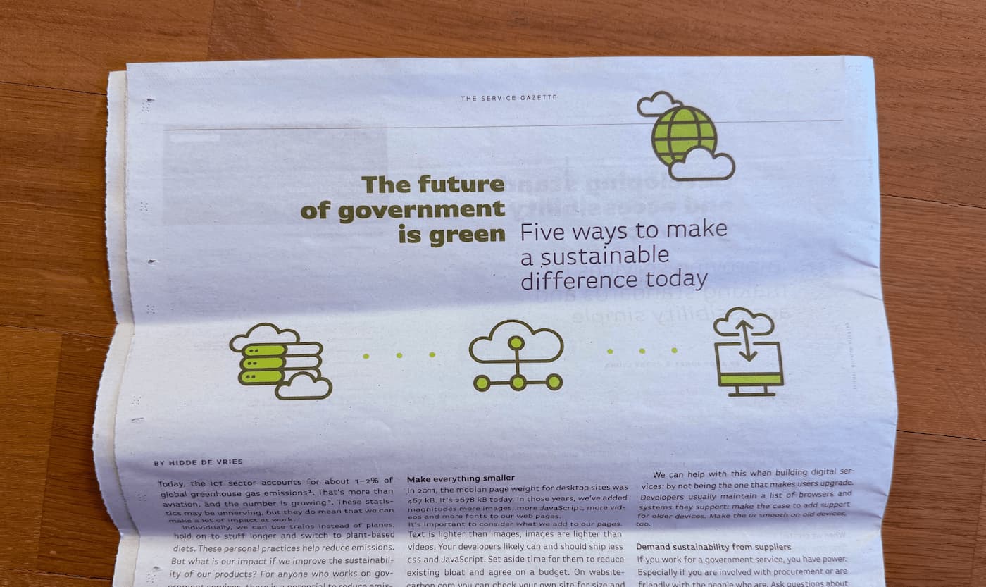 The future of government is green: five ways to make a sustainable difference today
Today, the ICT sector accounts for about 1–2% of global greenhouse gas emissions. That’s more than aviation, and the number is growing. These statistics may be unnerving, but they do mean that we can make a lot of impact at work.
-
Views on views
Web pages hold us back. What about views?
-
What I got up to in 2024
Some highlights from my 2024.
-
Turn off AI features by default (to reduce their climate impact)
If users don't use a future that requires a lot of energy and water, that's wasteful. Making such features opt-in is the right thing to do.
-
 Trains are offices
Some thoughts on traveling by train
-
 The open web, MIDI and assistive tech: State of the Browser 2024
My writeup of State of the Browser 2024.
-
Comparing design systems to find the best qualities
It's not easy to build very good UI components. A global effort to try and find the best qualities of components would be a great opportunity to improve components everywhere.
-
On authoring tools in EN 301 549
Notes from discussions on 11.8, the part of EN 301 549 that is about authoring tools.
-
On popover accessibility: what the browser does and doesn’t do
What does “built in accessibility” actually mean for browsers that support popover?
-
 Breadcrumbs, buttons and buy-in: Patterns Day 3
My write-up of the third Patterns Day.
-
“AI” and accessible front-end components: is the nuance generatable?
Are LLMs helpful tools to assist with making accessible front-end components? Let's find out.
-
Sharing links
This blog has a new section where I share links to posts I read in other places.
-
Clippy returned (as an unnecessary “AI”)
This week I used an “AI” feature that struck me as somewhat unnecessary.
-
2023 in review
Some highlights from my 2023.
-
Answers to common (web) accessibility questions
Common questions I hear about web accesssibility with short, low on nuance answers.
-
Ableist interactions
When someone called out lack of accessibility, they got ableist responses. This post has a collection of those responses and an explanation of why they're problematic.
-
Co-organising Design Systems Week 2023
Design systems come with a lot of promises. While those promises can be realised, that's not a given. And there's a lot to be said about process and how it works on the inside. During Design Systems Week, we'll get a peak into of the work of some very interesting teams.
-
It's pretty rude of OpenAI to make their use of your content opt-out
OpenAI, the company that makes ChatGPT, now offers a way for websites to opt out of its crawler. By default, it will just use web content as it sees fit. How rude!
-
“AI” content and user centered design
When organisations force LLM-output on users instead of paying people to create their content, they don't center users.
-
Joining CSSWG
I'm joining the CSS Working Group as an Invited Expert.
-
Positioning anchored popovers
Popovers are in the top layer, how can we position them relative to invokers that are not?
-
 Semantics and the popover attribute: which role to use when?
The popover attribute adds behaviour, but not a role. Which role should you use in combination with the popover attribute?
-
 Back to freelance
I have returned to working as an independent front-end / accessibility / devrel person.
-
Neither artificial, nor intelligent
Large Language Models (LLMs) and tools based on them (like ChatGPT) are a popular topic among technologists today. I struggle with the optimism I see from businesses, the haphazard deployment of these systems and the seemingly ever-expanding boundaries of what we are prepared to call “artificially intelligent”.
-
My ideal accessible components resource is holistic, well tested and easy to use
To improve accessibility of the web as it is today, I feel we dearly need accessibility guidance that is holistic, well tested and easy to use.
-
200
A bit meta: this post is about how I blog and what I wrote about in the last while.
-
Browser built-in search and ATAG A.3.5.1
I wondered if Ctrl/⌘ + F in a browser can be a way to meet ATAG A.3.5.1
-
 Data-informed flex-grow for illustration purposes
I had some fun creating illustrations using page count data as flex-grow values.
-
2022 in review
Some highlights from my 2022.
-
Mostly on Mastodon
There are now even more reasons to use Mastodon over Twitter.
-
ACT Rules CG published implementations
What is the ACT Rules CG and why is it great they published implementations?
-
My experience at Modern Frontends Live
I spoke at an event that turned out to have some lies surrounding it, documenting this for future reference.
-
 Dialogs and popovers seem similar. How are they different?
A deep dive into the semantics, behaviours and characteristics of some of the most common user interface elements of websites today.
-
Is this the last exodus from Twitter?
There have been reasons to leave Twitter since its inception. But it's increasingly compelling to post somewhere else.
-
Do we need an Interop for assistive technologies?
Interop 2022 makes a great impact for web developers, should something like an accessibility-specific Interop exist?
-
2.4.11 Focus Appearance adds more complexity to WCAG than we should want
My worries about a proposed new WCAG Succes Criterion: 2.4.11 Focus Appearance.
-
Better accessible names
Six tips on coming up with accessible names
-
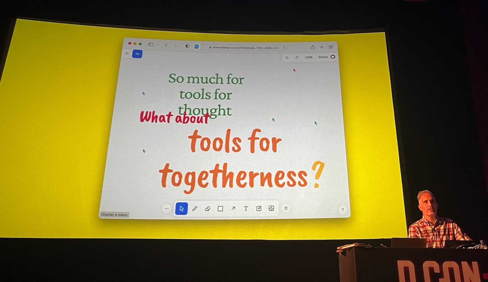 The last dConstruct
My writeup of the last dConstruct.
-
What's new in WCAG 2.2?
WCAG 2.2 has officially reached “Candidate recommendation” status, meaning it is pretty close to becoming an official standard. What's new?
-
Re: AI for content creation
Content that is created with the aid of machine learning lacks a human touch that is worth caring about.
-
How I use Twitter
I like Twitter, but only with some modifications.
-
Keyboard shortcuts need modifier keys
Keyboard shortcuts can make your website or app much more keyboard friendly. But they need modifier keys.
-
Individual climate action: small steps matter
A response to other posts about climate action
-
With :focus-visible, you can have focus styles when it makes sense
On why :focus-visible is more than a way to target keyboard users only.
-
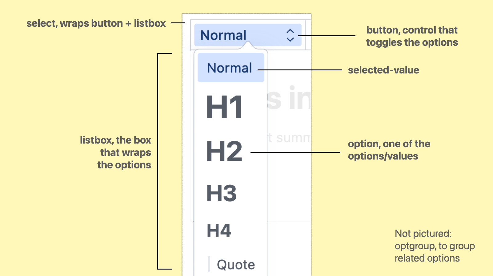 Two levels of customising <selectlist>
There will be two levels of customisation in selectmenu: via CSS or via replacing parts.
-
Two talks about documentation
Some notes from two talks I saw recently about making better documentation.
-
“That's not accessible!” and other statements about accessibility
Is the accessibiliy of a website a binary thing? It depends!
-
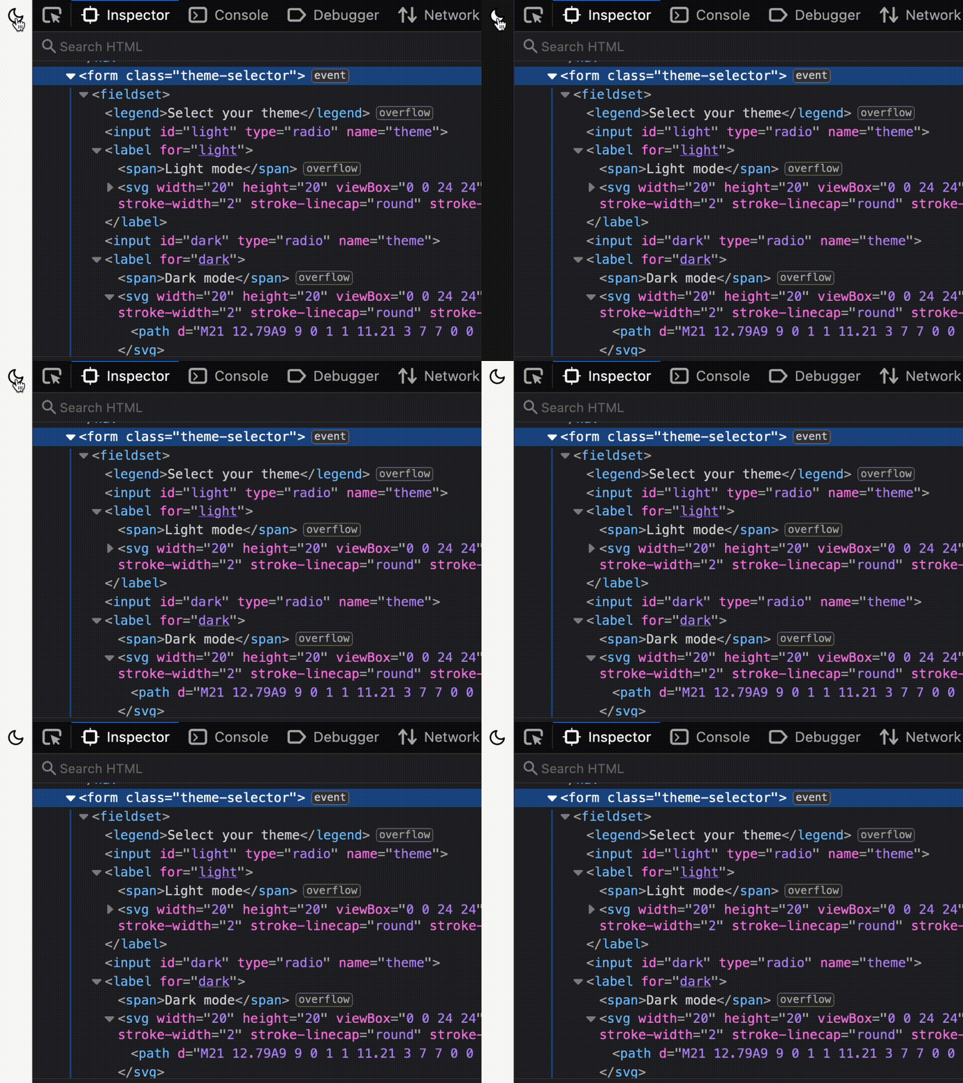 How I built a dark mode toggle
I added a dark mode toggle to this site. This is how.
-
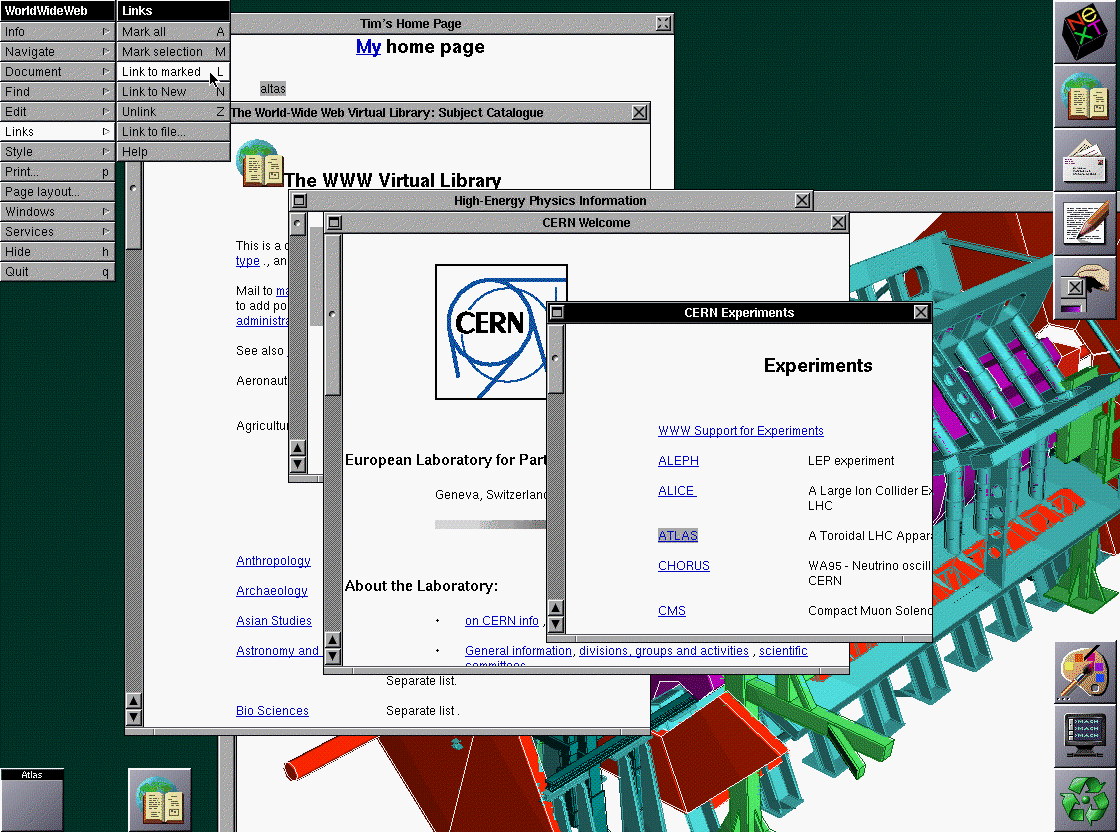 ATAG: the standard for accessibility of content creation
A primer to ATAG, the accessibility standard that applies to tools that create web content.
-
Accessibility from different perspectives
I've worked in web accessibility in various positions, this post is about how the accessibility-specialised developer's position can be difficult.
-
More common accessibility issues that you can fix today
As a follow up to my previous post about common accessibility issues, I have written out five more issues that you could fix today.
-
Test in many browsers
In which I explain why I feel it's still a great habit to test in many different browsers and browser engines.
-
Action, inaction and ‘cancel culture’
Some thoughts on banning certain content from communities versus not doing that.
-
The URLs are new
I've updated the URL these posts live on.
-
Common accessibility issues that you can fix today
Tips based on WebAIM’s “Million” survey.
-
Photo blogging with Sanity and Eleventy
On how I built a photo blog with Sanity and Eleventy.
-
 Menlo Park
Curiosity and crossing disciplines can result in better products.
-
Re: nuance in ARIA
A quick response to Dave Rupert’s post on HTML and ARIA.
-
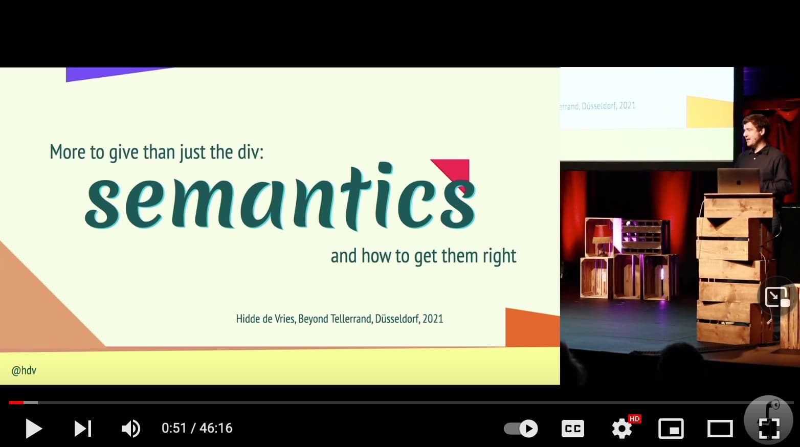 More to give than just the div: semantics and how to get them right
A write-up of my talk about semantics.
-
Use Firefox with a dark theme without triggering dark themes on websites
A quick tip to make Firefox’s
prefers-color-schemeimplementation respect system colour preferences rather than browser theme colours. -
Boolean attributes in HTML and ARIA: what's the difference?
Some attributes in ARIA are boolean(-like). These attributes may seem a lot like boolean attributes in HTML, but there are some important differences to be aware of.
-
Joining Sanity
I will start a new job.
-
 The web doesn’t have version numbers
I think there are lots of exciting uses for the web outside the realm of ‘web3’.
-
Twitter needs manual language selection
Thoughts about auto-adding
langattributes. -
2021 in review
Some highlights from my 2021.
-
How many people with disabilities use our site?
Many ask ‘How many users with disabilities use our site?’ We probably don’t need to know, if we need to decide whether to improve web accessibility on our sites.
-
The better version of digital life is real life, not ‘the metaverse’
A look at Facebook’s new ideas through the lense of their current endeavors.
-
Meeting “2.2.2 Pause, Stop, Hide” with prefers-reduced-motion
I’m a little torn on whether to see
prefers-reduced-motionas a sufficient way to meet 2.2.2 Pause, Stop, Hide. My thoughts. -
In person
I experienced my first web conference during The Situation.
-
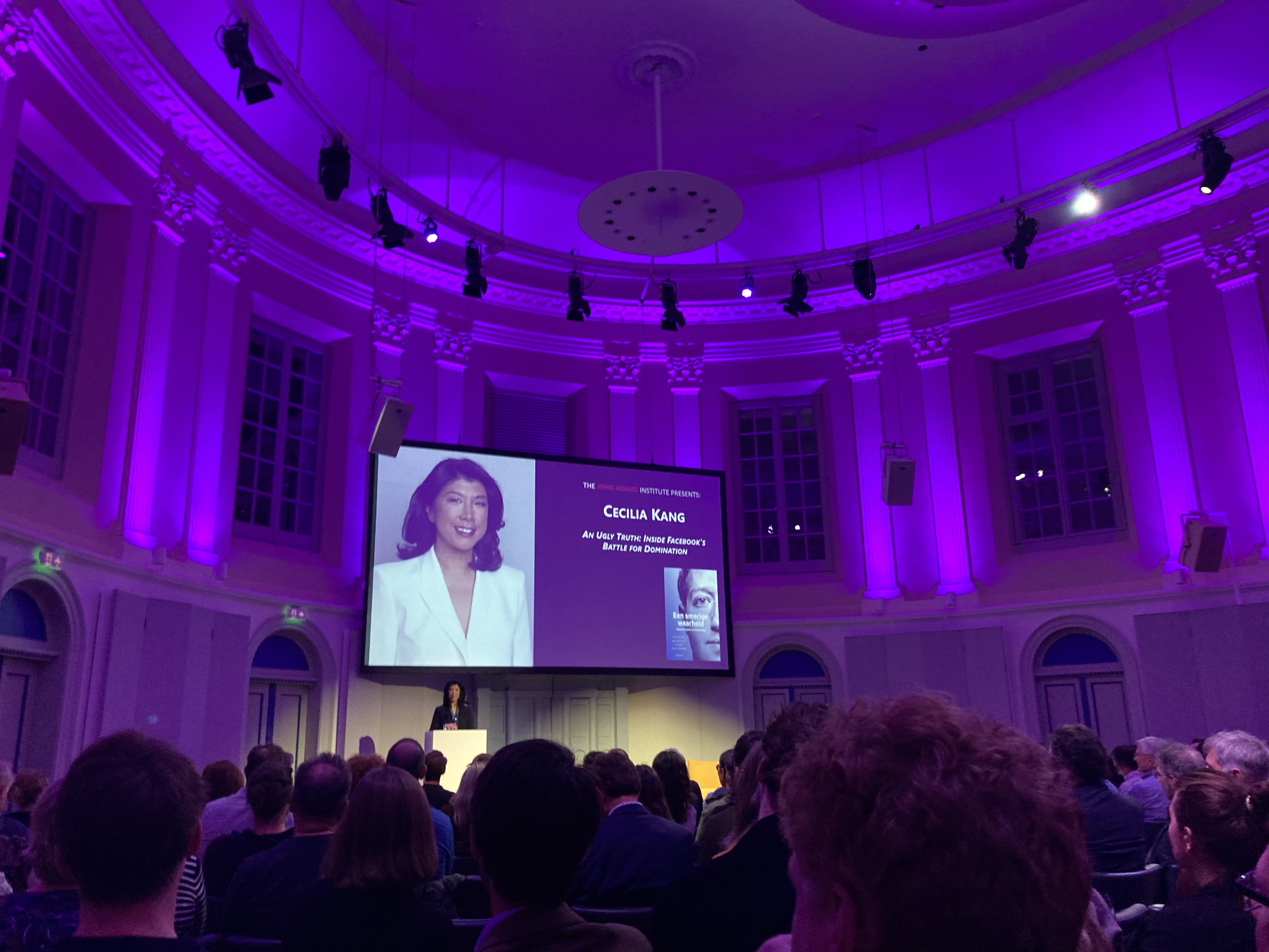 Patterns
I attended a conversation with Cecilia Kang. These are some thoughts about An Ugly Truth and Facebook.
-
Subsets and supersets of WCAG
Many use WCAG as a baseline to ensure web accessibility. In this post, I look at doing less and doing more than the standard.
-
Trying out spicy sections on here
This week I had some fun adding the experimental spicy-sections custom element to this website.
-
How AI is made matters, confirms “Atlas of AI”
My review of Atlas of AI.
-
A case for accessibility statements in app stores
In which I argue app stores need fields for accessibility meta information.
-
Solutionism
In which I talk about why fallbacks are good.
-
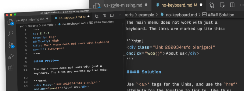 Introducing: an Eleventy starter project for WCAG reports
I’ve released the code I use to generate WCAG conformance reports using the Eleventy static site generator. Here’s some context.
-
150
This post is my 150th, so I decided to write about writing and look back at some of the posts.
-
Criticism pushes the web forward
It may not be easy, but it is important to include perspectives outside your own.
-
What's ‘normative’ in WCAG?
In which I go into the difference between normative and non-normative in WCAG.
-
Queuing up
Meetings are better with queues. Here’s why.
-
Accessible front-end components: claims vs reality
Not all ‘accessible components’ are created equal. Find out which will work best for our end users with this checklist.
-
My typical day
My part in a blogging chain about daily life.
-
It's easier when you do it earlier
Web accessibility becomes easier and cheaper, when you address it earlier.
-
 How I turned my Goodreads data into a self-hosted website with Eleventy
So that I could control what and how to display.
-
2020 in review
Some highlights from my 2020.
-
Why it's good for users that HTML, CSS and JS are separate languages
A response to an idea to merge HTML, CSS and JavaScript into one language.
-
When there is no content between headings
Why having no content between headings can be problematic.
-
Equality, a reading list (2)
A list of books about inequality and race.
-
Reply via email
I added a Reply via email link to my RSS feed.
-
22281
My browser blocked 22281 trackers since July, 2019.
-
How deployment services make client-side routing work
When we deploy a single page application with client-side routing, some server configuration is needed to make it work.
-
Uncanny Valley
A review of Anna Wiener’s Uncanny Valley.
-
Minimum Viable Data Collection
What if more website-owners used Minimum Viable Data Collection as their strategy for complying with privacy regulations?
-
More accessible defaults, please!
Useful HTML elements like date inputs and <video> could make the web a much better place, if browser accessibility bugs in their implementations were prioritised.
-
Could browsers fix more accessibility problems automatically?
Let’s explore which accessibility issues browsers could fix automatically!
-
2019 in review
A personal review of 2019.
-
Tech vs society: a reading list
A list of books about technology and society.
-
Breaking barriers with your CMS
A written version of my lighting talk “Breaking barriers with your CMS”.
-
Notes from the Internet Health Report 2019
My notes from reading the Internet Health Report 2019.
-
Book review: Zed
A review of Joanna Kavenna’s novel Zed.
-
Managing accessibility in open source CMSes: a write-up
Write-up of the Drupal and WordPress meetup.
-
Equality: a reading list
A reading list about equality.
-
Meaning without markup: Accessibility Object Model
Proposals for the Accessibility Object Model include a new way to convey semantics: without markup, directly in JavaScript. This post looks at the proposals and their current status.
-
Click here to kill everybody: a review
A review of Bruce Schneier’s book Click here to kill everybody.
-
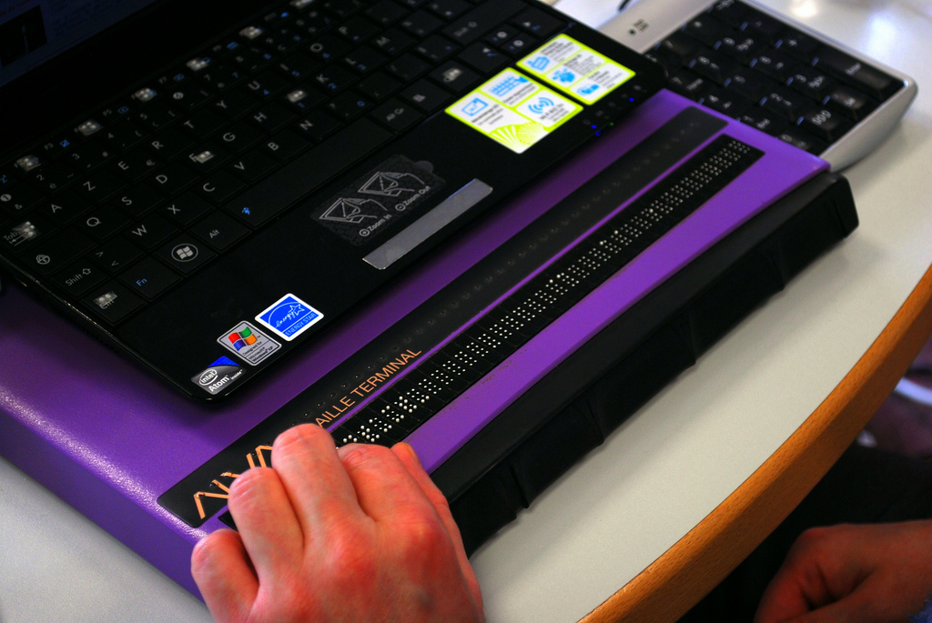 How accessibility trees inform assistive tech
Inspectable accessibility trees are a great innovation that have recently come to all major browsers. This post looks at how accessibility trees inform assistive tech.
-
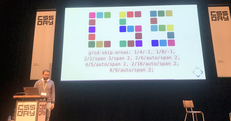 CSS Day 2019: some things I learned
Last week I joined over 400 web nerds at CSS Day 2019, which took place once again in the lovely Compagnietheater in Amsterdam. These are some of the things I learned.
-
Indicating focus to improve accessibility
It’s a common, but fairly easy-to-fix accessibility issue: lack of indicating focus. In this post I will explain what we mean by focus and show you how focus outlines make your site easier to use.
-
Hello W3C!
I am joining the W3C! Some thoughts on leaving Mozilla and the City of The Hague and on joining this new team.
-
Baking accessibility into components: how frameworks help
Some thoughts on seeing declarative component frameworks as a way to make the web more accessible, not less.
-
Naming things to improve accessibility
Why and how the right HTML elements can improve the user experience of people that use assistive technologies.
-
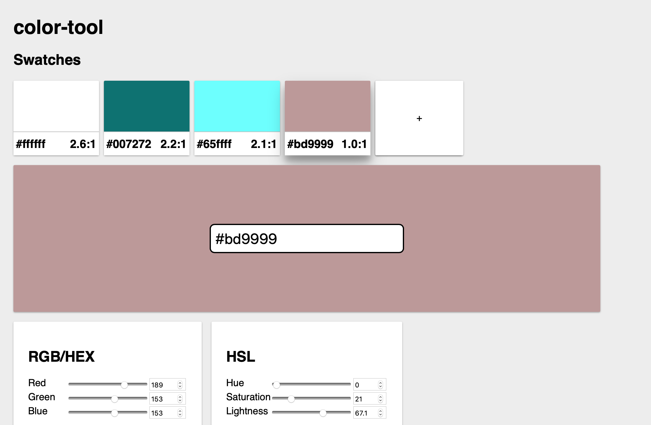 Content and colour at #idea11y in Rotterdam
Write-up of the Inclusive Design and Accessibility meetup in Rotterdam on 21 March 2019.
-
Book review: The age of surveillance capitalism
This week I read The age of surveillance capitalism by Shoshana Zuboff. This is my review.
-
Component frameworks and web standards
Are component frameworks at odds with a vanilla approach to web development? Well, partly, but not as much as I used to think. Some thoughts after I tried a framework.
-
Content-based grid tracks and embracing flexibility
A bit about designing min-content, max-content and auto, and how they can be used.
-
Three ways to build Crouwel's Hiroshima poster in CSS
Recreating old posters, I figured there are at least two approaches to deciding how many grid tracks your component or page needs: one can make it visually perfect, the other is more flexible if content is bound to change.
-
Console logging the focused element as it changes
It can be done by listening to
focuson the document, with capturing turned on. -
Linking to translations
On
lang,hreflangand BCP47. -
On the importance of testing with content blockers
With more people using tracking protection features, we should test our sites with content blockers.
-
Return of the blog roll
Personal blogs are making a comeback among web folks. I like this. I have even gone so far as to add a blog roll to this site, so that you can see, fwiw, which blogs I like to read.
-
2018 in review
Highlights and things I learned this year.
-
Making single color SVG icons work in dark mode
One way to make SVG icons work in dark mode.
-
Scroll an element into the center of the viewport
Element.scrollIntoView takes as its argument either a boolean value or an object. The object syntax gives more alignment capabilities and smooth scroll, but it works in less browsers.
-
Calm tech, platform abuse and reality
This week I attended the Digital Design Ethics conference in Amsterdam. I learned about calm technology, how platforms are abused, what our options are and how to try and prevent abuse earlier. My write-up of the day.
-
Up to speed with web performance
A write-up of performance.now() conference in Amsterdam.
-
My first MozFest
Some things I learned at the 2018 MozFest in London.
-
Grids in cards
In cards, you could use grid tracks instead of padding.
-
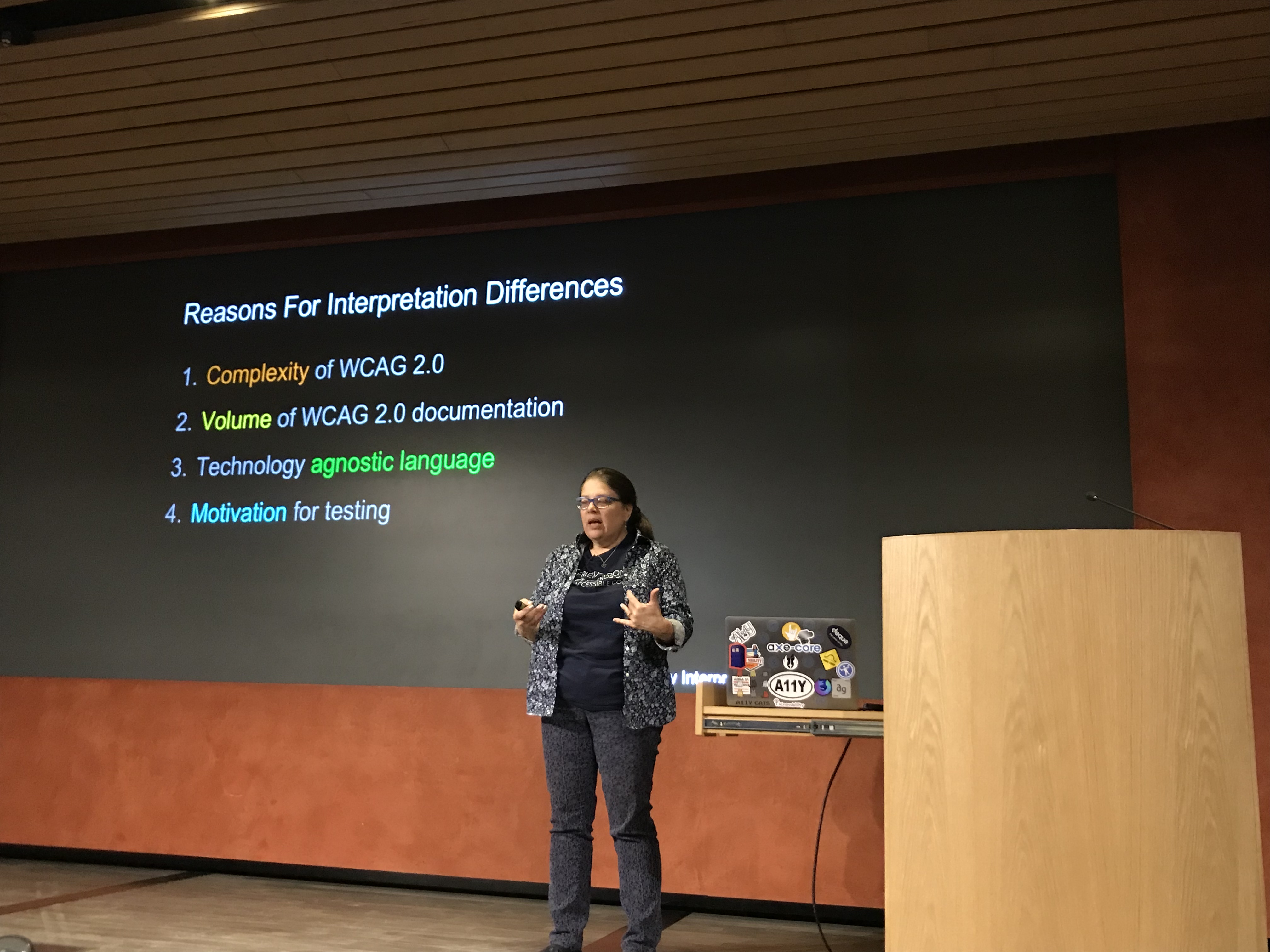 Accessibility wars and the state of talking to machines
Writeup of Accessibility London, September 2018.
-
Review: New Frontiers in Web Design
Review of Smashing Book #6.
-
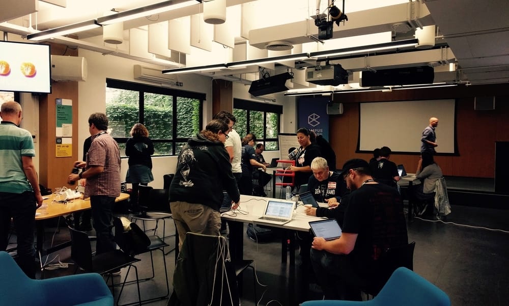 #HackOnMDN
Quick summary of my experience this weekend at #HackOnMDN, a three day event where people came together to improve accessibility of and accessibility information on MDN.
-
Overlapping skills in front-end development
Last week a poll about CSS got me thinking about the language and overlapping skills in front-end development.
-
Heading structures are tables of contents
Heading structures give screenreader users and others a table of contents for our sites. By being conscious of that, we can make better choices about heading levels and their contents.
-
Let's serve everyone good-looking content
Now that Grid Layout is seeing more adoption, it seems like a good time to remember that websites don’t need to look the same in all browsers.
-
An AI reading list
Five books about artificial intelligence and the philosophy of AI that I can recommend.
-
Accessible page titles in a Single Page App
According to WCAG 2, criterion 2.4.2, web pages should have titles. How to go about this in a single page world?
-
What kind of ethics do front-end developers need?
Some ways of how, as front-end developers, we can apply ethics in our work.
-
How I learned to stop worrying and love CSPs
An introduction to CSPs for front-end developers.
-
 Vague, but exciting…
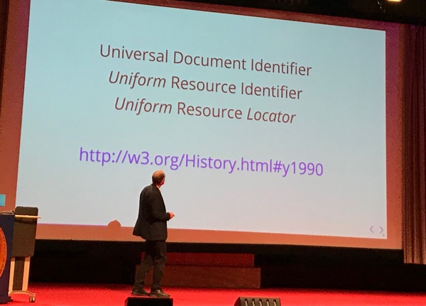
A write-up of Sir Tim Berners-Lee’s ACM Turing Lecture in Amsterdam.
-
More accessible markup with display: contents
With
display: contents, we can have more accessible markup for our CSS Grids. One caveat: supporting browsers currently break this. -
For everyone
On different meanings of ‘for everyone’.
-
A Dutch version of the Inclusive Design Principles
I translated the Inclusive Design Principles to Dutch.
-
Donuts and Fronteers
Fronteers now has a Donut-bot.
-
You don't always need alternative text
Alternative text is a great opportunity to make the non-text parts of the web accessible. However, look out for redundancy, and only add it when it conveys something that isn’t already there.
-
aria-expanded does not require a fallback
The benefits and downsides of providing a fallback for the aria-expanded attribute, and why it is now best to not provide a fallback at all.
-
Making password managers play ball with your login form
Some tips for building password manager proof login forms.
-
My ideal newspaper app is not very smart
On why I like newspaper apps that are not much more than PDF readers.
-
Form events when submitting with keyboard
Some notes on happens when you press enter to submit a form.
-
2017 in review
Looking back at 2017.
-
 #yallhands
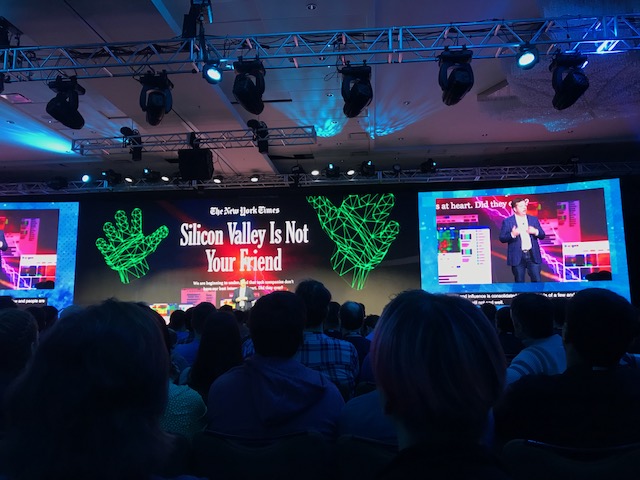
At Mozilla’s All Hands in Austin I learned met a lot of colleagues, learned about Mozilla projects and saw a bunch of interesting lightning talks.
-
What to use Grid Layout for? Some ideas.
If you have learned how to use Grid Layout, you might wonder what to use it for. In this post, I will give some use cases where I think Grid will excel.
-
The web is ready for great graphic design
New CSS possibilities are ending the unrealistic content problem and the generic layout problem. It’s a great time to build layouts in CSS!
-
New challenges
This month is my last at Wigo4IT, and I’m excited to start new projects at Mozilla and the Dutch Ministry of the Interior.
-
Web Components as compositions of native elements
I’m starting to get more excited about Web Components, and think they can be very helpful to encapsulate compositions of elements.
-
On recruiting for specific technologies
I’ve found recruiters often look for specific frameworks, but I don’t think they are what matters in web projects.
-
Brique: a conference about challenging reality
This week I attended Brique, a new conference about design. This post contains some things I picked up.
-
ICONS: work on stuff that matters
At ICONS, three speakers shared their view on what I can only paraphrase as: to do something that matters.
-
Accessibility Design Drive
My thoughts about Mozilla’s one week Accessibility Design Sprint.
-
Small steps
Last Friday, De Volkskrant exposed how much trouble the Dutch tax office has had in recent years to build software and manage its IT projects. I’ve listed the four main things they lack according to the article.
-
Enabling people with accessible technology and positive thinking
A quick summary of the Inclusive Design and Accessibility Meetup on 20 July in Rotterdam.
-
Testing the accessibility of pattern libraries
Can pattern libraries be tested for accessibility? And if so, what do we test? In this post I will address those questions and look at accessibility testing in different levels of pattern library driven development.
-
This website now uses Grid Layout
I’ve rewritten the CSS for this blog, using Grid Layout for the lay-out. These are some of my findings.
-
Professional developers
In this article, I try to answer the question: is there much inherently wrong with setting standards for what we think is a real/good/professional/sufficient developer?
-
Did CSS get more complicated since the late nineties?
A look into the early days of CSS and changes that have occurred since.
-
Coherence, Lego and how naming things is hard: Patterns Day 2017
My write-up of Patterns Day 2017, on 30 June in Brighton.
-
Pseudo classes vs pseudo elements
On the difference between pseudo classes and pseudo elements
-
 Browser API Special and CSS Day
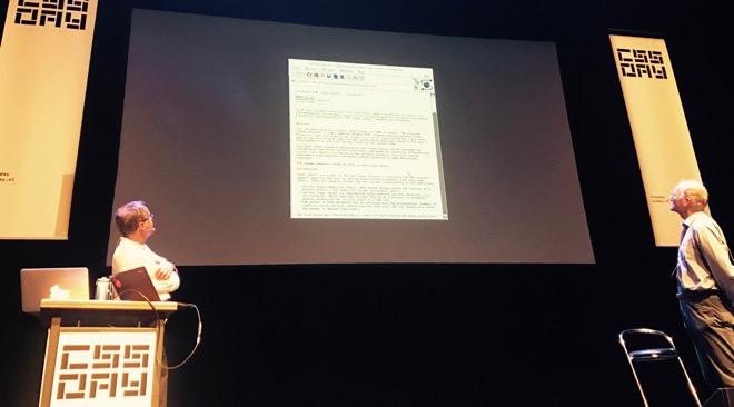
My write-up of Browser API Special and CSS Day 2017.
-
ICONS: five questions about screen readers
My notes from the ICONS meetup with Léonie Watson on 31 May 2017.
-
I, Daniel Blake
Some thoughts after seeing the Ken Loach’s film I, Daniel Blake.
-
Accessibly labelling interactive elements
All interactive elements should have accessible names and can have descriptions. In this post I explain labelling with native HTML and ARIA attributes and discuss how to future-proof your labelling.
-
How to customise a file upload control
A trick to build a file upload control that uses a native input element, but looks custom.
-
Where focus goes when following in page links
Today I learned about the sequential focus navigation starting point, which helps browsers decide what to do with focus when you link to content that is not focusable
-
Book tip: Turing’s vision
A few notes about Chris Bernhardt’s book Turing’s Vision: The Birth of Computer Science.
-
Mom-jokes as part of corporate culture
On jokes between friends and jokes on a corporate level.
-
On hiding content
A post about how the
hiddenattribute works, how it differs from[aria-hidden]and how it relates to just hiding with CSS. -
How to make inline error messages accessible
On how to help users see which fields have errors, what’s wrong with them and how to fix it.
-
My last day at Fronteers
Looking back at over 8 years of volunteering at Fronteers. It’s been a blast!
-
Perfwizardry
My notes from Harry Roberts’ performance workshop in Amsterdam on 9 March, 2017.
-
The importance of web standards and design for accessibility
My notes from the Inclusive Design and Accessibility meetup, 20 February 2017 in Amsterdam.
-
Using JavaScript to trap focus in an element
This is how to temporarily trap focus in an element, a functionality that can be used to make modal interface elements more accessible.
-
On initialising JavaScript from markup
In this post I explain why I think declaring behaviour in markup is advantageous rather than problematic.
-
Leaving the Fronteers board: what happened
Some clarification on why I left the Fronteers board, what was decided at this year’s members meeting and what the Fronteers future now looks like.
-
Review: Inclusive Design Patterns
My review of Inclusive Design Patterns by Heydon Pickering
-
Things I learned at From the Front 2016
My notes from From The Front 2016.
-
Some pointers on default cursors
Some thoughts about standards when it comes to cursors for buttons.
-
Progressive Web Apps Dev Summit
My takeaways from the Progressive Web App Dev Summit, organised by Google in Amsterdam.
-
The internet does forget
Write-up of Jeremy Keith’s talk at ICONS in Amsterdam.
-
Reasons to make digital products accessible
My notes from NCDT, the Dutch digital accessibility conference
-
ConfConf
My notes from ConfConf, the conference for conference organisers.
-
Notes on CSS Grid Layout
Some notes I wrote after reading the CSS Grid Layout specification.
-
Collaborative CSS
My thoughts about styling with classnames versus styling with HTML elements. TL;DR: we need both.
-
Font loading strategies
When it comes to loading custom typefaces in CSS, use a font loading strategy instead of the default browser behaviour
-
Perf mattered at the Fronteers Spring Conference
My write-up of Fronteers Spring Conference 2016.
-
Cascading and cognitive overhead
On the cognitive overhead of cascading
-
World IA Day 2016 in Bristol
Write-up of World IA Day 2016 in Bristol
-
Turning off Heartbeat in WordPress made my day!
Protip for working on WordPress sites using a slow connection
-
Making conference videos more accessible
About a workflow for improving the accessibility of conference videos
-
The website as an instantiation of your design system
By documenting a web design as a system of components, your website can be an instantiation of your design system.
-
JSCS vs JSHint
What’s the difference?
-
Scripts and stylesheets in WordPress sites
I like WordPress plug-ins that do not insert their own CSS or JavaScript.
-
Declaring grid layouts with ‘just’ CSS
We can soon use ‘just’ CSS to describe our lay-outs. But, arguably, that leaves us with a naming problem.
-
The role of grid systems in component-based front-end builds
I think for large websites and organisations, in addition to having a component system, it makes sense to have one agreed-upon, shared-between-projects grid system.
-
Offline apps and user intent
I think when designing apps that work offline, we should consider user intent and let users choose which content becomes available offline.
-
What kind of Web Components do we need?
Web Components give developers lots of freedom, but also a big responsibility. In this post, I look at the kind of components we need.
-
Responsive day out 3: the final breakpoint
Write-up of Responsive Day Out 3, on 20 June 2015 in Brighton
-
The accessibility tree
Every time you add HTML to a page, think ‘what does this expose to the accessibility tree?’ My notes from Léonie Watson’s talk at Accessible Bristol.
-
The web is fast by default, let’s keep it fast
Website slowness is optional, and I think that it can and should be avoided. The web is fast by default, let’s keep it fast.
-
Solving problems with CSS
To solve CSS problems, it is much more important to understand the spec and how browsers implemented it, than which abstraction to use.
-
Making our websites even more mobile friendly
Google’s algorithm for deciding wether sites are “mobile friendly” is great, but not perfect. In this article, I go into other things we could do to make sites more mobile friendly.
-
Switching to HTTPS
This website is now only available over HTTPS. Some notes on why and how I did it.
-
On cognitive accessibility
Some notes about the Accessible Bristol meetup about cognitive accessibility
-
Progressive enhancement with handlers and enhancers
In which I describe how to do progressive enhancement by declaring handler and enhancer functions on HTML elements.
-
Review: Responsible Responsive Design
My review of Scott Jehl’s recent book ‘Responsible Responsive Design’.
-
Collaborate 2014: designing with empathy for all
A summary of Collaborate Conference in Bristol
-
Review: the Mobile Web Handbook
A review of PPK’s Mobile Web Handbook
-
 Breakpoints based on language
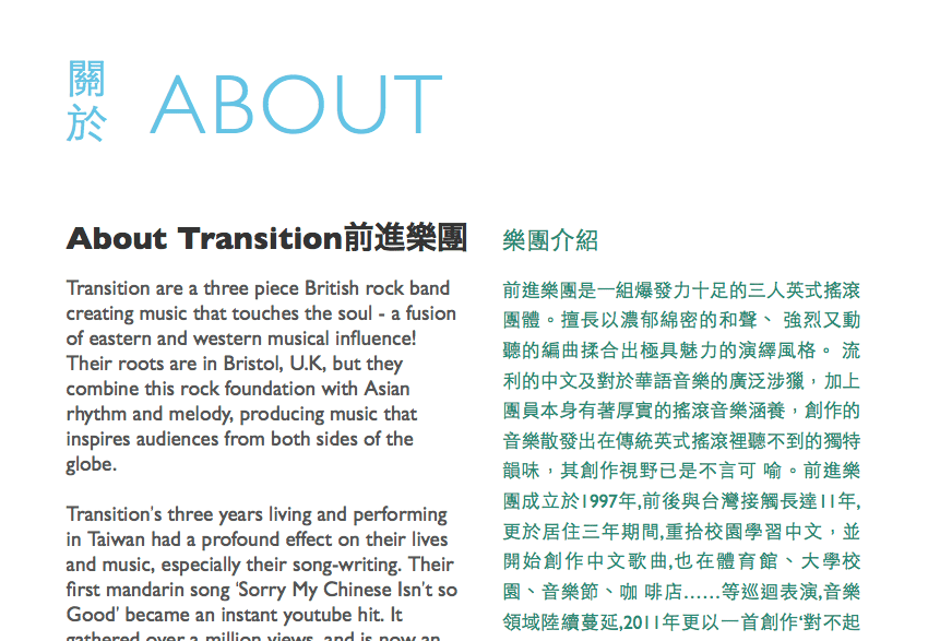
Why not adapt lay-out for languages, like we do for screen widths?
-
Responsive Day Out 2 - the squishening
On the 27th of July, I went to Responsive Day Out 2 in Brighton.
-
Museums Get Mobile!
My notes from Museums get Mobile, 16 May 2014 in Bristol.
-
Keeping it simple
When improving front-end skills, we improve our knowledge of HTML, CSS and JavaScript first and at our knowledge of specific tools later.
-
State of the Browser 2014
At State of the Browser, I saw talks about things like @viewport, Service Workers, responsive images and Firefox OS. My notes of the day.
-
Embedded video in responsive lay-outs
In which I show a trick to embed videos responsively and how to make it work with Wordpress.
-
Meeting the TAG
I went to London to meet the TAG, where things like the web’s design principles, drm, web components and URLs were discussed.
-
Unobtrusive icons
Explaining two ways of adding icons whilst offering a basic alternative.
-
Handheld 2013: the web's structure, expectations and data poetry
Handheld 2013 was about a variety of subjects, including struture, client expectations and data poetry. A round-up.
-
Mark Boulton's grid system design workshop
Notes from Mark Boulton’s workshop.
-
World Usability Day in Bristol
A write-up of a wonderful day at the MShed in Bristol.
-
Styleguides for better front-ends
Some notes after reading Anna Debenham’s Pocket Guide.
Blog roll: I love these other blogs
- Adrian Roselli
- Alastair Campbell
- Ana Rodrigues
- April King
- Baldur Bjarnason
- Bram(us) van Damme
- Brian Kardell
- Bruce Lawson
- Chris Coyier
- Cory Dransfeldt
- eend
- Eric Bailey
- Eric Eggert
- Eric Meyer
- Ethan Marcotte
- fantasai
- Florens Verschelde
- Heydon Pickering
- Hui-Jing Chen
- Jen Simmons
- Jeremy Keith
- Jeroen Hulscher
- Johan Ronsse
- Kilian Valkhof
- Laura Kalbag
- Lea Verou
- Léonie Watson
- Marco Zehe
- Manuel Matuzović
- Marcus Herrmann
- Melanie Richards
- Michael Cooper
- Michelle Barker
- Miriam Suzanne
- Mu-An Chiou
- Nic Chan
- Niels Leenheer
- Oliver Reichenstein
- Peter-Paul Koch
- Rachel Andrew
- Robin Rendle
- Ryan Trimble
- Sara Soueidan
- Sarah Higley
- Scott O'Hara
- Sophie Koonin
- Stephen Hay
- Stefan Judis
- Steve Messer
- Tim Severien
- Una Kravets
- Vasilis van Gemert
- Zach Leatherman