In responsive web design, many of us think of breakpoints as related to the width of lay-outs. But there are other points that can break a website, like language.
Breakpoints: more than just widths and heights
In Responsive Design Workflow, Stephen Hay encourages readers to think about breakpoints regardless of specifics like widths or lay-out. Stephen says breakpoints are ‘the points when certain aspects of a website or web application change depending on specified conditions’ (RDW, page 92). This definition includes lay-out, but it also leaves room for many other aspects to be breakpoints.
Thinking of breakpoints in this more abstract way, they can be added for any change of condition. Width-based breakpoints optimise for width conditions. If a lay-out breaks on wide screens, a breakpoint is added. There can be breakpoints for conditions like ‘JavaScript is available’ and ‘JavaScript is not available’; some websites break without JavaScript. Certain aspects can be implemented differently to accommodate this: a form that gives validation feedback as you tab through it, versus a form that is able to show such information , but only after submission to the server.
Between the conditions ‘screen is greyscale’ and ‘screen is full colour’ is another breakpoint. Maybe they require different logos.
Breakpoints based on language
Recently, I worked on a project for Transition前進樂團, a Bristol-based band that performs in Taiwan and China. They recently launched their first all Chinese album. Naturally, they needed their website to support both languages. We explored the option of building separate sites in Chinese and English. But the cool thing about the band is that they are English, but sing in Chinese. Bilinguality is an essential part of their identity. Showing the two languages side by side would probably work ok, especially since the two languages look quite different. We decided to give it a go.
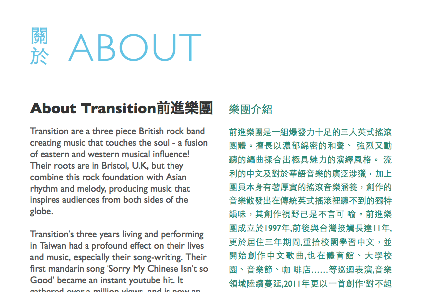 The Transition前進樂團 website has two languages side by side
HTML allows for language attributes, so that authors can define in which language content is written. Most people add one to the <html> element. The attribute can be useful for browsers, search engines and screen readers. For example, it can help a browsers suggest “This page is in Chinese. Can we translate this page to English for you?”, or help a screen reader decide to use a Chinese voice.
This website uses:
<html lang="en">In the Transition site, pages contain both English and Chinese. I added lang="en" to the HTML element, and lang="zh-TW" to all bits of Chinese content. Content that is not in the page’s main language can be a breakpoint, especially if it’s in a non-Western language. Chinese text is much easier to read if it is aligned justified. Likewise, right-to-left reading language may require optimisations too.
Language breakpoints in CSS
If the Chinese content is in elements with the correct language attribute, they can be styled with simple CSS. There are no language media queries, but there is something that works just as well: attribute selectors.
Let’s say content in the default language is marked up like this:
<div class="content-part"></div>And styled like this:
.content-part {
  text-align: left;
  color: black;
}
The Chinese text is marked up the same, but with a lang attribute:
<div class="content-part" lang="zh-TW"></div>For the Chinese bits, we would like the text to appear justified. And in purple, because we can. Chinese characters are all the same width, so justified alignment can make them more readable. We can do this by adding [lang|=zh] to the style rule. This applies to all content parts with a language attribute that starts with zh, i.e. all different kinds of Chinese.
.content-part[lang|=zh] {
  text-align: justify;
  color: purple;
}
Other options
There is also the :lang() selector, which can be used to apply style rules to content in a specific language. Differences:
- It does not only (?) look at the language attribute, it can also uses browser technology to decide what language content is in. Depending on the situation, this may be useful.
- It does not accept regular expressions, so in the case of Chinese, it does not let you write the rule for all different kinds of Chinese (zh-TW, zh-CN)
Alternatively, one could also add classnames to content in a different language, and use those to style. See also: Styling using language attributes by the W3C.
Conclusion
Like screen width conditions, language conditions can be adapted to with simple CSS rules. This is what makes the web such a great medium: if your document is well structured, there are a lot things you can do depending on specific conditions. Really, this is just progressive enhancement.
Comments, likes & shares
No webmentions about this post yet! (Or I've broken my implementation)