Last year, I was lucky to be selected to present at the Web We Want session at View Source in Amsterdam, to argue for something that’s bugged me (and others) for a while: browsers could be more proactive in fixing accessibility issues for end users.
This post is part write-up of that 5 minute talk, part new additions.
Outreach only does so much
The accessibility community produces lots of information about making accessible websites. Especially for folks who want to get the basics right, detailed info is out there. Sources like WAI, The Accessibility Project and MDN Accessibility have information on what to do as designers, developers and content creators.
This is great, but realistically, this guidance is only ever going to reach a subset of website owners. There are always going to be websites that do not include accessibility best practices, for all sorts of reasons. Whether it’s ill will or obliviousness, it impacts people’s ability to use the web effectively.
It would be pretty useful if browsers could give users the power to override the web, so that they can browse it better. They would then be less at the mercy of willing or knowing developers.
Note: I do not want to say browser features can remove the need for us to worry about improving accessibility. Usually, websites can make the best choices about accessibly offering their content. When it comes to responsibility for accessibility, it is the website’s, not the browser’s.
Can browsers fix issues when they find them?
Most web folks will be aware of WCAG 2.1, the internationally embraced web standard that defines what it means for a website to be “accessible”. The sources I mentioned earlier often refer to this document (or earlier versions of it). When we speak of an “accessibility problem”, there’s often a specific success criterion in WCAG that specifies it.
WCAG conformance is largely tested manually, but luckily we can detect some accessibility problems automatically. An interesting project to mention in that regard, is ACT Rules, a Community Group at the W3C. They are mostly people from accessibility testing software vendors, like aXe and SiteImprove, who work on rewriting WCAG as testing rules (paraphrase mine). While doing that, they help harmonise interpretation of the WCAG success criteria, in other words: find agreement about when some web page conforms and when it does not. Guideline interpretation is not trivial, see The Web Accessibility Interpretation Problem by Glenda Sims and Wilco Fiers of Deque.
Interpretation may not be trivial, there are issues that are pretty clear. There are some that we can get true positives for (note, this is a small subset of WCAG; useful, but small). So, if we can automatically find these issues, can we also automatically fix them?
What browsers could do today
There are some issues that browsers could fix automatically today. In my ideal world, when a website has one of those barriers, the user notices nothing, because the browser fixed it proactively. This is not a Get out of jail free card for developers, designers or content people, but more so one for end users, to improve their experience when they encounter inaccesibility.
For lack of a better metaphor, I imagine each of these features to exist as a checkbox within the browser. I’ll gladly admit this is somewhat oversimplified and high level, it is really just to make the point. Browser makers will likely solve these problems most effectively.
During my research, I found that some browsers already fix some of these issues. Yay, go browsers!
Force zoomability
Some users may depend on zoom functionality to read content. With the Apple-invented viewport meta-tag, web developers can disable zooming:
<meta name="viewport" content="user-scalable=no">This may be useful in some edge cases, like in photo cropping or maps functionality. But often, it prevents what was a useful feature to some users.
Browsers could fix this automatically, for example via some sort of preference that bypasses the developer’s preferences in favour of the user’s.
This fix exists currently, as Apple does ignore the user-scalable directive in the latest versions of iOS (>10), and it seems some Android browsers do, too.
Force readability
Claiming that 95% of the web is text, Oliver Reichenstein once said:
It is only logical to say that a web designer should get good training in the main discipline of shaping written information
(from: Web Design is 95% Typography)
Plenty of websites out there aren’t great at “shaping written information” at all. There may be differences in taste and all, but some design decisions objectively make content illegible to at least a portion of users. Common problems include: light grey text on a white background, typefaces with extremely thin letters as body text and way too many words per line.
Browsers could fix such readability problems automatically, by forcing page content into a lay-out optimised for reading. Examples of browser features that do this:
- Safari has had a Reader View for a long time, it lets you select fonts and colours and is marketed as allowing for distraction-free reading
- Firefox Reader View, which will let you make some choices in typography, dark modes and can even speak the page content out loud so that users can listen instead of read
- Microsoft Edge has Immersive Reader View (previously Reader View), which can, like Firefox, read aloud. It even has grammar tools, that will let you do things like highlight nouns.
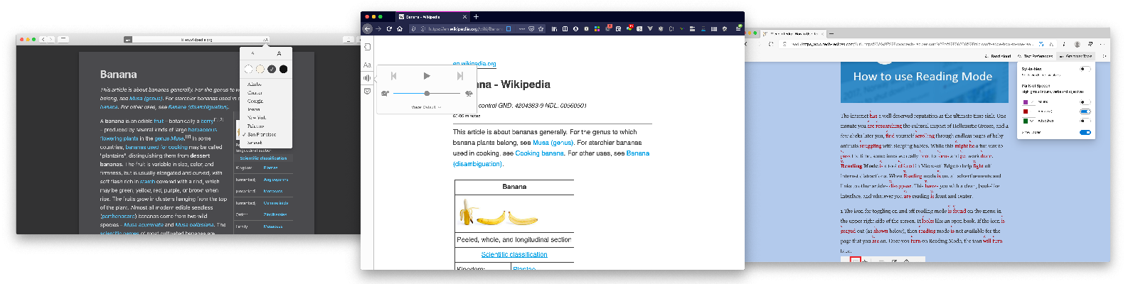 Examples of reader mode: Safari, Firefox, Edge
Enforce contrast
When there is too little colour contrast in our UIs, they are harder to use for people with low vision and as well as people with color deficiencies. With contrast checkers (like Contrast Ratio), designers can ensure their work meets WCAG criteria like Contrast Minimum and Non-text Contrast. Still, whenever new content gets added, there’s a risk new contrast problems emerge. That text on a photo on the homepage could turn from super readable to hardly readable in a whim.
You might be getting the theme by now… browsers can deal with contrast problems automatically. Why not have a “enforce contrast” setting, that adds a black background to any white text, always?
It turns out, some browsers are already working on this, too! I was unaware when I prepared my talk. The basic idea is to fix contrast for users that use Windows High Contrast Mode (HCM). So, rather than the individual setting I suggested, it ties in with a related and existing preference. Much better!
The details:
- Microsoft Edge’s solution is a readability backplate that could be behind all text when High Contrast Mode is on. Melanie Richards also mentioned this in her talk Effectively Honoring Visual Preferences at View Source 2019 (also goes into some great other colour-related accessibility features Microsoft are working on)
- Firefox is also adding a backplate, see bug 153912, which works in HCM and uses theme background color. Firefox used to completely disable background images in HCM, which ensured lots of contrast, but also in losing potentially important context.
Fix focus styles
For many different kinds of users, it is important to see which element they are interacting with. As I wrote in Indicating focus to improve accessibility, focus indicators are an essential part of that.
Some websites remove them, which makes navigation with keyboards and some other input methods nearly impossible. It is a bit like removing the mouse indicator. CSS allows for doing either, but that doesn’t mean we should.
Browsers could fix this automatically! I would welcome a setting that forces a super clear focus indicator. Basically, it would activate a stylesheet like :focus { outline: 10px solid black; } (and probably a white outline for dark backgrounds), and boom, people who need focus indication no are no longer dependent on individual website’s willingness to provide it.
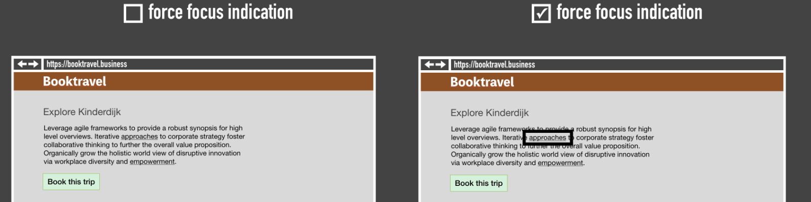 A simplified example of what “force focus indication” could look like
I am not aware of any browsers that implement this, but believe it could be an effective way to mitigate a common problem.
Update 26 April 2021: From Chrome 86, there is a Quick Highlight functionality that can be turned on in settings://accessibility. It will force focus outlines on any interactive element, even if the website didn’t provide any. The outline disappears after a few seconds.
Autoplay optional
There’s a number of potential accessibility problems with autoplaying content:
- autoplayed audio can get in the way for screenreader users trying to navigate (see Understanding 1.4.2)
- some autoplayed content can be in the way for people with attention deficit disorders (see Understanding 2.2.2)
- certain autoplayed videos (notably with flashing content) could cause seizure (see Web accessibility for seizures and physical reactions on MDN).
Some websites fix this automatically now. Twitter disabled animated PNGs after they had been used to attack users with epilepsy.
Browsers could fix such issues automatically, too… what if they had a setting that would never allow anything to autoplay? It turns out, Firefox has a flag for this. In about:config, you can set image_animation_mode to none, or once if you prefer (via PCMag). For Chromium, there are plugins.
Block navigation
When every page on a website starts with a bunch of navigation and header elements, it can be cumbersome to users of some assistive tech. If you use a system that reads out web pages sequentially, you don’t want to listen to the navigation menu for every page you go to. 2.4.1 Bypass Blocks exists for this reason, and many websites implement it with a “skip link” (e.g. “Skip to content”) that lets users jump to the content they need.
Browsers can determine blocks of repeated content between pages, especially if they are marked up as labeled regions (see: Labeling regions). If a page has one <main> element, browsers could provide navigation to skip to that element.
Wrapping up
In an ideal world, websites ensure their own accessibility, so that they can do it in a way that works with their content and (sometimes) their brand. Website owners have the responsibility to make their stuff accessible, not browsers or other tools.
Yet, when websites ship with accessibility problems, browsers could fix some. They could automatically “fix” zoomability, readability, colour contrast, focus indication, autoplay and block navigation. If they did, users need to rely less on what websites provide them.
See also: my original proposal, and my other proposal on throwing accessibility errors in the consoleUpdate 26 April 2021: added Quick Highlight Chrome feature
Comments, likes & shares (6)
Accessabilly, Vasilis and Eric Eggert liked this
Like many people, I have been monitoring the creation of WCAG 2.2, the upcoming new version of the Web Content Accessibility Guidelines. Nine new Sucess Criteria are proposed. One particularly worries me: 2.4.11: Focus Appearance.
Focus Appearance builds on two existing WCAG criteria that affect focus indicators: that users can see which element has focus (2.4.7), and that focus styles have sufficient contrast (1.4.11). Focus indication is essential for a wide range of users, including users who browse by keyboard or zoom in. For an introduction to why focus indication matters, see my post on indicating focus.
What's new about 2.4.11 is adds more requirements for what the indicator looks like:
It's a clever new criterion, that addresses important user needs that were previously unaddressed. The Working Group clearly put a lot of research and thought into it. This is hard to do, as co-chair Alastair Campbell mentions in a GitHub issue:
This is the crux of why this isn't trivial to solve and I appreciate everyone's efforts on the proposed Success Criterion. I know the text has had revisions and improvements after people have flagged complexity issues. Still, I'm sorry the Success Criterion as it stands now has me worried.
“Focus Appearance” is “at risk” of being removed from the final version of WCAG 2.2. My vote would be to drastically change it (again) or remove it entirely. Firstly, the requirements are complex to apply or teach. Secondly, browsers, OSes or assistive technologies could guarantee focus appearance better (and I feel it would be easier to talk to them than to convince all of the world's web developers).
Why I hesitate about including 2.4.11
Complex to apply
I expect Focus Appearance would be hard to apply, because the Success Criterion text has a lot of complexity. It is full of clauses and sub clauses. It often includes “and” (8 times), “or” (7 times) and “non”/“not” (4 times). There are two ways to meet it (you can choose one or both), and there are two exceptions and three notes. All in all, it's a lot to grasp.
The wording requires knowledge of a lot of specialised terminology, especially in the “area of the focus indicator” part. It may be that I am a non-native English speaker, but I had to look up what a “perimeter” is. The Oxford Dictionary of English states:
WCAG 2.2 makes this definition more specific to the web by defining “perimeter” as ”continuous line forming the boundary of a shape not including shared pixels, or the minimum bounding box, whichever is shortest”.
In this, “minimum bounding box” has its own definition:
And because it is about web content, another clause is added:
This is a lot to take in and it seems easy to misunderstand. There are so many sub definitions needed. One could easily misinterpret the concepts of a bounding box, the perimeter,“shared pixels”, “CSS pixels” (ok, that's already used in Reflow and Target Size) and apply the whole SC wrongly.
This makes 2.4.11 Focus Appearance very different from other criteria, like Non-Text Content or Keyboard. Accessibility specialists will know there are indeed lots of ways not to meet those requirements, but the general idea of how to comply is easier to grasp. Very few people will need to look up what a keyboard or text is.
Admittedly, there are easy ways to comply with the proposed Focus Appearance, too. One is to have a solid outline with a minimal offset of 1px that has sufficient contrast (3 : 1) with its background, as James Edwards explains in New Success Criteria in WCAG 2.2.
Complex to teach
As someone who sometimes teaches WCAG to teams, I also worry about the complexity of 2.4.11. I could teach the ‘easy way’ described above, that doesn't seem too complex to teach. But if I would try to teach the whole Success Criterion with all the requirements, exceptions and notes and also cover what the Understanding document explains, I fear I won't get it across.
“But teaching is your job, Hidde!”, you might say. Yes. And I could probably make it work, but it would take class time that I would like to spend on other barriers, and there is still the risk the information sticks with participants less because of the complexity. There will also be people trying to apply this Success Criterion on their own.
Leave it to browsers
We can't just leave all of our problems to browsers to fix. But if I had any say in it, browsers should fix any accessibility problems they are able to fix. That way, end users have to rely less on individual web developers to make good choices. I feel focus indication is a great example of that: the browser knows what has focus, users want to know it, web developers could fail to add a good indicator. So why rely on web developers?
In a discussion on relying on browsers for focus indication, the Working Group concluded that browsers don't do sufficient default focus indication today, so if we want accessible websites, we need to require it through WCAG. If browsers start to do it later, the requirement could be removed or moved to a different level then. A chicken and egg situation, basically, but with one of them more likely to materialise (I'm not super sure which, to be honest).
A second argument is that web designers are in a better position to design an appropriate indicator, one that fits well with the rest of the site's design. But it's unlikely those designers can take into account user needs as well as a browser could with settings. Some users may prefer an indicator they can see move from one element to another, some may want a very high contrast indicator, some may want it more subtle (see also Rain's comment mentioning high visible focus indicator from a COGA perspective). A browser could provide options. We wouldn't want individual websites to start offering focus indication choosers, right?
Forced focus indication already exists in various forms through OS settings, assistive technologies (like VoiceOver) and even some (buried away) browser settings (in Chrome). There is a bunch of browser plugins and bookmarklets that force focus indication, too. So we've got forced visibility. Forced “good appearance”, however, is not fully in browsers and harder to implement, of course. It would need to account for all the things 2.4.11 requires, like sufficient contrast with surroundings (the browser/add-on/plugin would need to make it work with any background) and sufficient contrast with non-focused state.
I get the idea of putting this on developers before full browser support exists, but it does feel a bit like solving all problems with one (conformance-shaped) hammer. It also doesn't apply when developers simply don't meet WCAG. Yes, there are human rights, ethics and laws, but we know they are violated a lot today. I fear this will only be more common when the requirements are too complex.
How to make it less complex
I know WCAG 2.2 is close to its last standardisation stages, so I'm sorry to bring this up now. I also don't want to just say ‘don't include 2.4.11’. Let me describe a possible way to make the situation less complex for developers, evaluators and teachers, by replacing Focus Appearance with multiple Success Criteria:
These two on their own seem a lot less complex to apply, test and teach. As minimum contrast and visibility are already covered in other Success Criteria, these two criteria between them would make focus indication much better for low vision users, while not adding the complexity 2.4.11 adds.
Conclusion
The proposed Focus Appearance criterion does a great job at capturing which problems end users have around focus into requirements. But it lacks understandability for users of the standard: people who make websites, people who evaluate accessibility conformance, developers of testing tools, et cetera.
It may seem reasonable to say those understandability concerns are secondary to the ability of end users to use the web. Of course they are. But if there is too much complexity in WCAG wording and mathematics, I worry the web won't actually get better for end users. We'll lose the people who need follow the recommendations. This is already an issue with current requirements, as shown by the many “WCAG in plain words” derivatives and checklists that exist. The original source gets plenty of “appropriate requirements love”, it could use content design love.
I'm sorry, but I feel WCAG 2.2 is better off without 2.4.11. Even after some iterations, it (still) adds more complexity than we should want WCAG to have. It's difficult to apply and teach. It may end up like Terms and Conditions: factually correct, but commonly skipped over. That would be problematic in this case, and mean not considering important end user needs.
My ideal resolution would be (I know, easier said than done): sit down with browser makers and improve the focus indication game structurally together. Meanwhile, people who make websites can prioritise the 86 other WCAG Sucess Criteria (rather than implementing 2.4.11 until browsers are ready). Focus indicators are a core need web users have, it needs better appearance and likely choice in appearance, let's bring the research from AGWG into (browser) practice.
My explanation of 2.4.11 was partially based on TPGi's post on WCAG 2. Thanks to Kitty Giraudel for the terms and conditions analogy.