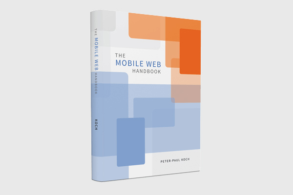
Peter-Paul Koch, famous for PPK on JavaScript, Quirksmode.org and more recently as a co-organiser of various Amsterdam-based web conferences just released his new book: the Mobile Web Handbook, published by Smashing Magazine.
 ! I have read the book on a recent train trip from Bristol to Brighton. It is 227 pages and beautifully illustrated.
Websites have been developed for more than one screen for a few years now. This inevitably followed from the rise of lots of different screen sizes. New phones, phablets, tablets, laptops and desktops with excellent and not so excellent browsers have come out and users simply started using those to visit our websites. As a response to the explosion of screen widths in our browser statistics, website owners could do nothing but adapt. Websites had to work on mobile.
Why we (still) need a handbook for mobile
By now, most of us have worked on websites made for lots of different screens. There are heaps of talks and articles out there to help. But development for mobile is complex, and untangling this complexity is important. The pixels, viewports and touch events that are discussed in the Mobile Web Handbook may be things we already use every day, but it is incredibly useful to see the concepts explained and annotated by someone with a lot of experience in testing browsers and mobile devices.
The book
The book starts with an introduction of the mobile world, which goes into things like market shares, OSes, stats (and how to interpret them) and strategies of device vendors, operators and browser makers. It gives a lot of useful background information, essential stuff to understanding the mobile world. More context of the mobile world is given throughout the book, for example in the chapter about (the politics of) Android.
After this first chapter the book goes into the more technical aspects of mobile development: from browsers and viewports to pseudo class selectors in CSS and touch/pointer events in JavaScript.
Towards the end of the book, a chapter is devoted to acquiring devices, with some useful hints as to which devices (not) to buy. This chapter, I found, is easier to read than to bring in practice. The argument for having real devices to test on is clear to me, but spending a hundred pounds every month on new devices would not work for me. As a freelancer, I prefer to use a combination of my own real devices, an Open Device Lab (like the Bristol ODL) and even emulators.
Last but not least, the last chapter is about the future of mobile web development, and contains various predictions on what to expect next.
Buy this book
If you’re not sure what the differences are between the visual viewport and the layout viewport, or between device pixels and CSS pixels, you have to read this book! The same goes if you would like to have better insight in the mobile landscape and the politics of (mobile-related) web standards. The ebook is available for direct download, and it seems that hard copies are going to be shipped sometime this month.
Comments, likes & shares
No webmentions about this post yet! (Or I've broken my implementation)