Last night I joined the ‘inclusive design and accessibility’ meetup (idea11y) at Level Level in Rotterdam, to learn more about optimising content and colors.
When I talk about accessibility, I often approach the subject from a front-end code perspective, and I make a point of disclaimering: this is only one of the many aspects to ensure the accessibility of a website. Content and colours are two other very important aspects that are essential to get right, so it was great to hear Damien Senger and Erik Kroes talk us through those subjects.
Content
Damien Senger, designer and accessibility advocate at Castor EDC, talked about cognitive impairments: ‘they are interesting, because they are often invisible’ (Damien’s slides). This is a great point, it also implies that these aspects are harder to catch in automated tests. Lighthouse can’t warn about them like it can about ill-formatted ARIA. Cognitive impairments we can optimise for include dyslexia, autistic spectrum disorder and ADHD. Users with such impairments benefit from less content, better organised content and more readable text.
Damien explained we read not by word but by ‘saccade’, jumping between parts. He also showed how shapes are important, and lack thereof bad for readibility, for instance all caps or justified text. These four C’s help, Damien said: continuity (repeat same information for reassurance), conspicuity (make it obvious), consistency (use same wording for same things) and clarity (ensure copy is understable).
Damien gave lots of tips for designing, on four levels:
- micro typography: too much contrast can make letters dance for dyslexics, so dark grey is preferred to black; breaking highlighting is bad at people use that to see where they are
- macro typography: think about heading hierarchy and group related things
- layout: ensure consistency of layout and always offer multiple ways to find content
- global: avoid distracting users with things like autoplaying videos; reduce content
Colour
Erik Kroes, accessibility specialist at ING, talked about colour, specifically what colour contrast means and how to create a for-screen colour palette for your brand that can be used with black and white accessibly.
Most people will know that colour contrast is important and use tools like Lea Verou’s awesome Contrast Ratio. For AA-level conformance, WCAG 2.1 prescribes contrast ratios of 3:1 (large text) and 4.5:1 (all text). These tools simply tell us whether our colours are within the range. Erik wanted to know more than just the numbers and had great feature requests (‘why do none of these tools show contrast with black and white at the same time?’).
Most of the talk was about creating colour schemes that lead to sufficient contrast ratios. Erik showed how HSL doesn’t really help when working out a contrastful scheme… to really get into finding colours with enough contrast, we need to look at ITU-R Recommendation BT.709, a standard from the 90s that describes colors for television screens that takes the human eye’s workings into account (‘useful luminence’, Erik called it). I had no idea, that this is what WCAG colour contrasts ultimately are based on. The reason this 30 year old standard is still somewhat suitable, is that screens still use sRGB and human eyes are still the same.
Erik explained that in WCAG 2.1, ratios range between 1:1 (zero contrast) and 21:1 (black on white). What I never realised, and am still unsure if I fully get how, is that when a colour has a ratio of 3:1 on a white background, it has a 7:1 ratio on a black background, because 21 divided by 7 equals 3. The maximum of 21 makes that the set of accessible colour combinations is limited.
To help with finding colour schemes that work well with black and white texts, Erik recommended the Contrast Grid tool. He also works on his own tool to meet his contrastful color needs, this looks very exciting (and is Web Components based).
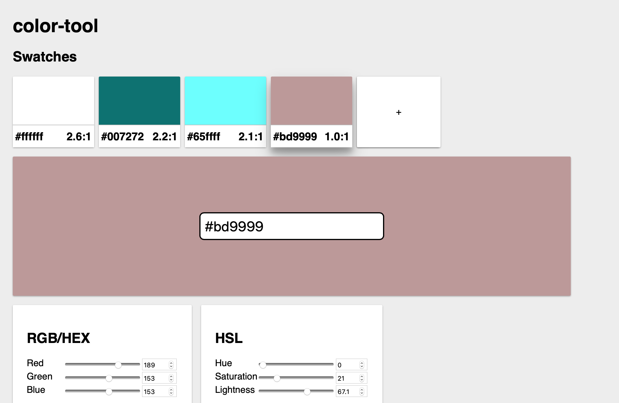 Erik’s tool
Wrapping up
This was a great evening, thanks to Job. Rumour has it that there will be another one next month, so I am looking forward to that!
Comments, likes & shares
No webmentions about this post yet! (Or I've broken my implementation)