Recreating old posters, I figured there are at least two approaches to deciding how many grid tracks your component or page needs: one can make it visually perfect, the other is more flexible if content is bound to change.
In the past 1.5 year or so I spread my excitement for flexbox and Grid Layout through workshops. An assignment I used in each one, is to recreate Wim Crouwel’s iconic “Hiroshima” poster using CSS. Poster recreation in CSS is an idea, of course, popularised by Jen Simmons and her awesome Experimental Layout Lab. She has lots of poster experiments on that site, check it out if you have not.
I like having a poster recreation exercise in the workshop, as it lets people learn CSS properties, without worry over maintainability or other concerns that come in mind when doing real-world CSS coding. It also lets the participants build graphic designs that are wildly different from most websites, think outside of the box (oh wait, CSS is ALL boxes, as Hui Jing Chen explains in her Box Alignment talk).
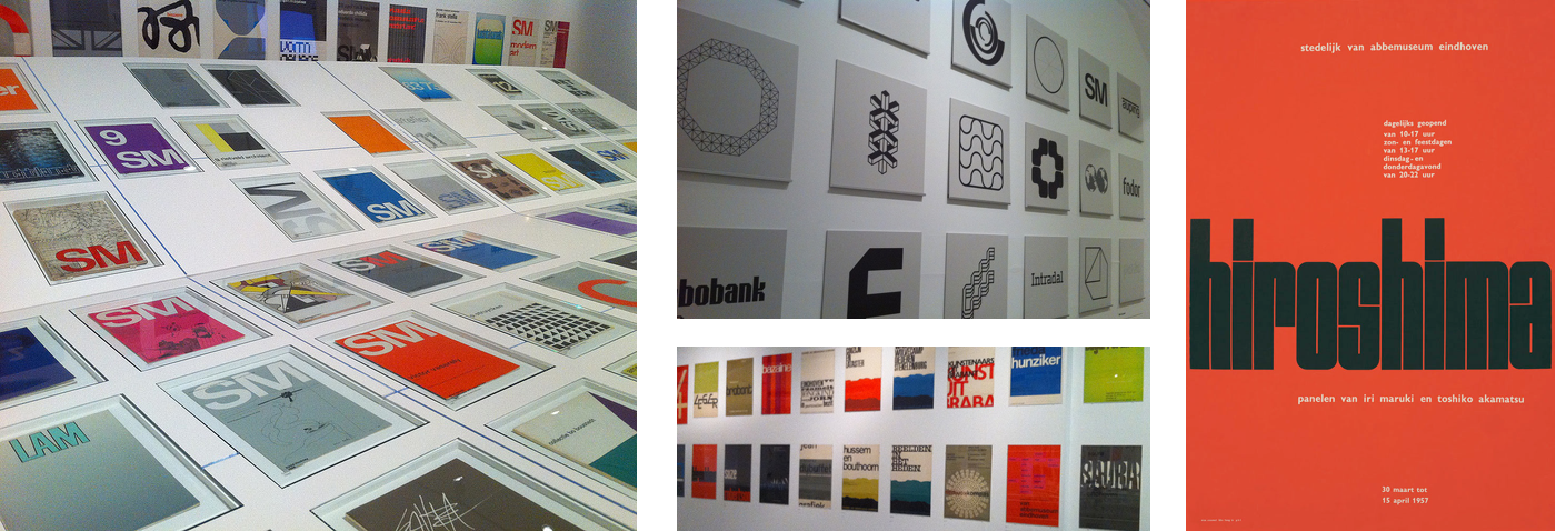 Photos from the exhibition about Crouwel’s work at the Design Museum in London (2010), photos by Ben Terrett. On the right: the original Hiroshima poster.
One poster I like to use is Wim Crouwel’s “Hiroshima” poster. Crouwel is one of The Netherlands’ most influential graphic designers. As co-founder and designer at the influential agency Total Design, he worked on large corporate house styles. He is best known though, for the posters he designed for Dutch museums, including the Stedelijk Museum in Amsterdam. The “Hiroshima” poster was made for an exhibition in the Van Abbe Museum in Eindhoven, The Netherlands. It’s not a complicated poster, sporting the name of the exhibition, a subtitle, location and the opening times.
The letters used for the word “Hiroshima” were manually designed by Crouwel. They have inspired various typefaces, including “Shima” by Nate Navasca, which closely resembles it, and UT Morph by Oscar Cobo.
Column choices
If you look closely, you’ll find that the opening times and exhibition duration align with the stem of the second letter ‘h’. The subtitle aligns with the letter ‘o’. Presumably, this is on purpose.
A column for each stem
One way to design the columns for this poster, is to define a column for each of the stem: 17 in total. The minimal space between the letters can be the grid’s column-gap. This leaves us closest to what we presume the poster maker intended.
We then need to decide one or more columns to each letter: one for the ‘i’ and three for the ‘m’, for instance.
A column for each letter
Another approach is to create a column for each letter, and let the columns be of auto width. They will then grow with the letters contained in them.
The content-based choice
We could also base our track choices on the four bits of content (title, subtitle, opening times, exhibition duration). This is a more functional approach, and less precise. The bits of content will likely not fully align with the letters of the word “Hiroshima”.
Ok, show me the code!
I’ve built examples with all three approaches: 4, 9 and 17 columns.
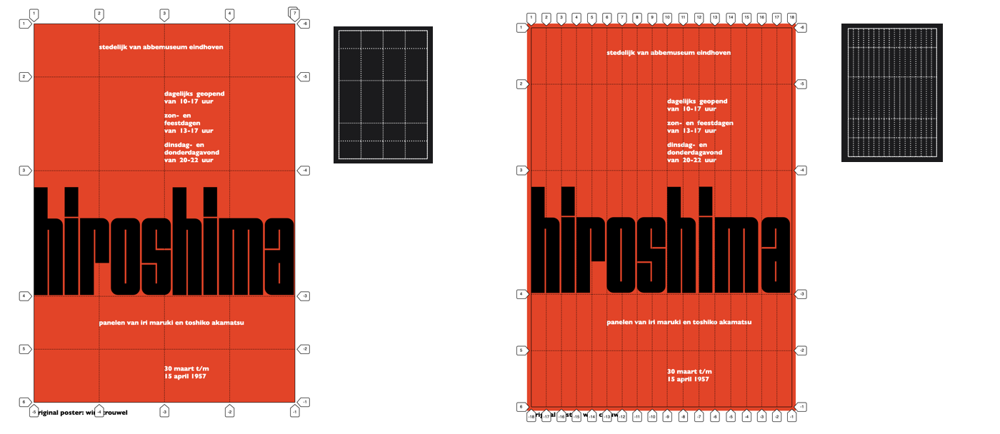 The two extremes: 4 columns and 17 columns, visualised using Firefox’s built-in Grid Inspector.
4 columns
The 4 column has least markup and classnames related to the function of the element in the whole. With just those four columns, it does the bare minimum. Dates and opening times don’t align with the letters they’re supposed to align with. But had someone decided to change the exhibition’s name, little harm would be done.
I approximated the size of the columns by making them all 1 part of the available space:
grid-template-columns: repeat( 4, 1fr );9 columns
My 9 column version, has each letter wrapped in a span. Only direct children of grid containers get to play in the grid game, but with display: contents on the <h1> , it gets skipped and its children become grid items. Warning: do not use display: contents in production just yet, as the heading will lose its accessible role in most browsers.
In this one, the columns are of auto size, so that they grow with their content:
grid-template-columns: repeat( 9, auto );Note that this works because the letters are the largest things in their respective tracks. If we had put anything larger in the same column, for instance in another row, that larger thing would have made the whole column larger.
Because of display: contents, the spans within the h1 became grid items. With no explicit placement, they get auto-placed in a column of their own, allowing for alignment of content with the actual letters. With that in place, I then told all spans to go to the correct row:
h1 span {
  grid-row: 3;
}
17 columns
In the 17 column version, I’ve wrapped each letter in a span with a classname. I did not need to space each letter individually, but I did have to address differences in how many columns a letter should span: the letters ‘i’ require one column, the letter ‘m’ requires three and all the others require 2. I did unique classnames for each letter, with the two h’s and i’s sharing one between them:
.hiroshima-r,
.hiroshima-o,
.hiroshima-s,
.hiroshima-h,
.hiroshima-a {
  grid-column: span 2;
  grid-row: 3;
}

.hiroshima-m {
  grid-column: span 3;
  grid-row: 3;
}

.hiroshima-i {
  grid-column: span 1;
  grid-row: 3;
}
Another, more abstract approach could be to have a span-1, span-2 and span-3 classname.
What’s better?
Thanks for reading this far in a post that is just about grid columns. Basically, my point is about two approaches: visual perfection versus functional pragmatism. I’ve seen both in real world CSS. Either can be effective. Neither of the two is better, everyone can grid however they like.
I would say visual perfection makes more sense in a promotional type of website, where the site was designed just for one purpose, maybe to communicate a one off event. A conference that you already know the name of. That sort of thing.
The functional approach is ideal when working with a CMS, where content can change, or there are multiple instances of the same design work. It’s more resilient to change.
Comments, likes & shares (1)