I have this web page to display the books I've read. Book covers often bring back memories and it's been great to scroll past them on my own page. It's also an opportunity to play around with book data. This week, I added a bit of page count-based visualisation for fun.
This is what it looks like: rectangles with colours based on book covers. Each relates to a specific book, and its size is based on that book's page count.

What's flex-grow?
Flex grow is part of the CSS's flex layout mode. When you add display: flex to a HTML element, it becomes a flex container, and with that, its direct children become flex items. Flex items behave differently from block or inline level children. The difference is that flex items can be layed out in a specific direction (horizontal or vertical) and sized flexibly. This system is called “flexible layout box model” or simply flexbox. It comes with sensible defaults as well as full control via a range of properties.
One of those properties is flex-grow. This is what it does:
[flex-grow] specifies the flex grow factor, which determines how much the flex item will grow relative to the rest of the flex items in the flex container when positive free space is distributed
(from: CSS Flexible Box Layout Module Level 1)
So let's say you have ten spans in div, where the div is a flex container and the spans flex items:
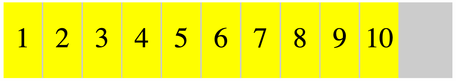
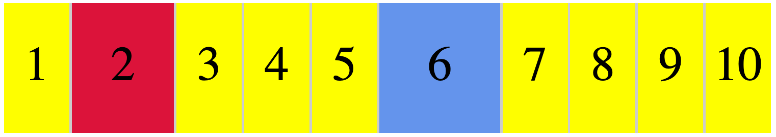
If you want one to proportionally take up double the space and another to take up triple the space, you'll give them a flex-grow value of 2 or 3, respectively:
/* item 2 */
span:nth-child(2) {
  flex-grow: 2; /* takes up double */
  background: crimson;
}

/* item 6 */
span:nth-child(6) {
  flex-grow: 3; /* takes up triple */
  background: cornflowerblue;
}
The others will then each take up one part of the remaining space (as if set to 1):
The specification recommends generally using flex instead of flex-grow. This shorthand can take three numbers: a flex-grow factor (how much should it be able to grow), flex-shrink factor (how much should it be able to shrink) and a flex-basis factor (what size should we start with before applying grow or shrink factors.
We can also give flex just one positive number, to use that number as flex-grow, and a default of “1” as flex-shrink and “0” as the basis (meaning no initial space is assigned, all of the size is a result from the grow or shrink factor). In our case, we'll use that flex shorthand, it's a sensible default.
Flex-grow for widths, aspect ratio for heights
My sites displays, like, 50 books for a given year. Each with a different amount of pages. Some are just over 100 pages, others are over 500. I wanted to use that number as the flex-grow factor. This means some books claim space of 113, others claim 514:
[a-113-page-book] {
  flex: 113;
}

[a-514-page-book] {
	flex: 514;
}
So that will claim 113 worth of space for the one book and 514 worth of space for the other. I used little magic for this, I just applied an inline style attribute to each book in my template (Nunjucks), setting flex dynamically. When they all have a number, they all take a proportion, and when all the numbers are similar amounts, you'll see that the size they take up is quite similar, except for a few outliers.

As mentioned above, these numbers represent a proportion of the total available space. You might wonder: which space? Flexbox can work in horizontal and vertical direction. Or, really, in inline and block direction, where inline is the direction in which inline elements appear (like em, strong) and block the direction in which block-level elements appear (eg paragraphs and headings).
Flexbox only takes space in one direction. For my illustration, I used the default, which is the inline direction or flex-flow: row (this is shorthand for a flex-direction: row and flex-wrap: nowrap). This means my flex-grow values are about a proportion of “inline” space, in my site's case, this means horizontal space.
I also want each book to take up some vertical space, as with only a width, we would not actually see anything. I could set a fixed height (in fact, I did that for the screenshot above). But in this case, I want the height to have a fixed relationship to the width. The aspect-ratio property in CSS is made for that: if an item has a size in one dimension, the browser figures out what the other dimension's size needs to be to meet a ratio you provide. In this case, the browser finds a height based on the width that it calculated for our proportion.
Ok, so let's add an aspect ratio:
.book {
  /* flex: [set for this book as inline style] */
  aspect-ratio: 1 / 4;
}
I also added a background-color that I have available in my template (it's a piece of image metadata that I get for free from Sanity).
Oh, but wait… they still have the same height! That's because by default, items are aligned to ”stretch”, they take up all available space in the opposite direction (block if items flow in inline direction, inline if items flow in block direction). When items stretch, remaining space is assigned back to them. In this case, that means they'll get the same height. Often super useful and quite hard to do pre-flexbox. But in this case, we don't want that, so we'll use align-items to set our items to align at the “end” (also can be set to “start”, “center” and “baseline”):
 What the books looks like for different values of align-items
In my case, I also added a max-width to avoid extreme outliers and I addded opposite rotate transforms to even and odd items for funs:
.book {
  transform: rotate(-2deg);
}
.book:nth-child(odd) {
  transform: rotate(2deg);
}
This works with grids too
When I shared this, Vasilis rightly noted you could pull the same trick with grids. If you add display: grid to an element it becomes a grid container and its children grid items. That sounds a lot like flexbox, but the main difference is that sizing isn't done from the items, it is done from the container. For a grid, you define columns (and/or rows) that have a size. The fr is one of the units you can use for this, it's short for “fraction”. Pretty much like proportions in flexbox, fr will let you set column/row size that is a proportion of the available space. If you set all your columns with fr, each one will be a proportion of all available space in the relevant direction.
Summing up
I usually use flexbox with much lower numbers, often under 10. But it turns out, it works fine with larger numbers, too. I have not done extensive performance testing with this though, there may be issues if used for larger sites with more complex data.
Comments, likes & shares (25)
Noah Gentile, llatan@mastodon.cloud, Leire Díez, Maarten Hus, Anuradha Kumari, Joe Lanman, Tyler Sticka, Bernard Nijenhuis, Michelle Barker, Dave Rupert, Evan, Sebastiaan Andeweg and Danny van Kooten liked this
JJ, Hidde, Tyler Sticka, Michelle Barker and Lene Saile reposted this
@hdv This is lovely!
@michelle thank youu!
@hdv Loved this! Incredibly clever and cool
Ik ben dus mijn RSS-reader aan het uitmesten en daarbij leerde ik een paar dingetjes over HTML en CSS die ik kon niet wist of kende.
Bijvoorbeeld dat je dus een uitklapbare boomstructuur kan maken met alleen maar HTML en CSS, dus zonder Javascript, door gebruik te maken van
<ul>en<li>, met daarin<details>en<summary>. Vooral die laatste twee elementen kende ik niet, weer wat geleerd.In CSS-land zijn ze kennelijk ook bezig met een nieuwe manier van kleuren uitdrukken, genaamd LCH of
oklch. Wiergbofcmykgebruikt, specificeert zelf hoeveel licht of inkt er moet worden gebruikt om de kleur te maken. In feite is dat een hele imperatieve manier van een kleur beschrijven. Een meer declaratieve manier ishsl, waarbij je je kleur beschrijft in termen van tint, verzadiging en helderheid. Deze methode heeft echter nog steeds een directe vertaling naarrgben is dus een 'leaky abstraction'. Delchis een abstractie die rekening houdt met welke kleuren wij als mensen kunnen waarnemen, en maakt berekeningen met kleuren ('deze kleur maar dan iets donkerder') veel makkelijker.Verder kwam Hidde met een leuke manier om flexbox te gebruiken voor data-visualisatie.