Yesterday I spent all day in a cinema full of design system nerds. Why? To attend Patterns Day 3. Eight speakers shared their knowledge: some zoomed out to see the bigger picture, others zoomed in on the nitty-gritty.
It was nice to be at another Patterns Day, after I attended the first and missed the second. Thanks Clearleft and especially Jeremy Keith for putting it together. In this post, I'll share my takeaways from the talks, in four themes: the design system practice, accessibility, the technical nitty-gritty, and communication.
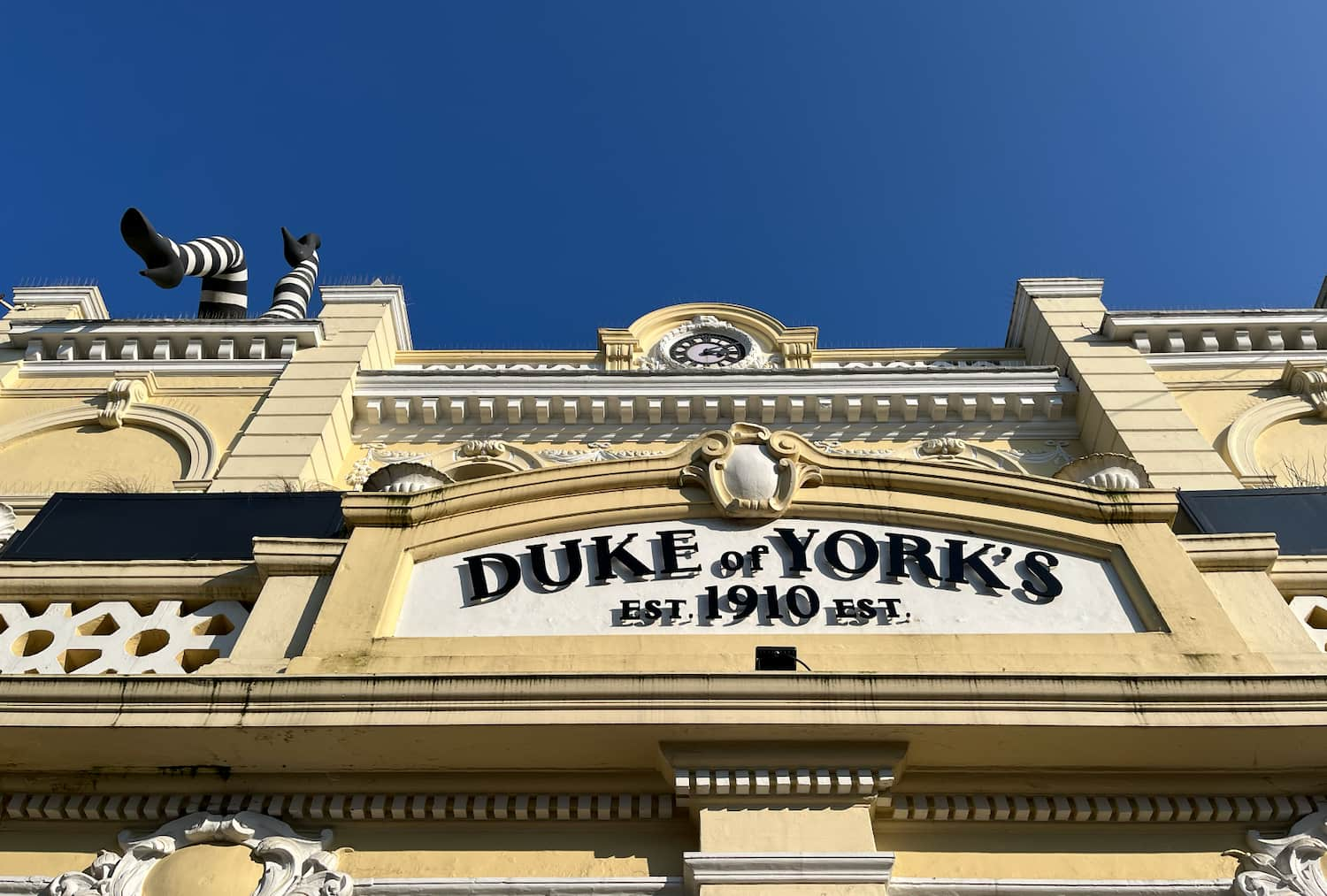 The day's venue: the Duke of York's cinema
The design system practice
Design system veteran Jina Anne, inventor of design tokens, opened the day with a reflection on over a decade of design systems (“how many times can I design a button in my career?”) and a look at the future. She proposed we find a balance between standardisation and what she called “intelligent personalisation”.
On the other hand, we aren't really done yet. There are so many complex UX patterns that can be solved more elegantly, as Vitaly Friedman showed. His hobbies include browsing postal office, governmental and e-commerce websites. He looks at the UIs they invent (so that we don't have to). Vitaly showed us more breadcrumbs than was necessary, including some that, interestingly, have feature-parity with meganavs.
Yolijn van der Kolk, product manager (and my colleague) at NL Design System, presented a unique way of approaching the design system practice: the “relay model”. It assigns four statuses to components and guidelines, which change over time on their road to standardisation. It allows innovation and collaboration from teams with wildly different needs in wildly different organisations. The statuses go from sharing a need (“Help Wanted”), to materialising it with a common architecture and guidelines (“Community”), to proposing it for real-life feedback (“Candidate”), to ultimately standardising an uncontroversial and well-tested version of it (”Hall of Fame”).
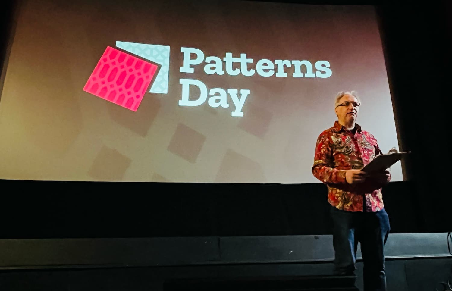 Jeremy Keith hosted the event
The technical nitty gritty
Two talks focused on design problems that can be solved with clever technical solutions: theming (through design tokens) and typography (through modular scales with modern CSS).
Débora Ornellas, who worked at Lego (haven't we all used the analogy?), shared a number of great recommendations around using design tokens: to use readily available open source products instead of inventing your own, publish tokens as packages and version them and avoid migration fatigue by reducing breaking changes.
Richard Rutter of Clearleft introduced us to typographic scales, which, he explained, are like musical scales. I liked how, after he talked about jazz for a bit, the venue played jazz in the break after his talk. He showed that contrast (eg in size) between elements is essential for good typography: it helps readers understand information hierarchy. How much depends on various factors, like screen size, but to avoid having to maintain many different scales, he proposed a typographic scale that avoids breakpoints, by using modern CSS features like clamp() (or a CSS locks based alternative if you don't want to risk failing WCAG 1.4.4). I suggest checking out Utopia to see both strategies in action.
Accessibility, magic and the design system
The power of design systems is that they can make it easier to repeat good things, such as well-engineered components. And they can repeat accessibility, but there is a lot of nuance, because that won't work magically.
Geri Reid (seriously, more conference organisers should invite Geri!) warned us about the notion that a design system will “fix” the accessibility of whichever system consumes it. Sounds like magic, and too good to be true? Yup, because what will inevitably happen, Geri explained, is that teams start using the “accessible” components to make inaccessible things. Yup, I have definitely seen this over and over.
To mitigate this risk of “wrong usage”, she explained, we need design systems to not just deliver components, but set standards and do education, too. At which point the design system can actually help build more accessible sites. For instance, if components contain ARIA, it's essential that the consumers of those components know how to configure that ARIA. In other words, design systems need very good documentation. Which brings me to the last theme: common understanding and why it matters.
Mitigating misunderstandings with better communication
The theme that stood out to me on the day: design system teams commonly have to deal with misunderstandings. Good communication is important. What a cliché, you might say, that's like anyone in any job. Yes, but it's specifically true for our field: design systems force collaboration between such a broad range of people. That includes similar-discipline-collaboration, like between designer and developer. Débora explained what can happen if they don't work together closely, or if breaking changes aren't communicated timely.
But it's also about wider collaboration: a design system team also needs to make sense to other departments, that have specific requirements and norms. Including those that don't really grasp all the technical details of front-end componentisation, like marketing or (non-web) brand teams, or the people who can help sponsor or promote the project. Samantha Fanning from UCL focused on this in her talk on “design system buy-in”, which she had a lot of useful tips about. She recommended to involve other departments early to do “co-design” rather than presenting (and surprising) them with a finished product. She also shared how it helped her to add design system work as extra scope onto existing projects, rather than setting up a design system specific project.
In her talk, Mary Goldservant of the Financial Times, also touched on the importance of communication. She shared how they got feedback from stakeholders and manage expectations, while working on a large update to Origami, the Financial Times' brilliantly named design system, that includes lots of changes, like multi-brand and multi-platform support.
Wrapping up
It was nice to hang out with so many like-minded folks and learn from them. A lot of the challenges, tools and ideas resonated. Once again, I've realised our problems aren't unique and many of us are in similar struggles, just in slightly different ways.
Comments, likes & shares (6)
Christian "Schepp" Schaefer, Mike-麥-Mai-v1.618 ????, Daniel Göransson and Sonja Weckenmann liked this
Mike-麥-Mai-v1.618 ???? reposted this