This week I visited the 6th From the Front conference in Bologna, which this year was themed The Frontend Guide to Life, The Universe and Everything. It was my second time at the conference, having visited their first in 2012. Great to be back!
Below I share with you my takeaways from two days of From the Front. I have written a summary of each talk, occasionally mixed with personal opinion.
 The Frontend Guide to Life, The Universe and Everything
We can develop personally to deal with the enormous amount of change in the 2016 web
Lyza Danger Gardner talked about overchoice, ‘the idea of an overload of choice’. Having worked on the web since the nineties, she already worked on the web when tables were commonly used for layout and CSS was a novelty. Browsers improved very slowly. The complete opposite is now true: browsers take feedback very seriously. New features get added very quickly into the browsers that people use. This also means there is a lot to learn. When Lyza spent 6 weeks in the woods, six weeks without working on web stuff at all, she felt she had to relearn the trade. And this is from someone who has worked on the web for a very long time.
Having the feeling that everyone else is smarter or that it is all just too much and you want to quit the trade altogether, can make individual developers unhappy. “We really want change, yet change is killing us, too”, Lyza said. She explained how she made some personal choices in order to take back responsibility for her own happiness.
Its built-in robustness makes the web great for progressive enhancement
Jeremy Keith shared with us a story of how the web was invented. Its main virtue, he explained, is that it is deliberately dumb: it provides simple mechanisms to transmit packages (TCP/IP), mark up documents (HTML) and declare what they look like (CSS). Beyond these mechanisms, the web does not care. It does not care what you name things, or what protocols you build on top of it. Super powerful, right from the start. It is also designed to be robust; browsers will not throw errors if you forget to close your HTML element or use a CSS property that they do not recognise. Instead, they will parse what they can parse. JavaScript is a bit different, as it will throw errors when you make a syntax error. This difference lets us divide front-end tech in two categories: the resilient and declarative (HTML, CSS) and the fragile and imperative (JavaScript).
Jeremy noted some websites now rely on JavaScript, which is fragile, to display content. He then made a strong argument for progressive enhancement. His strategy is to (1) identify core functionality, (2) build this with the simplest tech and (3) enhance. If you get (1) and (2) right, you can go crazy in step (3) and use tech that does not necessarily have broad browser support, without witholding core functionality from people. Service Workers, WebGL, push notifications, anything! This approach can take more time if you are not used to it, but it is definitely possible, even on large scale corporate websites (some might say they would benefit the most).
We can make non-default things in HTML accessible to more users with ARIA, keyboard support and focus management
Léonie Watson explained how to make our web applications more accessible (slides). The important part is that everything in our web application exposes three things: their accessible name, their role and the state they are in. This is easy for things that already exist in the web platform, like links, buttons and form elements. Browsers already know their names, roles and states. In other words, default HTML elements are already accessible out of of the box.
It gets more complex when we want to use things that don’t exist as such. Tabs, for example. Léonie showed us how to mark up tab links and tab panels in a way that is most usable for users of assistive technologies, and explained how ARIA attributes can help here. She also showed how to build in keyboard support and manage focus.
With radio buttons and checkboxes we can use logic to make HTML emails more interactive
Mark Robbins is an expert in interactive email HTML. He showed some perplexing techniques for making emails interactive. The trick: making extensive use of the ‘states’ that can be styled with CSS. Things like :hover, :active and :focus, but also :checked (a lot of that). By including a number of radio buttons / checkboxes (and nested labels for them), the document can have logic that can be targeted from CSS. For more advanced logic, a ‘punched card’ can be coded in radio buttons and allow for even more complex hiding and showing.
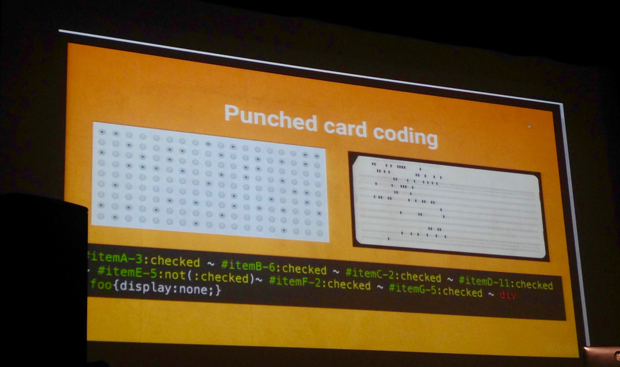
Using the above, Mark created galleries, interactive games, live shopping cards that can even update prices (using CSS counters), form validation, analytics that work by fetching background images based on :checked states and 3D views of products utilising CSS animations on 3D transforms. At the end of his talk, Mark revealed that even his slide deck was built as an HTML email: he had been presenting everything from Apple Mail. Mind. Blown. While Mark was talking I wondered about the accessibility of it all, and later I found his company has posted Accessibility in email and Accessibility in email part II.
All problems can be solved with CSS
Sara Soueidan showed us some of the work she had been doing on the upcoming redesign of Smashing Magazine. First, she talked about SVG and when to use or avoid it. She said that ‘not only should the image be a good candidate for SVG, the SVG should also be a good candidate for the image’: too many shadows/gradients/paths might mean a large file size and make an image less suitable for SVG (and more suitable for PNG). She also talked about scalable type: type can scale with the viewport when using vw/vh units, but then the need for minimum and maximum font sizes arises (font-size: calc(16px + 3vw can help here; 16px will work as your minimum size).
Some absolute highlights of Sara’s talk:
- she showed how a seemingly impossible article layout could be done with CSS
- she explained how she made whole blocks with links in them clickable while retaining the focus order she intended
- she talked us through building custom ordered lists with CSS counters
- she showed a method to do better underlines using text-shadow in the same colour as the background-colour.
This talk once more showed how incredibly flexible CSS is if used by smart people: everything is possible.
We should regularly reflect and listen to our gut feeling
Conference organiser Marc Thiele talked about the changes he had made in his life, recently and less recently, and the events in his life that triggered those changes. They lead to many good things, including his first Flashforum conferences years ago, and his current Düsseldorf/Berlin based conferences about the web in general. He explained that it is important to make time to reflect on the past and encourages the audience not to be afraid to make changes.
Apprenticeships can be a great thing for the web
Dan Mall ended the first day with a talk that strongly encouraged us to start an apprenticeship program within our companies. He shared his experiences with doing so in his own company. Apprenticeships encourage the best form of learning, he emphasised. They don’t just teach things you can learn in a school, they also teach people how to be a professional, act with customers and sell their services. They can decrease the gap between the best of our industry and people who have an interest in joining our industry. To take an apprentice does not have to be expensive or time consuming, Dan’s personal experience showed. Averages from 10 apprenticeships his company hosted, show a cost of about $7000 and a time investment of about 36 hours per apprentice (over a period of 9 months).
We can improve perceived performance by reducing passive phase waiting time
In his talk about the psychology of performance, Denys Mishunov said research showed that people who have to wait too long for specific things on your site, may end up disliking your entire brand for it. Reducing this waiting time and improving performance is not just about numbers, it is about experience as well. Denys discussed two phases in waiting, which he referred to as the active phase and the passive phase. Active waiting is waiting while your brain is still busy with other stuff, passive waiting is just waiting. A wait with an idle brain is perceived as a longer wait. Naturally, active waiting is a lot less frustrating, so a way to improve perceived performance is to make the passive phase shorter (even if that makes the active phase longer). In code, Denys explained, this can be done by taking advantage of resource hints (dns-prefetch, preconnect, prefetch, prerender and preload). In interaction design, it can be done by letting people do stuff while they wait, for example adding meta info to a photo that’s currently uploading.
Serving over HTTP/2 may the best thing you can do now to increase your site’s performance
Patrick Hamann explained to us why it would make sense from a performance point of view to start serving your websites over HTTP/2, given that we have already done other performance optimisations. Slow websites are often slow because of latency, and HTTP/2 fixes a large part of that. The major inefficiency of HTTP/1.1 is ‘head of line blocking’. HTTP/2 fixes this with its ‘multiplexing’ approach: bits of data that are called ‘streams’, of which multiple can go over one (!) TCP connection. A stream carries messages that are made up of frames, like its header and its actual data. Frames are binary, as opposed to data sent as plain text in HTTP/1.1. The advantage of that is that they can interleave, the disadvantage is that they are no longer human-readable. Streams can also have weights attached to them, and with HPACK their headers can be stored in referencable IDs so that they don’t need to be endlessly repeated. Special PUSH_PROMISE can inform the browser about resources it is going to send, saving requests.
To start using HTTP/2 you need HTTPS (Let’s Encrypt helps here) and a server that can handle HTTP/2 (many servers can now) and use its features. If you use CDNs, you also need to make sure they can do HTTP/2. Support is really getting there, and that means HTTP/2 is pretty much ready for adoption.
Voice User Interfaces are coming
Ben Sauer talked about user interfaces that are controlled by voice (VUI). Systems like Amazon Echo, Apple’s Siri and Microsoft’s Cortana. These companies are currently all heavily investing in voice technology and computers that are all around you all the time (‘ubiquitous computing’). They are also trying to normalise voice interactions, by showing their tech in social contexts, making it a lot less weird to be talking to your computer. With voice interfaces, Ben explained, apps will become more plain, or possibly invisible. The brand will likely be less invisible, too: if you ask your voice-based assistent what the name of a song is, you won’t go into a branded app interface, and you don’t need to know it uses the Shazam brand for it.
VUI still needs a lot of work, as it is not so good at large amounts of input, dealing with natural breaks in speech and working out fuzzier tasks. And then there is privacy, a huge issue in my opinion: a lot of VUI requires a microphone to be always listening (and this would be great for your ex or the police to listen in, too).
Your design system will thrive when you group modules by function and get their naming right
Alla Kholmatova did not try to convince us to come up with design systems for our sites, as every site already has one (paraphrasing her). A lot of her talk was about how to make it work better, through documentation and cross discipline collaboration. Integral to Alla’s approach is separation by function (not form): you try to figure out which things on your site have the same functional role, and group those together. Naming is incredibly important when working on the design of a site as a team: once something has a name and can be found under that name in a pattern library, it becomes a thing, it ‘comes into existence’ .
Alla shared five tips with us:
- Give your modules names that relate to the system, not to a specific page. Functional names (related to what something does) usually work better.
- You’ll likely have some modules that are generic and others that are specific. Let their naming reflect this. It’s okay if a specific thing is at some point changed to be a generic thing or vice versa.
- Name things collaboratively and make a point of always referring to the things by the names you’ve given them. This takes effort, but it is very helpful.
- Use names with personality, as they tend to stick better. You can use metaphors borrowed from other industries, or even from films. If names are not remembered by team members, you risk duplicate modules being created. Good names inspire other names, Alla said, and before you know it a family of names starts to grow.
- If it’s hard to come up with a name for a module, this may be a sign that there’s something not right about the module, you may need to go back to the drawing board.
Another interesting thing Alla shared is that at Future Learn, spacing in modules is part of their design system. They distinguish between types of modules: spacious, regular and ‘cosy’.
Finally, Alla recommended reading How to make sense of any mess by Abby Covert, and looking at the Visual Loudness Scale that Tom Osborne wrote about.
CSS Modules is a JS powered CSS pipeline that addresses concerns with the CSS language
Hugo Giraudel explained what CSS Modules are: a JS powered CSS pipeline that gives CSS namespacing, amongst other things. “CSS is broken”, Hugo said, because it has a global namespace, does not come with dependency management and has no mechanism to share configurations. CSS Modules lets you have all three, and can be plugged into various JS pipelines. Definitely a fascinating concept! It’s easiest to set up with Webpack, but can be used in Browserify or even Gulp. Hugo made a solid case for CSS Modules, however I personally strongly disagree with his premise: that CSS is broken and needs fixing. I admit CSS does not check all boxes that programming languages do, but I think that is because CSS is not a programming language (probably something for another blogpost).
Visual regression testing is most helpful when used on isolated components
Varya Stepanova showed us her approach to visual regression testing, the process of keeping track of visual differences between versions of your application. Instead of automatically testing whole pages, Varya said it is a lot more helpful to test isolated components. She demoed the Gulp plugin she built to do isolated visual regression testing. It uses PhantomJS to take screenshots (see on GitHub). Varya also explained the business value of having a component library with automated visual regression tests on each component: it makes the UI more stable and ultimately lets teams work faster.
If we want to do the good thing, we need to design features on websites with empathy
The last talk of day 2 was by Beth Dean. She shared her fascinating employment history with us, and explained how all these different things she did made her realise the importance of considering emotions in web design. “A lot of people live in a world that is not designed for them”, she said. Ill-considered design choices can give individual users of your site a terrible experience, for example when you send Mother’s Day marketing to someone who’s mother recently passed away. Part of the solution to this problem is to ensure that design teams are very diverse (in age, gender, ethnicity, etc). In addition, it is important for designers to be aware of any privilege they may have, and to have an attitude of empathy towards users.
Comments, likes & shares
No webmentions about this post yet! (Or I've broken my implementation)