Web platform concepts can sometimes be quite different, yet seem very similar. Semantics, behaviours and characteristics can be tricky to distinguish. In addition to the <dialog> element, HTML now has a popover attribute. This post goes into the differences between dialogs, popovers, overlays and disclosure widgets. We'll also look at what it means when an element is modal. All somewhat related concepts that can seem very similar. At least they did to me. Let's dive in!
(If this is too long, I did a 40 minute talk version at All Day Hey and a 7 minute version at JS Nation (don't believe the ‘AI’ summary on that page))
In this post
- Introduction
- The characteristics (modality, light vs explicit dismiss, top layer presence, backdrop, constrained focus, keyboard dismissable/collapsible)
- The main patterns (dialogs, popovers, overlays, disclosure widgets)
- FAQ
- Summing up
popover is available:
- Chrome (116) and Edge (115)
- Safari (17)
- Firefox (125)
You can use it in production (there is popover polyfill), but be sure to test it well, it is new and there may be issues with support, including accessibility support.
Introduction
The thing with words is that not everyone uses them the same everywhere. The words in this post are no different. As a long time contractor I changed environments on the regular—phrases changed when I worked in different teams, companies, countries and even years (see also older resources, like the WHATWG wiki on dialogs). Meanings change over time, also in the world in general… this is normal! But in the case of these components, interpretation differences can lead to bad user experience.

A lot of the concepts I'll discuss in this post originated in operating systems: see Apple's Human Interface Guidelines, Microsoft's “Win32” guidelines (old) and Controls for Windows apps (newer). If we compare those with patterns in ARIA Authoring Practices Guide, we'll find similarities. Some similarities are on the surface, they just look the same. Others are similar for users of assistive technologies: the ergonomics of some ARIA components are designed to be similar to the corresponding operating system ergonomics, for better or for worse.
But OS-level guidelines or ARIA Authoring Practices (APG) aren't the best place for web developers to look for implementation guidance. OS-level guidelines are for OS-es, APG is to demo how to use ARIA (not how well it is supported).
For clarity, throughout this post, I will refer to the concepts of dialog, modality and popovers as they exist on the web, in languages like HTML, CSS and ARIA (note: popovers don't exist yet, just as a proposal). My definitions are meant to align with the relevant web specifications, they may be slightly different from what is used in other places and in individual teams.
Below, we'll start with characteristics that components can have, like modality, light dismiss, top layer presence and backdrops. Then we'll talk about what we get when these characteristics are used together in a website or web app: dialogs, popovers, overlays and disclosures. Hopefully, when we discuss the characteristics in detail first, it is easier to distinguish the components themselves.
The characteristics
Modality / inertness
Some design systems have a component named “modal”, but modality is more of a characteristic than a component itself.
So what does it mean for an element to be modal? Basically, when a modal component is open, it is the only thing that is not inert. Only the modal content can be interacted with, the rest of the page or application is made inert. Inert content is content that users cannot interact with. It is only really there visually, but you cannot Tab to it, click it, scroll it or access the content via assistive technologies.
Elements that are not modal are called non-modal or modeless.
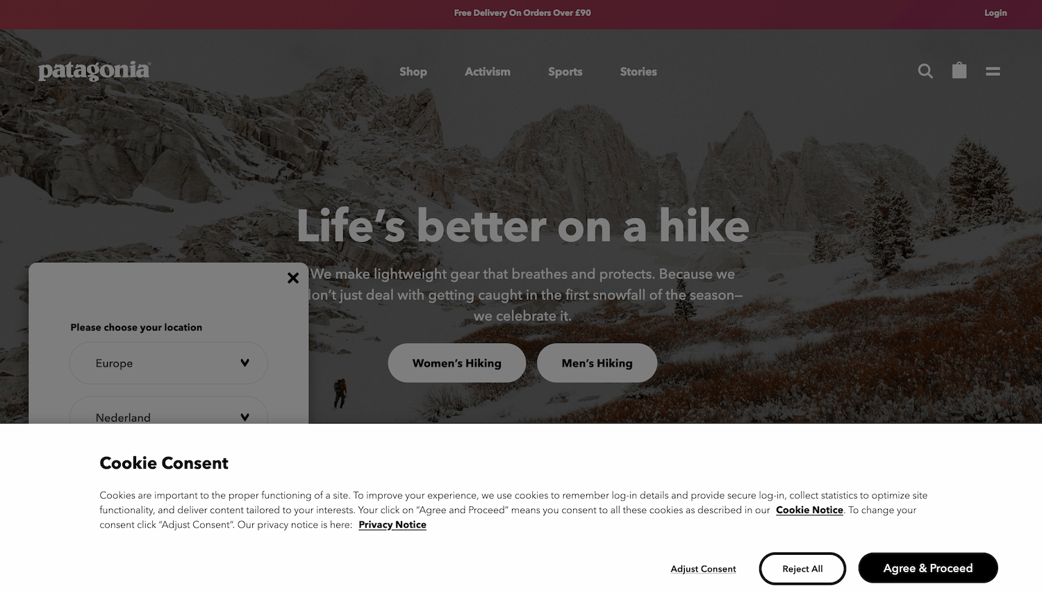 In this example, the dimmed background suggests a choice between accepting and refusing cookies has to be made before any other interaction can happen. (Note: on actual website, scrolling the background still works, it shouldn't)
Not everyone likes modality—as a UI concept, they are very disruptive. Use the pattern sparsely, only when disrupting is very much necessary. If you want to ask the user “Are you sure you want to delete all that?”, go ahead and make it disruptive. If you want to promote your newsletter sign-up or advertising, the disruption is unlikely to be appreciated.
In terms of implementation, you will need to make everything except your modal element inert. The <dialog> element (used with showModal()) does this for and would be the best to use.
If you cannot use <dialog> or are looking at an older code base that doesn't, here's an example of distinguishing between modal and inert content:
<body>
  <div class="modal" role="dialog">
    <!-- modal content -->
  </div>
  <div class="everything-else" inert>
    <!-- everything else -->
  </div>
</body>
The gist of it is that one element is modal and everything else inert: unavailable to any user or technology. As today, not all users will be on a browser that supports inert, best use the inert polyfill. Without inert or its polyfill, you would need to add aria-hidden="true" to the content outside of the modal (to make it unavailable for assistive technologies) and tabindex="-1" to any interactive elements that are not in the modal.
Just trapping focus in an element or adding a backdrop does not make it truly modal. With a focus trap, you only make the rest of the content unavailable via a keyboard. With a backdrop, you only make it unavailable visually.
Light vs explicit dismiss
Another aspect to consider is how users dismiss a component and whether that is affected by other elements: this can be via explicit dismiss or light dismiss.
With ‘explicit dismiss’, a component allows a user to dismiss it, for instance via a close button and the Escape key (when in doubt, best add both).
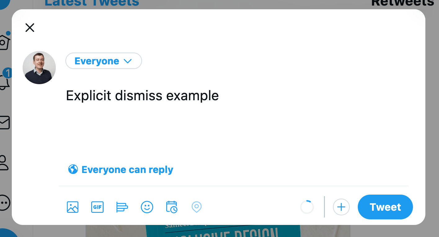 Explicit dismiss: if I don't want to send this tweet, I can press the close button or Escape to dismiss the dialog I'm presented with
With ‘light dismiss’, a component disappears automatically on certain conditions, like when users scroll, interact with something else or click outside of the component. Light dismiss doesn't happen when the user Tabs out of the element by default (but developers can add it if needed, see the discussion in openui/open-ui#415 for more details).
 Light dismiss: if the font picker is open and I click in the text that I'm editing, the font picker will close automatically
Light dismiss is something we can already build in JavaScript today, a lot of websites have components that light dismiss. But with the popover attribute, the browser would do it for you (if you use popover="auto").
Top layer presence
By default, if multiple elements are positioned in the same location, they are painted by the browser in DOM order. The element that is first in the DOM is painted first, each subsequent element on top of the previous and the last one in the DOM is painted last, at the top. With the z-index property in CSS you can deviate from the default on a case by case basis. You basically decide your own layer order. This feature is defined in an appendix to CSS 2.1 called the Elaborate description of Stacking Contexts.
The top layer (as of July 2023, part of CSS's Positioned Layout Module, Level 4) is painted after the painting process described above, and the stuff within it is therefore on top of everything else. The top layer is not new in the web platform, but the ability for developers to promote elements to it is. Web pages have just one top layer. Within the top layer, elements are painted in the order they are added to the top layer (so shuffling them around involves adding/readding them).
Sometimes, developers add components just before the closing </body> tag to try and ensure that they are painted above other things (given nothing has a z-index > 0). The top layer introduces a new way to allow elements to be on top of everything else, regardless of where they are in the DOM or their z-index.
Another benefit of the top layer has to do with overflow. If your popup is in an element with overflow: hidden, that will cut it off. If it is promoted to the top layer, no cutting off will take place.
A downside of an element being in the top layer, is that it can't be positioned relative to things in the main document. I believe this is something modal dialogs usually don't need, but popovers would need a lot of the time. See also: Positioning anchored popovers.
Backdrop
In some cases, it makes sense for elements to have a backdrop. A backdrop usually serves as a visual cue that conveys content behind it is unavailable for interactions. Sometimes, it can be used as a way to help the user focus.
The ::backdrop pseudo element can be applied to top layer elements. It allows you to style the backdrop in any way you want.
Constrained focus
Sometimes focus is constrained to (or trapped in) a specific element, meaning that if focus is in this element and you press Tab or Shift + Tab, you will never go to elements outside of the element. This characteristic is also known as a “keyboard focus trap”. It is a side-effect of making everything else inert (which <dialog> does for you). (Note: trapping focus in an element does not make that element modal, but if it is truly modal, focus cannot be moved outside of it, because nothing outside of it is focusable).
Focus traps should be temporary until the element it applies to is closed or dismissed (they would fail WCAG 2.1.2 if it is not temporary and has no way to escape with a keyboard).
Keyboard dismissable/collapsible
If content can be dismissed or collapsed, users should also be able to dismiss or collapse it with just a keyboard.
When content can be dismissed, a common pattern is that pressing the Escape key dismisses the content. Usually dismissal is restricted to happen only when the user is focused on something inside of the component to close. If there are multiple things to close, like with nested components, you would press Escape multiple times and closing would happen component by component from most inner to most outer element.
When content can be collapsed, keyboard users should be able to use the same button that mouse users click to collapse content.
The main patterns
Let's look at some common patterns and how to distinguish between them.
Dialogs
What is it
A dialog is a component in a web page or app that usually contains an action or some task to perform (see: <dialog> in HTML specification). It is usually not part of the natural flow of other content, for that reason it can (and usually does) cover other content. MDN describes it as a “subwindow”, ARIA Authoring Practices defines it as a “window overlaid on either the primary window or another dialog window”.
A dialog is often displayed when users need to be made aware of something or when they need to choose. Do you want to continue, yes or no? If you want to open a new file, what shall we do with your current file, save or delete? How do you want to crop this image, where is the hot spot?
 Browser dialogs /
 confirm()
Canonically, dialogs are a lot like window.confirm(), window.alert() and window.prompt(), which the HTML specification lists under ‘simple dialogs’. But unlike these browser built-in dialogs, custom dialogs offer more flexibility—you get to put whichever content and styling you want inside of them.
Dialogs have a role of dialog, which the browser will assign automatically for you when you use the <dialog> element.
You can also create dialogs with ARIA: apply role="dialog" to an element (like <div>). If it is a modal dialog, add aria-modal="true" when it shows, and remove it when it is dismissed. You will need to do all the modality work yourself (focus trap, making rest of content inert, etc). Note: aria-modal is not supported in IE11 (which may still be in use among your assistive technology users), there are issues with aria-modal in VoiceOver and it seems unsupported in Narrator.
You can put a form with method="dialog" in a dialog. This form will close its dialog when submitted.
Examples
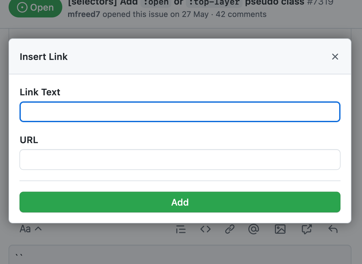 Modal dialog: add a link; nothing behind it can be interacted with while this modal dialog is open.
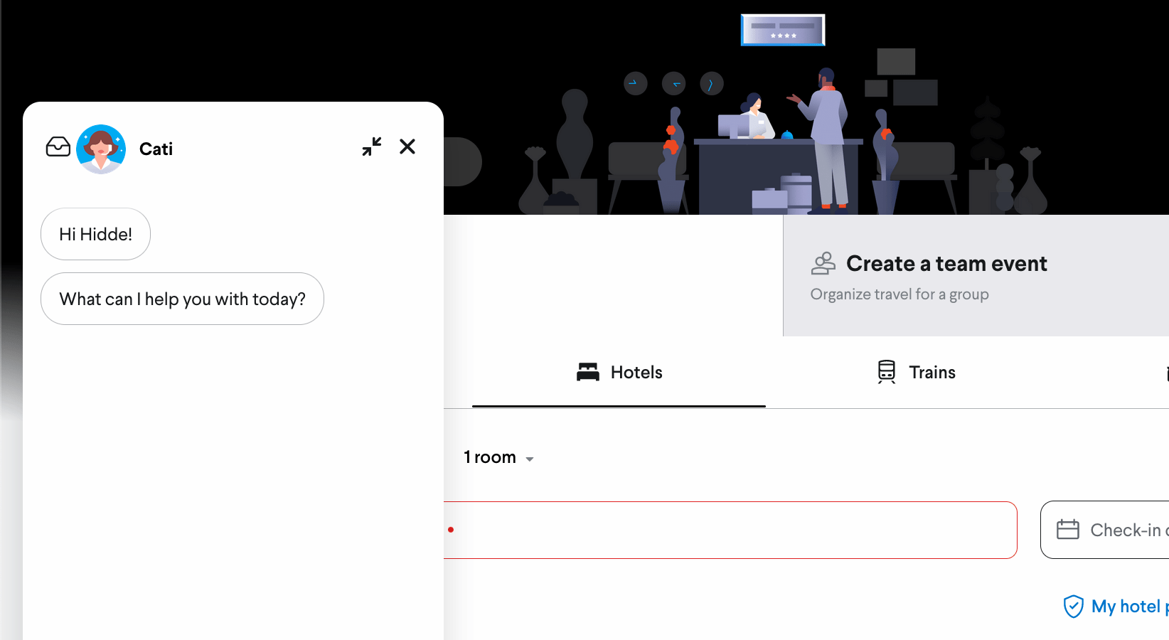 Non modal dialog: while this chat widget is open, I can still access the forms and content underneath.
Characteristics
Dialogs can be modal (<dialog> when shown with dialog.showModal()) or non modal (<dialog> when shown with dialog.show()). To avoid quirks, you will want to choose which of the two your dialog is, and only call one of these methods per dialog.
When <dialog>s are modal, the browser will treat the content outside of the dialog as inert, and prevent keyboard focus from reaching web content outside of the dialog (if you use role="dialog", you have to do this yourself). If a <dialog> is not modal, the other content is not treated as inert. This makes modal dialogs a lot more disruptive, so use them only when you have to. You usually don't want to interrupt or disrupt a user's flow.
Dialogs are in the top layer only if they are modal (and only if the <dialog> element is used; other elements with role="dialog" will not go to the top layer).
Dialogs must have an accessible name (see WAI-ARIA 1.2, dialog role). Associate your dialog with the visible heading or message (if brief) using aria-labelledby on the <dialog> / <div role="dialog">. You could also use aria-label, but associating with visible text is ideal, because it creates parity between what folks see and what assistive tech call stuff.
WAI-ARIA specifies that when you're using role="dialog", you should include at least one focusable element and move focus to one of the focusable elements when it opens.
Browsers will close modal dialogs when users press Escape. Non-modal dialogs don't get this default behaviour, developers can add it where it makes sense.
Alert dialogs
WAI-ARIA defines a specific type of dialog, which is called “alert dialog”. It is meant for dialogs that contain a brief, important message. Their function is to alert the user—the browser will do that by firing a system alert event to accessibility APIs. They are the ARIA-equivalent of the browser alert() dialogs we discussed above.
Examples
- After you didn't interact with your online banking environment for 10 minutes, an alert dialog shows and says you will log out in 5 minutes, unless you press “Continue my session”
- You're editing some important content and accidentally press
Command + W, the shortcut to close the current tab. An alert dialog appears to ask if you really want to “Leave” now or perhaps “Save your changes” first.
Characteristics
Alert dialogs are always modal and have their focus trapped. They also require an accessible name. Like with dialogs, if there is a visible title, associate the title's id with the alert dialog's aria-labelledby attribute. If not, aria-label can also be added to an alert dialog.
Popovers
What is it
Popover is a set of behaviors that can be added to any element through the popover attribute (like tabindex or contenteditable). It is specified in HTML and there is a polyfill (why is it an attribute and not an element?).
The popover attribute is meant for UI components that are:
- on top of other page content
- not always visible (eg just when they are relevant), also described as “short lived” or “ephemeral”
- usually displayed one at the time
As opposed to <dialog>s, a popover doesn't come with a built-in role (this is partly why it is an attribute and not an element), you pick your own role. It can take on any role that makes sense, or none at all. Sometimes popovers could be (modeless) dialogs, in that case you could use <dialog popover>.
The popover attribute is planned to allow for two values, each of which give a slightly different set of characteristics:
popover=auto: light dismisses; when it opens, it force-closes other popovers and hints (except its anchestors); it or its anchestor would usually receive focuspopover=manual: explicit dismiss (via timer, close button or some other script); when it opens, it does not force close anything
(More types may follow)
Full screen content also forces popovers of the “auto” type to close.
Examples
An example of a popover is the listbox that shows when a select is opened (conceptually for <select> and literally for <selectmenu> as it is currently implemented in Chromium).
These are some common examples of components with popover behaviours:
- Datepickers / calendar widgets
- Tooltips and toggletips
- Teaching UI (e.g. to point out parts of your interface when it is first shown)
- Action menus (see example below), using
role="menu"
There are also popovers that users need to dismiss or that automatically dismiss (like toasts).
So yes, there are lots of different UI patterns that can have “popover” behaviour as a requirement. This is why popover is proposed not as one HTML element, but as an attribute that is meant to be used with an HTML and/or role that is most suitable for that pattern. For an action menu, that's a <div role="menu" popover>. A tooltip could be <div role="tooltip" popover> (depending on context and what it is). In any case: each of these patterns has its own UX expectations.
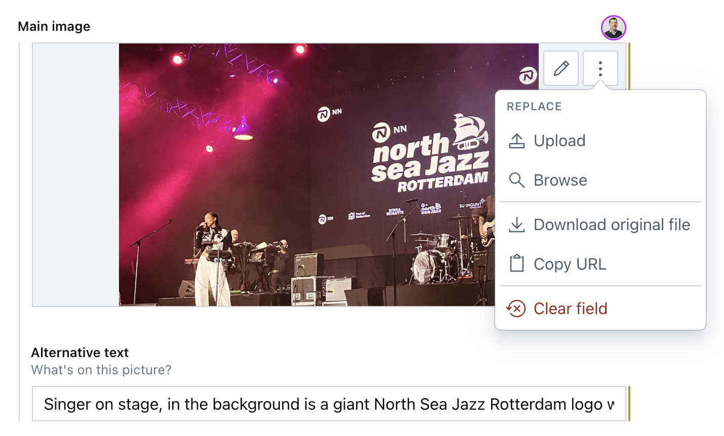 This menu with image options is a popover. It disappears when you click outside of it.
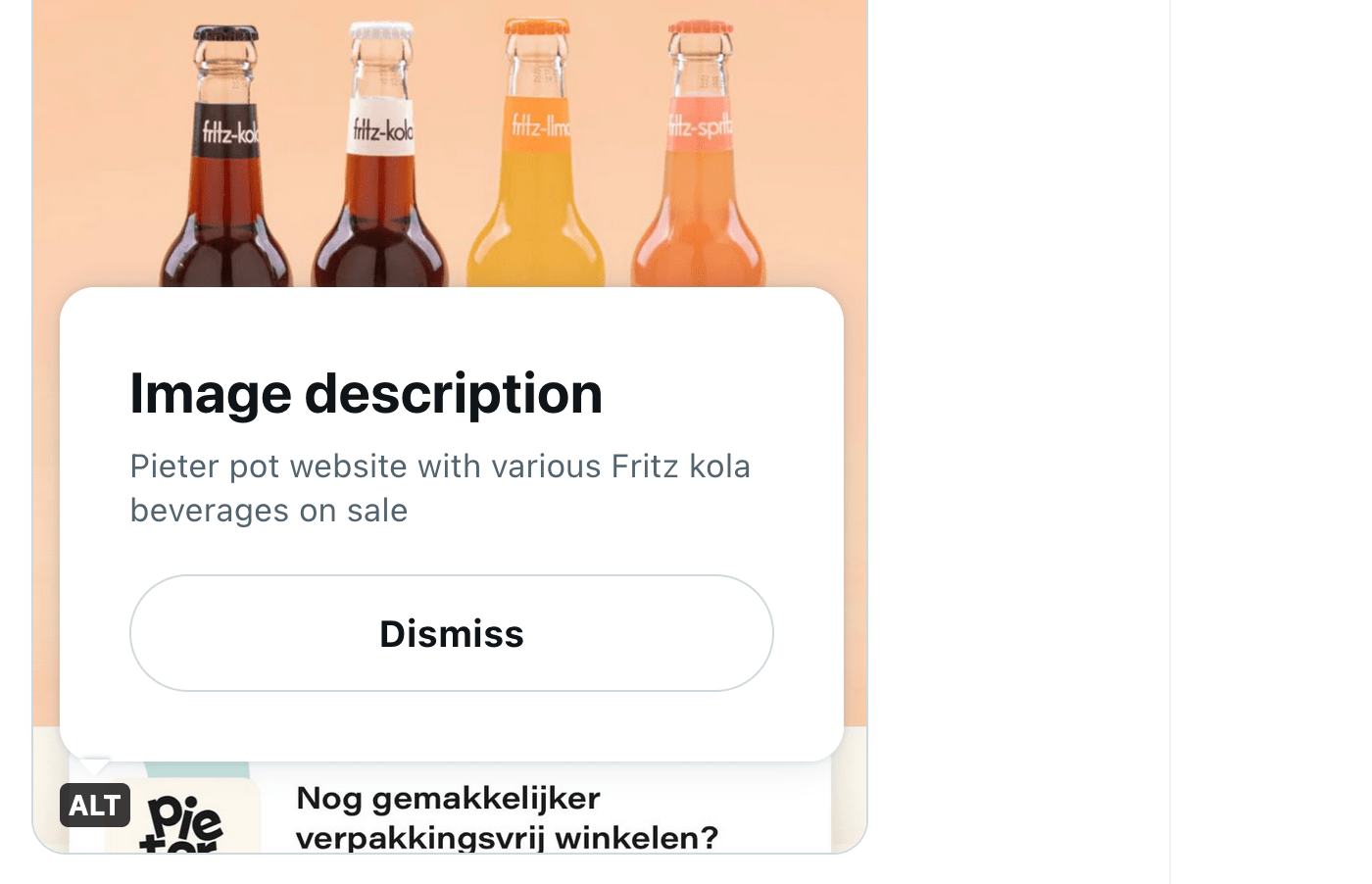
Twitter's alternative text feature is another example of a popover (implementation has accessibility issues)
Characteristics
Popovers are not modal. This is another major difference between popovers and dialogs. For this reason, it will be rare (but not impossible) for them to have a backdrop or focus trap.
Popovers can have ‘light dismiss’ behaviour, meaning they close by themselves, except when they are of the “manual” type. Manual popovers could be things like a “toast” notification that is dismissed via a timer or manual button.
Popovers, even if rare, can have a backdrop, which obscures content outside of it. This does not make the popover modal—as mentioned, popovers are non-modal. My recommendation is that if you're considering adding a backdrop to your popover, to also consider ”oh wait, maybe this is a modal dialog instead”. It might well be. Having said that, there is a handful of use cases for popovers with backdrops that are not modal.
Popovers can have focus trapped in them, for instance in complex widgets where you want to avoid that people accidentally tab out of the widget. A focus trap does not make a popover modal, as users can still access everything else on the page, it is just something that can improve usability in certain cases.
 A “toast” notification that dismisses automatically after a couple of seconds and also has a close button in case you want it to go away now (most toasts just disappear, that's also fine; in either case their contents should be conveyed to assistive tech).
Popovers also can be opened, closed and toggled without JavaScript: with a <button> in HTML and the popovertarget attribute that points to the popover's ID, the browser can take care of showing, hiding and toggling.
An example:
<button
  type="button"
  popovertarget="datepicker"
>Pick date</button>
<dialog popover id="datepicker"></dialog>
In this case, the dialog is turned into a popover with the popover attribute, which adds the popover behaviours. The button will toggle the popover, because the popover's ID matches the button's popovertarget attribute.
The button can also be set op to just show or just hide, in this case use popovertargetaction with show or hide (the toggle value exists too, and is the default).
To open the popover when the page loads, set defaultopen on the popover. This is useful for teaching UI.
To move focus to a popover when it opens, set the autofocus attribute on the popover itself, or an element within it. Normally, this attribute sets focus on page load. But if it is used on or within popovers, it only sets focus when the popover is shown (this can be on page load if defaultopen is used).
To position a popover, a very exciting proposal called CSS Anchor Positioning is in the works. As far as I understand it today, it would allow us popovers that automagically position in the most suitable place, avoiding collisions with the edge of the window. A bit like the Popper library does today, but built into the browser.
If focus management, positioning, JavaScript-less toggling and light dismiss weren't enough, there is also a proposal for popovers to be transitionable using CSS, between [popover] and [popover]:popover-open (of course, you'll want to adhere to your users' motion settings using prefers-reduced-motion).
Overlays
Overlays are more of a characteristic than a component on their own. Often, when developers talk about overlays, they mean dialogs that are modal. In a literal sense, overlays are things that lay on top of other things. Popovers and dialogs can both overlay other things.
Disclosure widgets
What are they
Elements that show and hide things are often called ‘disclosure widget’, as Adrian Roselli describes in his post about various kinds popover-like controls. Almost everything in this post is a subset of disclosure widgets… as in, they are pretty much all things that can be shown and hidden. Adrian describes disclosure widgets in more detail in his post Disclosure widgets.
Disclosure widgets exist in HTML as <details>/<summary>, but can also be built with <div> and the appropriate ARIA attributes. This isn't entirely the same. In Details/summary, again, Scott O'Hara suggests that this is more consistent:
If your goal is to create an absolutely consistent disclosure widget behavior across browsers, i.e., ensuring that all
<summary>s are exposed as expand/collapse buttons, then you’d be better off creating your own using JavaScript and the necessary ARIA attributes.
But, he adds, your ARIA disclosure widget won't have some of the features <details>/<summary> brings, like in-page search (Chromium triggers a <details>'s element open state when an in-page search query is found in its content).
There isn't a specific role for disclosure widgets, but there is the aria-expanded attribute for triggers and aria-controls to connect triggers with the element they trigger. When using <details/summary, <dialog> and (in the future) popover, browsers take care of setting up these kinds of accessibility properties for you.
Examples
- a Frequently Asked Questions section where the answers are collapsed and you can expand them from the questions
- tables in which individual rows can be expanded (See Adrian Roselli's Table with Expando Rows)
- “Toggle tips”, like an “info” button that displays next to complex terminology to open a tooltip that explains the word
- “meganav” style navigation where the main navigation items open more navigations
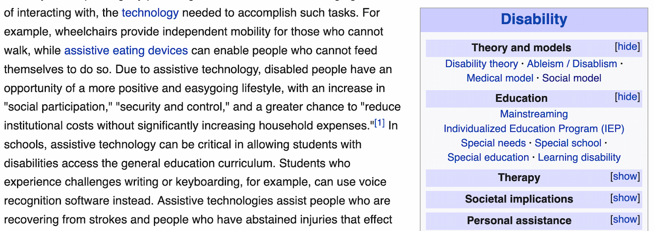 The show/hide functionality of sections within a category (displayed on the right) are a disclosure widget
Characteristics
There are a lot of different things that qualify as disclosure widgets. What they have in common is that they consist of two parts: one is a triggering element, the other is the triggered element.
Disclosure widgets do not trap focus, have no backdrops and are not modal. They are usually dismissed or collapsed with their trigger or a close-specific button.
FAQs
Where should focus move?
When a modal dialog opens, keyboard focus should move to the default action. If there's a form, it is probably the first form field. If there is multiple buttons, it could be the one that is least destructive, like if there's “Cancel” and “Confirm” button, a sensible default would be “Cancel”.
When a modal dialog closes: if the user triggered it, move focus back to the trigger. The browser does this automatically for <dialog>s. For popovers, it only does in cases “where it makes sense” (see the Popover Explainer). If the user did not trigger it, move it to an appropriate position earlier in the DOM.
For all other components (non-modal dialogs, popovers or disclosures), expected focus management differs case by case. The Popover Explainer's section on focus describes some of such cases.
Are all popovers dialogs?
Let's distinguish between three things we could mean by “dialog”:
- the
<dialog>element, an element with a built-in dialog role and dialog behaviours and possiblities (like, you can runshow()andshowModal()methods on it) - elements with
role="dialog": theroleattribute with thedialogvalue gives this a dialog role, but other than that, it comes with nothing, you would have to add your own behaviours to it - the word “dialog”: in your design system documentation, or in any casual conversation about components, you could be referring to dialogs and they could be none or one of the above
Sometimes, popovers use the <dialog> element or elements with a role="dialog". But not all of them. For instance, listboxes, menus, tooltips, grids, lists of links could all be components that require popover behaviours, but not the dialog role or the <dialog> element.
Are all dialogs popovers?
No, only non-modal dialogs are conceptually popovers (you can implement them with <dialog>/role="dialog" today). When the popover feature is stable and well-supported in browsers, it makes sense to use <dialog popover>, and would be the way to go if you want your non-modal dialog to appear in the top layer and leverage browser-provided light dismiss. In contrast, modal dialogs don't share the set of characteristics popovers have.
I'm building an X, should it be modal?
It depends. The question to ask is: is this component something that is the only thing your user may pay attention when it is open?
Country selector
You are building a check-out form for your online shop. In one of the fields, the user need to select a country. They eventually have to, because it is a required field. Still, while they select the country, they may scroll to something else, or decide to pop to the credit card stuff first. Maybe they need to read the label to check if you need country of birth or residence. This is best non-modal, because the user may want to look at other things.
Definition popover
You are building a toggle tip that can show definitions for complex words in your content. When the definition icon is clicked, it opens. Your user may want to scroll away or read other content or do other stuff. It is best to keep this non-modal.
Game over
The user has played some levels of your game, but they've lost and are now “game over”. They can't continue. It's really over and there's a dialog to tell them. There's no other thing they can interact with than this dialog. Modal it is.
Tracking consent
You are building a dialog that asks users if they want to agree that you track them. Your visitor is in an area where the law makes it illegal for you to do so without permission. In this case, there is no point in interacting with anything but the permission screen, so it would make sense to make it modal.
Fly-out navigation
You are building a “fly-out navigation”. It opens on the side of the viewport and is positioned on top of other content while it is open. When the user opens it, is this the only thing they want to see? This one is tricky, I feel modal could work, non-modal could work too.
Summing up / conclusions
OK, so, in summary: modality of a component is a state in which only that component can be used. When something is modal, everything else is inert: blocked from access in any way, unfocusable and usually obscured with a backdrop. Making something modal is a substantial decision, it should be used sparingly. Dialogs can be modal or non-modal (also called modeless). popovers are being proposed by Open UI as a new way to build non-modal dialogs with a specific set of behaviours and characteristics, like top layer presence, JS-less toggleability and browser-provided light dismiss. Unlike <dialog>, a popover does not have a built-in role: as a developer, you can add the popover attribute to the semantically most relevant element (see my other post on which role to use with your popover).
Most of the UI patterns that are mentioned in this post fall under the definition of overlays: content that can lay on top of other content (all dialogs and popovers). A lot also fall under the definition of disclosures, when they are patterns where one thing opens another thing.
That's all! Yes, I wrote this whole long post about definitions, only to conclude a lot of these are indeed different words for the same patterns. But there's nuance. Hopefully this post has helped you more clearly distinguish some of these patterns.
Further reading
- MDN -
<dialog> - WAI-ARIA: role=dialog
- Use the dialog element (reasonably) and Having an open dialog by Scott O'Hara on using
<dialog> - Stop using “pop-up” by Adrian Roselli, which offers clear distinction between various popup-like patterns
- Open UI issue 581: [popup] Add further clarity that popup is not (presently?) for modal dialogs
- Inert | The CSS Podcast with Una Kravets and Adam Argyle
List of updates
- 17 September 2024: Added video at All Day Hey, the most recent version of my popover talk.
- 18 September 2023: Updated support info to say stable Safari 17 and include links to post about possible roles and post about positioning popovers.
- 18 August 2023: Clarified non-modal dialogs with backdrops are rare but a possibility.
- 16 August 2023: Updated support info to say available in Chrome/Edge stable and Firefox behind a flag
- 25 July 2023: Updated link to top layer spec, which moved from WHATWG's Full Screen API Living Standard to W3C's CSS Positioned Layout Module Level 4
- 20 April 2023: Explained answer to “are all popovers dialogs?” question better. Updated title to no longer include “modality”.
- 19 April 2023: Updated “:open” to “:popoveropen”
- 18 April 2023: Improved intro to work better for today. Fixed popovertarget attribute description to match spec. Added a link to the HTML specification instead of to the PR. Added Safari Technology Preview info.
Comments, likes & shares (505)
Andrew Dyton, Thomas Bassetto, Paul Kinlan, Enrique Almado ۞❤️🎸🎤🎼🤟🏼🔻, Rene Noel 🏡, Bogdan Cerovac, Team Landesbehindertenbeauftragter Bremen, Tim Kraut, WebOverhauls.com, Michael Hastrich, BLJ, Accessabilly, Dean Birkett, Tricia (she/her), Egor Kloos, Bram Smulders, Timo Tijhof, DennisL, Jelmer, Schalk Neethling, mashbooq, Elise Hein, Egor Kloos, Passle, Jonathan Neal, Daniel Cordell, emre, Accessabilly, Westbrook, Paul Mason, Shalini Rana, Aurora 📎, นัทนัท, Laura Whitehead, Eric Cheung, Iván Arroyo Escobar, Kevin, Jacob Rask, Darryl Yeo 👨🏻💻🛠, Chris(topher) Allan Perry 🇪🇺, Jeroen Zwartepoorte, Marius Bleuer, Elly ✨🌱, Xavier Zaława, Jonathan Dallas, Colin, Andrew Noblet, Werner, Marcus Lindblom, HerrDietz, kyndrea martínez, Gabor (parody) 💗, Mihkel Eidast, Gerardjota, Bart van de Biezen, Fatimah Azzahra, Lucia Gonzalez, Chase McCoy, Shaun Tollerton 🏳️🌈, Kyle Morris, /home/Luka 🇧🇷, Leevi Graham 3x💉, Stephanie Eckles, Alaa, Una 🇺🇦, 더링, Noronha, adeleke5140.eth, Jordan Dingle, Allison, theswayambhu, Alberto Calvo, Marko, David Hund ✌, Arpit, Mayank, Lasko, Chris Cheng / Crs, ども, Paz 👽🖖, David Kim, tommy george, Ryo Katsuse, Katie Langerman, Rattleknife Design, reginald curtis, 全部入りHTML太郎, Mike Aparicio, plural killer, Orlando, ゆうてん🖖, Ryan Berg, Damon Cook, Gautam Kumar, kcd, Afif Abu Bakar, Dr. Adrian D. Alvarez, Andru Dunn, tex -Tweeto, ergo sum-, Lucifer_eveningstar, Karelverschraegen, Costin Geana, Martin Berglund, Beya Khalifa, Anuradha Kumari, むすびう, Max, Lena C., Kai, Daniel Fu 🌻🏳️🌈, Dirk Sidney Jansen, Kai, Mark, Michelle Barker, Jakub, Maarten Hus, Guillaume Deblock, Hakan Karaduman, Vernon Fowler, Calum Ryan, hārmañ, Carlos Jiménez, Kishore Andra, Tiago Mendes-Costa, Rudolfs Daugulis, Emmie Päivärinta 🇺🇦, 한, Tristan Dubbeld, Sheri Richardson, T Λ R Λ N T O, Gavin Thomas, Florian Weber, Nadhim Orfali, SidroDev, Voll Pfosten, Rafael Vieira, MatthewTyleeAtkinson, Pritam Patil 👨💻🛠️, hisako135, Tonimagraner, Chris Weekly, Davide Briano, Gary Byrne, JB, Karel Persoons, Pleun Vanderbauwhede, Patrick Way, Jens Grochtdreis, Vlad Kovac, negi4a, Meg, Joseph Kohlmann, Nick Ribal @ 🇮🇱, A. Selim Tunç, Joe Lanman, Todd 🦞 🔜 @ Modern Frontends Live!, Kitty Giraudel, Bhupesh Singh, Peter Antonius, David K. 🎹, Robin Bakker, Neha Sharma, Matthew, Johnny Taylor, mhatiboglu➿, Jan Jaap de Groot, Oscar Marcelo, Tom Bonnike, Robert, Ryan Mulligan, Nacho Codoñer, An, danilo leal, jailandrade, Rodney, José Villaseñor, a11y-mmo, 🦞 Todd :ve:, Maarten Stolte, cieara, Fiona, tazeverywhere, Christian "Schepp" Schaefer, Rick Doesburg, Tyler Sticka, Evan, Roman Vesely, Jens Oliver Meiert, Accessabilly, Tane Piper, Bram Nijmeijer, Šime Vidas, Joe Lanman, patak, Oliver, Martín Baldassarre, Francis Rubio :verified:, Adam Argyle, busticated, mkalina, Joe Lanman, Dave Rupert, Halvor William Sanden, Bsmth, the bsmth guy, Bart van de Biezen, robb, Kieran McGuire, Fynn Becker, Martijn Frazer, Chee Aun ????, Ryan Trimble, Mario, Tobias Wolf, ▚ pixelistik ▗▚▗▘, Josh Kramer, Patrick Fulton, Ian Sutherland ????????, Tyler Sticka, Julien Deniau, Jelmer, Cole Peters, Steve Bogart ????, Fynn Becker, Ash, Juan Fernandes, s:mon, Dan Burzo, westbrook, Sophie, benschwarz, Robin H. Hansen, Ben, Giana ✨, Ross McKay, Samir Saeedi :firedoge:, busticated, Eric A. Meyer, Grigør, Jens Bannmann, Nick Breaton, Egor Kloos, Art, Florian van der Galiën, Josh Kramer, Seth A. Roby, Apple Annie :prami:, Frederik Braun �, kaiserkiwi :kiwibird:, Mikhail Shornikov, Heather Migliorisi, Troels Thomsen, Joseph Leedy :magento:, Morgan Davis, Evan Minto, Richard Rutter, Jim Kozlowski, Simeon Nedkov, Baldur Bjarnason, Jonathan Schofield, Jeremy Gibson, Marty Ballard :verified:, Joni Korpi, dilong, Max R. Cerrina (he/him), andrew, Tyler Sticka, Chancerubbage, Erik (????????????????????), Troels Thomsen, Timo Tijhof, Dave Giunta, Chris Smith, HerrHerrmann, Tyler Sticka, Eric Eggert, Curtis Wilcox, Anneke, bkardell, Luke, Daniel Appelquist, Niels Abildgaard and David Marland liked this
Paul Kinlan, Michael Hastrich, Passle, Valentino Gagliardi, Tricia (she/her), Timo Tijhof, Schalk Neethling, Bram Smulders, Andrew Dyton, Michael Scharnagl, Jonathan Neal, Laura Whitehead, Chris(topher) Allan Perry 🇪🇺, Mihkel Eidast, Florin, Thomas Bassetto, Crystal Dionysopoulos, Elly ✨🌱, Colin, Michael Klöpzig, Stephanie Eckles, Gerardjota, Una 🇺🇦, Leevi Graham 3x💉, Marko, 全部入りHTML太郎, ゆうてん🖖, Ali Syahidin, Anuradha Kumari, Kishore Andra, Thomas Steiner, Guillaume Deblock, Dimitris Grammatikogiannis, Frontend Daily 🚀, Florian Weber, TPGi, Michael Großklaus, Bramus, JB, Victor Gutt, WebOverhauls.com, Joseph Kohlmann, Meg, Todd 🦞 🔜 @ Modern Frontends Live!, Bhupesh Singh, Dr. Adrian D. Alvarez, mhatiboglu➿, Acrónica, Ryan Mulligan, José Villaseñor, a11y-mmo, 🦞 Todd :ve:, cieara, maniflames, ffoodd, Manuel (码奴) Feller, Evan, Eric Eggert, ~/j4v1, Michael Wilson, Bhupesh Singh, Bram Nijmeijer, Web Axe, Oliver, Jeroen Zwartepoorte, Alex de Bosnia, Bramus, Brian David, Mason Conkright, Fynn Becker, Vadim Makeev, Axel Rauschmayer, Bhupesh Singh, Patrick Brosset, Jonathan Dallas, Sunny :autumnleaf6:, Thomas, Fynn Becker, Kaveinthran, Siilwyn, meduz', Frills, ysbreker, Ricard Torres, Bramus, westbrook, Ryan Townsend, Giana ✨, Revath S Kumar :javascript:, Joe Steinbring :thisisfine:, Gustav Hansen, Eric A. Meyer, Thomas Broyer, thudfactor, Florian van der Galiën, dusoft, Brian David, cimm, Apple Annie :prami:, Patrick Brosset, Trygve Lie, Evan Minto, Richard Rutter, Patrick Brosset, Axel Rauschmayer, Simeon Nedkov, Jonathan Schofield, Jim Kozlowski, Baldur Bjarnason, Paul McBride, Joni Korpi, Tyler Sticka, Eyal Eshet, Chancerubbage, Sebastian, Cory :prami_pride_demi:, Nic, Tyler Sticka, Zacky Ma :favicon:, Daniel Appelquist and Knut Branson reposted this
Web platform concepts can sometimes be quite different, yet seem very similar. Semantics, behaviours and characteristics can be tricky to distinguish. In addition to the
<dialog>element, HTML now has apopoverattribute. This post goes into the differences between dialogs, popovers, overlays and disclosure widgets. We'll also look at what it means when an element is modal. All somewhat related concepts that can seem very similar. At least they did to me. Let's dive in!(If this is too long, I did a 40 minute talk version at All Day Hey and a 7 minute version at JS Nation (don't believe the ‘AI’ summary on that page))
In this post
popoveris available:You can use it in production (there is popover polyfill), but be sure to test it well, it is new and there may be issues with support, including accessibility support.
Introduction
The thing with words is that not everyone uses them the same everywhere. The words in this post are no different. As a long time contractor I changed environments on the regular—phrases changed when I worked in different teams, companies, countries and even years (see also older resources, like the WHATWG wiki on dialogs). Meanings change over time, also in the world in general… this is normal! But in the case of these components, interpretation differences can lead to bad user experience.
A lot of the concepts I'll discuss in this post originated in operating systems: see Apple's Human Interface Guidelines, Microsoft's “Win32” guidelines (old) and Controls for Windows apps (newer). If we compare those with patterns in ARIA Authoring Practices Guide, we'll find similarities. Some similarities are on the surface, they just look the same. Others are similar for users of assistive technologies: the ergonomics of some ARIA components are designed to be similar to the corresponding operating system ergonomics, for better or for worse.
But OS-level guidelines or ARIA Authoring Practices (APG) aren't the best place for web developers to look for implementation guidance. OS-level guidelines are for OS-es, APG is to demo how to use ARIA (not how well it is supported).
For clarity, throughout this post, I will refer to the concepts of dialog, modality and popovers as they exist on the web, in languages like HTML, CSS and ARIA (note: popovers don't exist yet, just as a proposal). My definitions are meant to align with the relevant web specifications, they may be slightly different from what is used in other places and in individual teams.
Below, we'll start with characteristics that components can have, like modality, light dismiss, top layer presence and backdrops. Then we'll talk about what we get when these characteristics are used together in a website or web app: dialogs, popovers, overlays and disclosures. Hopefully, when we discuss the characteristics in detail first, it is easier to distinguish the components themselves.
The characteristics
Modality / inertness
Some design systems have a component named “modal”, but modality is more of a characteristic than a component itself.
So what does it mean for an element to be modal? Basically, when a modal component is open, it is the only thing that is not inert. Only the modal content can be interacted with, the rest of the page or application is made inert. Inert content is content that users cannot interact with. It is only really there visually, but you cannot Tab to it, click it, scroll it or access the content via assistive technologies.
Elements that are not modal are called non-modal or modeless.
Not everyone likes modality—as a UI concept, they are very disruptive. Use the pattern sparsely, only when disrupting is very much necessary. If you want to ask the user “Are you sure you want to delete all that?”, go ahead and make it disruptive. If you want to promote your newsletter sign-up or advertising, the disruption is unlikely to be appreciated.
In terms of implementation, you will need to make everything except your modal element inert. The
<dialog>element (used withshowModal()) does this for and would be the best to use.If you cannot use
<dialog>or are looking at an older code base that doesn't, here's an example of distinguishing between modal and inert content:The gist of it is that one element is modal and everything else inert: unavailable to any user or technology. As today, not all users will be on a browser that supports
inert, best use theinertpolyfill. Withoutinertor its polyfill, you would need to addaria-hidden="true"to the content outside of the modal (to make it unavailable for assistive technologies) andtabindex="-1"to any interactive elements that are not in the modal.Just trapping focus in an element or adding a backdrop does not make it truly modal. With a focus trap, you only make the rest of the content unavailable via a keyboard. With a backdrop, you only make it unavailable visually.
Light vs explicit dismiss
Another aspect to consider is how users dismiss a component and whether that is affected by other elements: this can be via explicit dismiss or light dismiss.
With ‘explicit dismiss’, a component allows a user to dismiss it, for instance via a close button and the Escape key (when in doubt, best add both).
With ‘light dismiss’, a component disappears automatically on certain conditions, like when users scroll, interact with something else or click outside of the component. Light dismiss doesn't happen when the user
Tabs out of the element by default (but developers can add it if needed, see the discussion in openui/open-ui#415 for more details).Light dismiss is something we can already build in JavaScript today, a lot of websites have components that light dismiss. But with the
popoverattribute, the browser would do it for you (if you usepopover="auto").Top layer presence
By default, if multiple elements are positioned in the same location, they are painted by the browser in DOM order. The element that is first in the DOM is painted first, each subsequent element on top of the previous and the last one in the DOM is painted last, at the top. With the
z-indexproperty in CSS you can deviate from the default on a case by case basis. You basically decide your own layer order. This feature is defined in an appendix to CSS 2.1 called the Elaborate description of Stacking Contexts.The top layer (as of July 2023, part of CSS's Positioned Layout Module, Level 4) is painted after the painting process described above, and the stuff within it is therefore on top of everything else. The top layer is not new in the web platform, but the ability for developers to promote elements to it is. Web pages have just one top layer. Within the top layer, elements are painted in the order they are added to the top layer (so shuffling them around involves adding/readding them).
Sometimes, developers add components just before the closing
</body>tag to try and ensure that they are painted above other things (given nothing has az-index> 0). The top layer introduces a new way to allow elements to be on top of everything else, regardless of where they are in the DOM or theirz-index.Another benefit of the top layer has to do with overflow. If your popup is in an element with
overflow: hidden, that will cut it off. If it is promoted to the top layer, no cutting off will take place.A downside of an element being in the top layer, is that it can't be positioned relative to things in the main document. I believe this is something modal dialogs usually don't need, but popovers would need a lot of the time. See also: Positioning anchored popovers.
Backdrop
In some cases, it makes sense for elements to have a backdrop. A backdrop usually serves as a visual cue that conveys content behind it is unavailable for interactions. Sometimes, it can be used as a way to help the user focus.
The
::backdroppseudo element can be applied to top layer elements. It allows you to style the backdrop in any way you want.Constrained focus
Sometimes focus is constrained to (or trapped in) a specific element, meaning that if focus is in this element and you press
TaborShift + Tab, you will never go to elements outside of the element. This characteristic is also known as a “keyboard focus trap”. It is a side-effect of making everything else inert (which<dialog>does for you). (Note: trapping focus in an element does not make that element modal, but if it is truly modal, focus cannot be moved outside of it, because nothing outside of it is focusable).Focus traps should be temporary until the element it applies to is closed or dismissed (they would fail WCAG 2.1.2 if it is not temporary and has no way to escape with a keyboard).
Keyboard dismissable/collapsible
If content can be dismissed or collapsed, users should also be able to dismiss or collapse it with just a keyboard.
When content can be dismissed, a common pattern is that pressing the
Escapekey dismisses the content. Usually dismissal is restricted to happen only when the user is focused on something inside of the component to close. If there are multiple things to close, like with nested components, you would pressEscapemultiple times and closing would happen component by component from most inner to most outer element.When content can be collapsed, keyboard users should be able to use the same button that mouse users click to collapse content.
The main patterns
Let's look at some common patterns and how to distinguish between them.
Dialogs
What is it
A dialog is a component in a web page or app that usually contains an action or some task to perform (see:
<dialog>in HTML specification). It is usually not part of the natural flow of other content, for that reason it can (and usually does) cover other content. MDN describes it as a “subwindow”, ARIA Authoring Practices defines it as a “window overlaid on either the primary window or another dialog window”.A dialog is often displayed when users need to be made aware of something or when they need to choose. Do you want to continue, yes or no? If you want to open a new file, what shall we do with your current file, save or delete? How do you want to crop this image, where is the hot spot?
confirm()Canonically, dialogs are a lot like
window.confirm(),window.alert()andwindow.prompt(), which the HTML specification lists under ‘simple dialogs’. But unlike these browser built-in dialogs, custom dialogs offer more flexibility—you get to put whichever content and styling you want inside of them.Dialogs have a role of
dialog, which the browser will assign automatically for you when you use the<dialog>element.You can also create dialogs with ARIA: apply
role="dialog"to an element (like<div>). If it is a modal dialog, addaria-modal="true"when it shows, and remove it when it is dismissed. You will need to do all the modality work yourself (focus trap, making rest of content inert, etc). Note:aria-modalis not supported in IE11 (which may still be in use among your assistive technology users), there are issues witharia-modalin VoiceOver and it seems unsupported in Narrator.You can put a form with
method="dialog"in a dialog. This form will close its dialog when submitted.Examples
Characteristics
Dialogs can be modal (
<dialog>when shown withdialog.showModal()) or non modal (<dialog>when shown withdialog.show()). To avoid quirks, you will want to choose which of the two your dialog is, and only call one of these methods per dialog.When
<dialog>s are modal, the browser will treat the content outside of the dialog as inert, and prevent keyboard focus from reaching web content outside of the dialog (if you userole="dialog", you have to do this yourself). If a<dialog>is not modal, the other content is not treated as inert. This makes modal dialogs a lot more disruptive, so use them only when you have to. You usually don't want to interrupt or disrupt a user's flow.Dialogs are in the top layer only if they are modal (and only if the
<dialog>element is used; other elements withrole="dialog"will not go to the top layer).Dialogs must have an accessible name (see WAI-ARIA 1.2,
dialogrole). Associate your dialog with the visible heading or message (if brief) usingaria-labelledbyon the<dialog>/<div role="dialog">. You could also usearia-label, but associating with visible text is ideal, because it creates parity between what folks see and what assistive tech call stuff.WAI-ARIA specifies that when you're using
role="dialog", you should include at least one focusable element and move focus to one of the focusable elements when it opens.Browsers will close modal dialogs when users press
Escape. Non-modal dialogs don't get this default behaviour, developers can add it where it makes sense.Alert dialogs
WAI-ARIA defines a specific type of dialog, which is called “alert dialog”. It is meant for dialogs that contain a brief, important message. Their function is to alert the user—the browser will do that by firing a system alert event to accessibility APIs. They are the ARIA-equivalent of the browser
alert()dialogs we discussed above.Examples
Command + W, the shortcut to close the current tab. An alert dialog appears to ask if you really want to “Leave” now or perhaps “Save your changes” first.Characteristics
Alert dialogs are always modal and have their focus trapped. They also require an accessible name. Like with dialogs, if there is a visible title, associate the title's
idwith the alert dialog'saria-labelledbyattribute. If not,aria-labelcan also be added to an alert dialog.Popovers
What is it
Popover is a set of behaviors that can be added to any element through the
popoverattribute (liketabindexorcontenteditable). It is specified in HTML and there is a polyfill (why is it an attribute and not an element?).The
popoverattribute is meant for UI components that are:As opposed to
<dialog>s, apopoverdoesn't come with a built-in role (this is partly why it is an attribute and not an element), you pick your own role. It can take on any role that makes sense, or none at all. Sometimes popovers could be (modeless) dialogs, in that case you could use<dialog popover>.The popover attribute is planned to allow for two values, each of which give a slightly different set of characteristics:
popover=auto: light dismisses; when it opens, it force-closes other popovers and hints (except its anchestors); it or its anchestor would usually receive focuspopover=manual: explicit dismiss (via timer, close button or some other script); when it opens, it does not force close anything(More types may follow)
Full screen content also forces popovers of the “auto” type to close.
Examples
An example of a popover is the listbox that shows when a select is opened (conceptually for
<select>and literally for<selectmenu>as it is currently implemented in Chromium).These are some common examples of components with popover behaviours:
role="menu"There are also popovers that users need to dismiss or that automatically dismiss (like toasts).
So yes, there are lots of different UI patterns that can have “popover” behaviour as a requirement. This is why popover is proposed not as one HTML element, but as an attribute that is meant to be used with an HTML and/or
rolethat is most suitable for that pattern. For an action menu, that's a<div role="menu" popover>. A tooltip could be<div role="tooltip" popover>(depending on context and what it is). In any case: each of these patterns has its own UX expectations.Twitter's alternative text feature is another example of a popover (implementation has accessibility issues)
Characteristics
Popovers are not modal. This is another major difference between popovers and dialogs. For this reason, it will be rare (but not impossible) for them to have a backdrop or focus trap.
Popovers can have ‘light dismiss’ behaviour, meaning they close by themselves, except when they are of the “manual” type. Manual popovers could be things like a “toast” notification that is dismissed via a timer or manual button.
Popovers, even if rare, can have a backdrop, which obscures content outside of it. This does not make the popover modal—as mentioned, popovers are non-modal. My recommendation is that if you're considering adding a backdrop to your popover, to also consider ”oh wait, maybe this is a modal dialog instead”. It might well be. Having said that, there is a handful of use cases for popovers with backdrops that are not modal.
Popovers can have focus trapped in them, for instance in complex widgets where you want to avoid that people accidentally tab out of the widget. A focus trap does not make a popover modal, as users can still access everything else on the page, it is just something that can improve usability in certain cases.
Popovers also can be opened, closed and toggled without JavaScript: with a
<button>in HTML and thepopovertargetattribute that points to the popover's ID, the browser can take care of showing, hiding and toggling.An example:
In this case, the dialog is turned into a popover with the
popoverattribute, which adds the popover behaviours. The button will toggle the popover, because the popover's ID matches the button'spopovertargetattribute.The button can also be set op to just show or just hide, in this case use
popovertargetactionwithshoworhide(thetogglevalue exists too, and is the default).To open the popover when the page loads, set
defaultopenon the popover. This is useful for teaching UI.To move focus to a popover when it opens, set the
autofocusattribute on the popover itself, or an element within it. Normally, this attribute sets focus on page load. But if it is used on or within popovers, it only sets focus when the popover is shown (this can be on page load ifdefaultopenis used).To position a popover, a very exciting proposal called CSS Anchor Positioning is in the works. As far as I understand it today, it would allow us popovers that automagically position in the most suitable place, avoiding collisions with the edge of the window. A bit like the Popper library does today, but built into the browser.
If focus management, positioning, JavaScript-less toggling and light dismiss weren't enough, there is also a proposal for popovers to be transitionable using CSS, between
[popover]and[popover]:popover-open(of course, you'll want to adhere to your users' motion settings using prefers-reduced-motion).Overlays
Overlays are more of a characteristic than a component on their own. Often, when developers talk about overlays, they mean dialogs that are modal. In a literal sense, overlays are things that lay on top of other things. Popovers and dialogs can both overlay other things.
Disclosure widgets
What are they
Elements that show and hide things are often called ‘disclosure widget’, as Adrian Roselli describes in his post about various kinds popover-like controls. Almost everything in this post is a subset of disclosure widgets… as in, they are pretty much all things that can be shown and hidden. Adrian describes disclosure widgets in more detail in his post Disclosure widgets.
Disclosure widgets exist in HTML as
<details>/<summary>, but can also be built with<div>and the appropriate ARIA attributes. This isn't entirely the same. In Details/summary, again, Scott O'Hara suggests that this is more consistent:But, he adds, your ARIA disclosure widget won't have some of the features
<details>/<summary>brings, like in-page search (Chromium triggers a<details>'s elementopenstate when an in-page search query is found in its content).There isn't a specific
rolefor disclosure widgets, but there is thearia-expandedattribute for triggers andaria-controlsto connect triggers with the element they trigger. When using<details/summary,<dialog>and (in the future)popover, browsers take care of setting up these kinds of accessibility properties for you.Examples
Characteristics
There are a lot of different things that qualify as disclosure widgets. What they have in common is that they consist of two parts: one is a triggering element, the other is the triggered element.
Disclosure widgets do not trap focus, have no backdrops and are not modal. They are usually dismissed or collapsed with their trigger or a close-specific button.
FAQs
Where should focus move?
When a modal dialog opens, keyboard focus should move to the default action. If there's a form, it is probably the first form field. If there is multiple buttons, it could be the one that is least destructive, like if there's “Cancel” and “Confirm” button, a sensible default would be “Cancel”.
When a modal dialog closes: if the user triggered it, move focus back to the trigger. The browser does this automatically for
<dialog>s. For popovers, it only does in cases “where it makes sense” (see the Popover Explainer). If the user did not trigger it, move it to an appropriate position earlier in the DOM.For all other components (non-modal dialogs, popovers or disclosures), expected focus management differs case by case. The Popover Explainer's section on focus describes some of such cases.
Are all popovers dialogs?
Let's distinguish between three things we could mean by “dialog”:
<dialog>element, an element with a built-in dialog role and dialog behaviours and possiblities (like, you can runshow()andshowModal()methods on it)role="dialog": theroleattribute with thedialogvalue gives this a dialog role, but other than that, it comes with nothing, you would have to add your own behaviours to itSometimes, popovers use the
<dialog>element or elements with arole="dialog". But not all of them. For instance, listboxes, menus, tooltips, grids, lists of links could all be components that require popover behaviours, but not thedialogrole or the<dialog>element.Are all dialogs popovers?
No, only non-modal dialogs are conceptually popovers (you can implement them with
<dialog>/role="dialog"today). When the popover feature is stable and well-supported in browsers, it makes sense to use<dialog popover>, and would be the way to go if you want your non-modal dialog to appear in the top layer and leverage browser-provided light dismiss. In contrast, modal dialogs don't share the set of characteristics popovers have.I'm building an X, should it be modal?
It depends. The question to ask is: is this component something that is the only thing your user may pay attention when it is open?
Country selector
You are building a check-out form for your online shop. In one of the fields, the user need to select a country. They eventually have to, because it is a required field. Still, while they select the country, they may scroll to something else, or decide to pop to the credit card stuff first. Maybe they need to read the label to check if you need country of birth or residence. This is best non-modal, because the user may want to look at other things.
Definition popover
You are building a toggle tip that can show definitions for complex words in your content. When the definition icon is clicked, it opens. Your user may want to scroll away or read other content or do other stuff. It is best to keep this non-modal.
Game over
The user has played some levels of your game, but they've lost and are now “game over”. They can't continue. It's really over and there's a dialog to tell them. There's no other thing they can interact with than this dialog. Modal it is.
Tracking consent
You are building a dialog that asks users if they want to agree that you track them. Your visitor is in an area where the law makes it illegal for you to do so without permission. In this case, there is no point in interacting with anything but the permission screen, so it would make sense to make it modal.
Fly-out navigation
You are building a “fly-out navigation”. It opens on the side of the viewport and is positioned on top of other content while it is open. When the user opens it, is this the only thing they want to see? This one is tricky, I feel modal could work, non-modal could work too.
Summing up / conclusions
OK, so, in summary: modality of a component is a state in which only that component can be used. When something is modal, everything else is inert: blocked from access in any way, unfocusable and usually obscured with a backdrop. Making something modal is a substantial decision, it should be used sparingly. Dialogs can be modal or non-modal (also called modeless).
popovers are being proposed by Open UI as a new way to build non-modal dialogs with a specific set of behaviours and characteristics, like top layer presence, JS-less toggleability and browser-provided light dismiss. Unlike<dialog>, apopoverdoes not have a built-in role: as a developer, you can add thepopoverattribute to the semantically most relevant element (see my other post on which role to use with your popover).Most of the UI patterns that are mentioned in this post fall under the definition of overlays: content that can lay on top of other content (all dialogs and popovers). A lot also fall under the definition of disclosures, when they are patterns where one thing opens another thing.
That's all! Yes, I wrote this whole long post about definitions, only to conclude a lot of these are indeed different words for the same patterns. But there's nuance. Hopefully this post has helped you more clearly distinguish some of these patterns.
Further reading
- MDN -
- WAI-ARIA: role=dialog
- Use the dialog element (reasonably) and Having an open dialog by Scott O'Hara on using
- Stop using “pop-up” by Adrian Roselli, which offers clear distinction between various popup-like patterns
- Open UI issue 581: [popup] Add further clarity that popup is not (presently?) for modal dialogs
- Inert | The CSS Podcast with Una Kravets and Adam Argyle
List of updates<dialog><dialog>- 17 September 2024: Added video at All Day Hey, the most recent version of my popover talk.
- 18 September 2023: Updated support info to say stable Safari 17 and include links to post about possible roles and post about positioning popovers.
- 18 August 2023: Clarified non-modal dialogs with backdrops are rare but a possibility.
- 16 August 2023: Updated support info to say available in Chrome/Edge stable and Firefox behind a flag
- 25 July 2023: Updated link to top layer spec, which moved from WHATWG's Full Screen API Living Standard to W3C's CSS Positioned Layout Module Level 4
- 20 April 2023: Explained answer to “are all popovers dialogs?” question better. Updated title to no longer include “modality”.
- 19 April 2023: Updated “:open” to “:popoveropen”
- 18 April 2023: Improved intro to work better for today. Fixed popovertarget attribute description to match spec. Added a link to the HTML specification instead of to the PR. Added Safari Technology Preview info.
Many thanks to Jonathan Neal, Eric Eggert, Una Kravets, Adrian Roselli and Scott O'Hara for providing feedback on earlier drafts of this post, to Mason Freed for answering questions and to Mu-An Chiou and Kristján Oddsson for enlightening me on some aspects of this. Any errors in the post are on me, not them (obviously :-)).@hdv thanks for defining some of the common terms that are used for similar experiences. Terminology is important!
Mona & Hubot Sans – Check out these versatile open-source variable fonts.
How are Dialogs, Modality & Popovers Different? – Take a deep dive into what makes these design elements unique.
GitHub Blocks – Try this technical preview of a block-based method for enhancing GitHub repositories.
The Grumpy Designer Asks: Are You Tired? – Why balancing life and career has never been more difficult.

CSS Clothoid Corners – This online tool will generate rounded corners using CSS
clip-path.Almost Monospaced: The Perfect Fonts for Writing – Scenarios where using monospaced fonts may make sense.

Those Things That Can Come Back to Haunt Web Designers – How to avoid mistakes that have long-term consequences.

Why We Need CSS Speech – A look at designing the aural presentation of content.
3D Typing Effects with Three.js – A detailed tutorial on how to create typable 3D text with Three.js.

Lenis Library – A new smooth-scrolling library worth checking out.
Slim Icons – A free open-source library of 90+ icons.
Bricks – Download this free component library for Figma.
Tips for Taking Event Registrations on Your Website – How to make sure you choose the right platform for your needs.

The Evolution of Scalable CSS – The problems with scaling CSS on large projects, along with best practices.
15 Stunning Lightroom Presets for Fashion Photoshoots – Enhance the look of your fashion shots with these amazing presets.

Stylify – This tool generates CSS dynamically based on what you write.
Beautiful CSS Checkboxes Examples – Find inspiration with these copy-and-paste checkbox styles.
Managing CSS Styles in a WordPress Block Theme – Learn the best practices behind writing CSS for these newfangled themes.
Source link
Related
Mona & Hubot Sans – Check out these versatile open-source variable fonts.
How are Dialogs, Modality & Popovers Different? – Take a deep dive into what makes these design elements unique.
GitHub Blocks – Try this technical preview of a block-based method for enhancing GitHub repositories.
The Grumpy Designer Asks: Are You Tired? – Why balancing life and career has never been more difficult.
CSS Clothoid Corners – This online tool will generate rounded corners using CSS
clip-path.Almost Monospaced: The Perfect Fonts for Writing – Scenarios where using monospaced fonts may make sense.
Those Things That Can Come Back to Haunt Web Designers – How to avoid mistakes that have long-term consequences.
Why We Need CSS Speech – A look at designing the aural presentation of content.
3D Typing Effects with Three.js – A detailed tutorial on how to create typable 3D text with Three.js.
Lenis Library – A new smooth-scrolling library worth checking out.
Slim Icons – A free open-source library of 90+ icons.
Bricks – Download this free component library for Figma.
Tips for Taking Event Registrations on Your Website – How to make sure you choose the right platform for your needs.
The Evolution of Scalable CSS – The problems with scaling CSS on large projects, along with best practices.
15 Stunning Lightroom Presets for Fashion Photoshoots – Enhance the look of your fashion shots with these amazing presets.
Stylify – This tool generates CSS dynamically based on what you write.
Beautiful CSS Checkboxes Examples – Find inspiration with these copy-and-paste checkbox styles.
Managing CSS Styles in a WordPress Block Theme – Learn the best practices behind writing CSS for these newfangled themes.
Source link
Related
Mona & Hubot Sans – Check out these versatile open-source variable fonts.

How are Dialogs, Modality & Popovers Different? – Take a deep dive into what makes these design elements unique.

GitHub Blocks – Try this technical preview of a block-based method for enhancing GitHub repositories.

The Grumpy Designer Asks: Are You Tired? – Why balancing life and career has never been more difficult.

CSS Clothoid Corners – This online tool will generate rounded corners using CSS

clip-path.Almost Monospaced: The Perfect Fonts for Writing – Scenarios where using monospaced fonts may make sense.

Those Things That Can Come Back to Haunt Web Designers – How to avoid mistakes that have long-term consequences.

Why We Need CSS Speech – A look at designing the aural presentation of content.

3D Typing Effects with Three.js – A detailed tutorial on how to create typable 3D text with Three.js.

Lenis Library – A new smooth-scrolling library worth checking out.

Slim Icons – A free open-source library of 90+ icons.

Bricks – Download this free component library for Figma.

Tips for Taking Event Registrations on Your Website – How to make sure you choose the right platform for your needs.

The Evolution of Scalable CSS – The problems with scaling CSS on large projects, along with best practices.

15 Stunning Lightroom Presets for Fashion Photoshoots – Enhance the look of your fashion shots with these amazing presets.

Stylify – This tool generates CSS dynamically based on what you write.

Beautiful CSS Checkboxes Examples – Find inspiration with these copy-and-paste checkbox styles.

Managing CSS Styles in a WordPress Block Theme – Learn the best practices behind writing CSS for these newfangled themes.

Source link
Related
@hdv This is great, I've been struggling with the differences so often. Thanks for taking the time to write all that down.
@VincentTunru glad it's useful!
@hdv thanks, that was a really good read!
In addition to dialogues, there is a new API to handle popovers, small blocks of text, natively in the browser.
This post will explore the Popover API, what it does, how it works and provide examples of how to use it.
Necessary context
Before we jump into popovers we need to define a few terms.
Top layer The top layer, as the name implies is painted last as the top-most layer of content in the browser viewport, regardless of document order or z-index values By default, if multiple elements are positioned in the same location, the browser paints them in the order they appear in the document (document order). With the z-index property you decide your layer order Within the top layer, elements are painted in document order If your popup is in an element with overflow: hidden, that will cut it off. If it is promoted to the top layer, no cutting off will take place. Backdrop A backdrop usually serves as a visual cue that any content behind the popover is unavailable for interactions. This can be used as a way to help the user focus. You can style the backdrop with the::backdroppseudo-element.Why another API
Using the popover API let’s the browser manage the complexity of working with popups. The API will handle the following tasks for you:
Accessible component bindings. Connecting a popover element to a popover trigger semantically.
These tasks make it easier to work with popovers. It gives you a lot of functionality “for free”, just by using the API
The basic popover
The basic popover has two components:
buttonto trigger the popover with apopovertargetattributte pointing to the ID of the popover contentdivelement for the popover contentpopovertargetvalue in the buttonpopoverattributeThe code looks like this:
The default behavior for popovers is to only allow one open popover at a time; the browser will close any other popover on the page.
Automatic versus manual popovers
using the
popoverattribute is an alias for `popover = ‘auto’. This is the default behavior that we discussed in previous sections.There is another value for the
popoverattribute:manual.Manual popovers wil not work like automatic popovers (they will not force close any other element type and do not close when you click outside them). You must close them via a timer or explicit close action.
These manual popovers are best for elements that shouldn’t affect the rest of the page, such as a toast notification.
Handling popovers programmatically
You can also use Javascript to create and manage popovers.
The following table provides the Javascript properties along with their HTML equivalents.
Javascript property HTML equivalentpopoverpopoverpopoverTargetElementpopovertargetpopoverTargetActionpopovertargetactionIn this example, we first capture references to the popover and the buttons to control them.
Next, we create a feature detection function.
We use the feature detection function to check if popovers are supported. If they are then we set the
popoverTargetElementandpopoverTargetActionproperties for the toggle and close buttons.If the popover API is not supported then we hide the toggle button since it won’t work.
I’ve avoided talking about the semantics of the popover API. Hidde de Vries does a much better job than I can in Semantics and the popover attribute: what to use when?.
Links and Resources
@hdv Great point!
@hdv but the backdrop shows, so they look modal, or at least made to look modal.... i need to look up the css of the backdrop on popovers now.... i feel a rabbit hole coming..
@estelle yes I agree that's strange, I can't think of many cases where a popover with backdrop makes sense. As I understand it the reason ::backdrop works on popovers is because all top layer elements have a styleable backdrop, and popovers are top layer elements
@estelle by default UAs shouldn't be styling the backdrop, are you seeing that they are?
@hdv You wouldn’t happen to know if they’re planning on `overlay: auto` and `transition-behavior` in that release, too?
@westbrook I don't sorry!
@hdv this is great!
@hdv @scottohara ok, thanks!
@hdv @yatil @patrick_h_lauke I’m pairing with another engineer on it this week, I’ll share what we figure out in the end.
Ty to everyone for sharing knowledge! ❤️
@hdv @yatil @patrick_h_lauke So super fun (/s) trying to figure this out.
Tested in Windows with Edge and JAWS and it works perfectly.
All elements with role of alert or alertdialog, that are also marked with the aria-live attribute, whether modal or non-modal, are read to the user. It's exactly the experience we expected. ????