Popovers are commonly positioned relative to their invoker (if they have one). When we use the popover attribute, anchoring is tricky, as these popovers are in the top layer, away from the context of their invoker. What options do we have?
See also: Hidde's talk on popovers, and other posts about popover accessibility, positioning popovers and the difference with dialogs and other components.
Basically, there are two ways to position popovers: one you can use today and one that will be available in the future. I'll detail them below, but first, let's look at why we can't use absolute positioning relative to a container shared by the invoker and the popover.
Not all popovers are anchored, but I expect anchored popovers to be among the most common ones. For popovers that are not anchored, such as toast-like elements, “bottom sheets” or keyboard-triggered command palettes, these positioning constraints do not apply.
 Examples of anchored popovers: map toggletip (Extinction Rebellion), date picker (European Sleeper), colour picker (Microsoft Word web app)
See also my other posts on popovers:
- Dialogs and popovers seem similar. How are they different
- Semantics and the popover attribute: what to use when?
- On popover accessibility: what the browser does and doesn't do (with Scott O'Hara)
Top layer elements lose their positioning context
One of the unique characteristics of popovers (again, the ones made with the popover attribute, not just any popover from a design system), is that they get upgraded to the top layer. The top layer is a feature drafted in CSS Positioning, Level 4. The top layer is a layer adjacent to the main document, basically like a bit like a sibling of <html>.
Some specifics on the top layer:
- It's above all
z-indexes in your document, top layer elements can't usez-index. Instead, elements are stacked in the order they are added to the top layer. - As developers, we can't put elements in the top layer directly, as it is browser controlled. We can only use certain elements and APIs that then trigger the browser to move an element to the top layer: the Full Screen API,
<dialog>s withshowModal()andpopover'ed elements, currently. - Top layer elements, quoting the specification, “don't lay out normally based on their position in the document”.
When I positioned my first popover, I tried (and failed): I put both the popover and its invoking element in one element with position: relative. Then I applied position: absolute to the popover, which I hoped would let me position relative to the container. It didn't, and I think the last item above explains why.
In summary, elements lose their position context when they are upgraded to the top layer. And that's okay, we have other options.
Option 1: position yourself (manually or with a library)
The first option is to position the popover yourself, with script. Because the fact that the top layer element doesn't know about the non-top layer element's position in CSS, doesn't mean you can't store the invoker's position and calculate a position for the popover itself.
There are some specifics to keep in mind, just like with popovers that are built without the popover attribute: what happens when there's no space or when the popover is near the window? Numerous libraries can help with this, such as Floating UI, an evolution of the infamous Popper library.
Let's look at a minimal example using Floating UI. It assumes you have a popover in your HTML that is connected to a button using popovertarget:
<button popovertarget="p">Toggle popover</button>
<div id="p" popover>… popover contents go here</div>
By default, browsers show the open popover in the center of the viewport:
 The popover is centered
The reason that this happens is that the UA stylesheet applies margin: auto to popovers. This will reassign any whitespace around the popover equally to all sides as margins. That checks out: if there's the same amount of whitespace left and right, it element will effectively be in the center horizontally (same for top and bottom, but vertically).
For anchored popovers, we want the popover to be near the button that invoked it, not in the center. Let's look at a minimal code example.
In your JavaScript, first import the computePosition function from @floating-ui:
import { computePosition } from '@floating-ui/dom';Then, find the popover:
const popover = document.querySelector('[popover]');Popovers have a toggle event, just like the <details> element, which we'll listen to:
popover.addEventListener('toggle', positionPopover); In our positionPopover function, we'll find the invoker, and then, if the newState property of the event is open, we'll run the computePosition function and set the results of its computation as inline styles.
function positionPopover(event) {
  const invoker = document.querySelector(`[popovertarget="${popover.getAttribute('id')}"`);

  if (event.newState === 'open') {
    computePosition(invoker, popover).then(({x, y}) => {
      Object.assign(popover.style, {
        left: `${x}px`,
        top: `${y}px`,
      });
    });
  }
}
To make this work, I also applied these two style declarations to the popover:
margin: 0, because the UA's auto margin's whitespace gets included in the calculation, with0we remove that whitespaceposition: absolute, because popovers getposition: fixedfrom the user agent stylesheet and I don't want that on popovers that are anchored to a button
It then looks something like this:
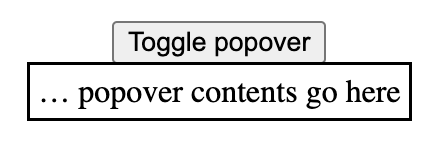
See it in action: Codepen: Positioning a popover with Floating UI.
In the Codepen, I also use some Floating UI config to position the popover from the left. In reality, you probably want to use more of Floating UI's features, to deal with things like resizing (see their tutorial).
Option 2: with Anchor Positioning
To make all of this a whole lot easier (and leave the maths to the browser), a new CSS specification is on the way: Anchor Positioning, Level 1. It exists so that:
a positioned element can size and position itself relative to one or more "anchor elements" elsewhere on the page
This, as they say, is rad, because it will let the browser do your sizing and positioning maths (even automatically- update 4 May 2024: looks like automatic anchoring was removed). It is also exciting, because it doesn't care where your elements are. They can be anywhere in your DOM. And, important for popovers, it also works across the top layer and root element.
Though popovers would get implicit anchoring, you can connect a popover with its invoker via CSS. To find out how all of this works in practice, I recommend Jhey Tompkins's great explainer on Chrome Developers (but note it's currently somewhat outdated, the editor's draft spec changed since that post, and has new editors). Roman Komarov covers his experiments and some interesting use cases in Future CSS: Anchor Positioning, and also wrote Anchor Positioning on 12 days of web.
The Anchor Positioning spec was recently updated, and is currently in the process of being implemented in browsers, hence the Option 1 in this article. But, excitingly, it is in the works. Chromium has already issued an intent to ship anchor positioning, and so did Mozilla/Gecko. The recent updates are still pending TAG review.
Wrapping up
So, in summary: if your popover needs to be anchored to something, like a button or a form field, you can't “just” use absolute positioning. Instead, you can use JavaScript (today), or, excitingly, anchor positioning (in the near-ish future, an Editor's Draft in CSS was published last year and a new version of that with new editors was released in April 2024.
List of updates
- 6 May 2024: Added that Gecko intents to ship anchor positioning.
- 4 May 2024: Reworded to reflect that the editor's draft of the anchor positioning spec was updated (as editor's drafts are), is now different and not yet passed TAG review.
Comments, likes & shares (94)
sim, Derek P. Collins, Ash, Michelle Barker, Roel Groeneveld, Nicolas Chevobbe, Mike Aparicio, James Basoo, Roma Komarov, Wolfr, Mikhail Shornikov, Thomas Broyer, carmya, Martín Baldassarre, Paul Mason, Heather Buchel, dovyden, Curtis Wilcox, Florian Geierstanger, Philip Zastrow, Cory :prami_pride_demi:, Vincent Valentin, Scott Kellum :typetura:, Jason Lawton :wordpress:, Nic, Maïa ????, s:mon, Patrick Grey, Andy Davies, Konnor Rogers, Masataka Yakura, Ollie Boermans, Zacky Ma :favicon:, Olliew, Henry, Baldur Bjarnason, Bruce B, Sonia P., Simon St.Laurent, Vale, Karpour, Matt Wilcox, Dennisn't, sidasa, micha, mariuz, Kaare Larsen, carlfeberhard@mastodon.social, Angela "Ge" Ricci and Max liked this
Jeroen Zwartepoorte, Manuel Matuzović, ~/j4v1, Nicolas Chevobbe, Roma Komarov, Wolfr, Bramus, Thomas Broyer, Bhupesh Singh, Ted M. Young, Ryan Trimble, Konnor Rogers, Henry, Olliew, dasplan, Axel Rauschmayer, The gallant knight, mgiraldo, GENKI and Jens Tangermann reposted this
Web platform concepts can sometimes be quite different, yet seem very similar. Semantics, behaviours and characteristics can be tricky to distinguish. In addition to the
<dialog>element, HTML now has apopoverattribute. This post goes into the differences between dialogs, popovers, overlays and disclosure widgets. We'll also look at what it means when an element is modal. All somewhat related concepts that can seem very similar. At least they did to me. Let's dive in!(If this is too long, I did a 40 minute talk version at All Day Hey and a 7 minute version at JS Nation (don't believe the ‘AI’ summary on that page))
In this post
popoveris available:You can use it in production (there is popover polyfill), but be sure to test it well, it is new and there may be issues with support, including accessibility support.
Introduction
The thing with words is that not everyone uses them the same everywhere. The words in this post are no different. As a long time contractor I changed environments on the regular—phrases changed when I worked in different teams, companies, countries and even years (see also older resources, like the WHATWG wiki on dialogs). Meanings change over time, also in the world in general… this is normal! But in the case of these components, interpretation differences can lead to bad user experience.
A lot of the concepts I'll discuss in this post originated in operating systems: see Apple's Human Interface Guidelines, Microsoft's “Win32” guidelines (old) and Controls for Windows apps (newer). If we compare those with patterns in ARIA Authoring Practices Guide, we'll find similarities. Some similarities are on the surface, they just look the same. Others are similar for users of assistive technologies: the ergonomics of some ARIA components are designed to be similar to the corresponding operating system ergonomics, for better or for worse.
But OS-level guidelines or ARIA Authoring Practices (APG) aren't the best place for web developers to look for implementation guidance. OS-level guidelines are for OS-es, APG is to demo how to use ARIA (not how well it is supported).
For clarity, throughout this post, I will refer to the concepts of dialog, modality and popovers as they exist on the web, in languages like HTML, CSS and ARIA (note: popovers don't exist yet, just as a proposal). My definitions are meant to align with the relevant web specifications, they may be slightly different from what is used in other places and in individual teams.
Below, we'll start with characteristics that components can have, like modality, light dismiss, top layer presence and backdrops. Then we'll talk about what we get when these characteristics are used together in a website or web app: dialogs, popovers, overlays and disclosures. Hopefully, when we discuss the characteristics in detail first, it is easier to distinguish the components themselves.
The characteristics
Modality / inertness
Some design systems have a component named “modal”, but modality is more of a characteristic than a component itself.
So what does it mean for an element to be modal? Basically, when a modal component is open, it is the only thing that is not inert. Only the modal content can be interacted with, the rest of the page or application is made inert. Inert content is content that users cannot interact with. It is only really there visually, but you cannot Tab to it, click it, scroll it or access the content via assistive technologies.
Elements that are not modal are called non-modal or modeless.
Not everyone likes modality—as a UI concept, they are very disruptive. Use the pattern sparsely, only when disrupting is very much necessary. If you want to ask the user “Are you sure you want to delete all that?”, go ahead and make it disruptive. If you want to promote your newsletter sign-up or advertising, the disruption is unlikely to be appreciated.
In terms of implementation, you will need to make everything except your modal element inert. The
<dialog>element (used withshowModal()) does this for and would be the best to use.If you cannot use
<dialog>or are looking at an older code base that doesn't, here's an example of distinguishing between modal and inert content:The gist of it is that one element is modal and everything else inert: unavailable to any user or technology. As today, not all users will be on a browser that supports
inert, best use theinertpolyfill. Withoutinertor its polyfill, you would need to addaria-hidden="true"to the content outside of the modal (to make it unavailable for assistive technologies) andtabindex="-1"to any interactive elements that are not in the modal.Just trapping focus in an element or adding a backdrop does not make it truly modal. With a focus trap, you only make the rest of the content unavailable via a keyboard. With a backdrop, you only make it unavailable visually.
Light vs explicit dismiss
Another aspect to consider is how users dismiss a component and whether that is affected by other elements: this can be via explicit dismiss or light dismiss.
With ‘explicit dismiss’, a component allows a user to dismiss it, for instance via a close button and the Escape key (when in doubt, best add both).
With ‘light dismiss’, a component disappears automatically on certain conditions, like when users scroll, interact with something else or click outside of the component. Light dismiss doesn't happen when the user
Tabs out of the element by default (but developers can add it if needed, see the discussion in openui/open-ui#415 for more details).Light dismiss is something we can already build in JavaScript today, a lot of websites have components that light dismiss. But with the
popoverattribute, the browser would do it for you (if you usepopover="auto").Top layer presence
By default, if multiple elements are positioned in the same location, they are painted by the browser in DOM order. The element that is first in the DOM is painted first, each subsequent element on top of the previous and the last one in the DOM is painted last, at the top. With the
z-indexproperty in CSS you can deviate from the default on a case by case basis. You basically decide your own layer order. This feature is defined in an appendix to CSS 2.1 called the Elaborate description of Stacking Contexts.The top layer (as of July 2023, part of CSS's Positioned Layout Module, Level 4) is painted after the painting process described above, and the stuff within it is therefore on top of everything else. The top layer is not new in the web platform, but the ability for developers to promote elements to it is. Web pages have just one top layer. Within the top layer, elements are painted in the order they are added to the top layer (so shuffling them around involves adding/readding them).
Sometimes, developers add components just before the closing
</body>tag to try and ensure that they are painted above other things (given nothing has az-index> 0). The top layer introduces a new way to allow elements to be on top of everything else, regardless of where they are in the DOM or theirz-index.Another benefit of the top layer has to do with overflow. If your popup is in an element with
overflow: hidden, that will cut it off. If it is promoted to the top layer, no cutting off will take place.A downside of an element being in the top layer, is that it can't be positioned relative to things in the main document. I believe this is something modal dialogs usually don't need, but popovers would need a lot of the time. See also: Positioning anchored popovers.
Backdrop
In some cases, it makes sense for elements to have a backdrop. A backdrop usually serves as a visual cue that conveys content behind it is unavailable for interactions. Sometimes, it can be used as a way to help the user focus.
The
::backdroppseudo element can be applied to top layer elements. It allows you to style the backdrop in any way you want.Constrained focus
Sometimes focus is constrained to (or trapped in) a specific element, meaning that if focus is in this element and you press
TaborShift + Tab, you will never go to elements outside of the element. This characteristic is also known as a “keyboard focus trap”. It is a side-effect of making everything else inert (which<dialog>does for you). (Note: trapping focus in an element does not make that element modal, but if it is truly modal, focus cannot be moved outside of it, because nothing outside of it is focusable).Focus traps should be temporary until the element it applies to is closed or dismissed (they would fail WCAG 2.1.2 if it is not temporary and has no way to escape with a keyboard).
Keyboard dismissable/collapsible
If content can be dismissed or collapsed, users should also be able to dismiss or collapse it with just a keyboard.
When content can be dismissed, a common pattern is that pressing the
Escapekey dismisses the content. Usually dismissal is restricted to happen only when the user is focused on something inside of the component to close. If there are multiple things to close, like with nested components, you would pressEscapemultiple times and closing would happen component by component from most inner to most outer element.When content can be collapsed, keyboard users should be able to use the same button that mouse users click to collapse content.
The main patterns
Let's look at some common patterns and how to distinguish between them.
Dialogs
What is it
A dialog is a component in a web page or app that usually contains an action or some task to perform (see:
<dialog>in HTML specification). It is usually not part of the natural flow of other content, for that reason it can (and usually does) cover other content. MDN describes it as a “subwindow”, ARIA Authoring Practices defines it as a “window overlaid on either the primary window or another dialog window”.A dialog is often displayed when users need to be made aware of something or when they need to choose. Do you want to continue, yes or no? If you want to open a new file, what shall we do with your current file, save or delete? How do you want to crop this image, where is the hot spot?
confirm()Canonically, dialogs are a lot like
window.confirm(),window.alert()andwindow.prompt(), which the HTML specification lists under ‘simple dialogs’. But unlike these browser built-in dialogs, custom dialogs offer more flexibility—you get to put whichever content and styling you want inside of them.Dialogs have a role of
dialog, which the browser will assign automatically for you when you use the<dialog>element.You can also create dialogs with ARIA: apply
role="dialog"to an element (like<div>). If it is a modal dialog, addaria-modal="true"when it shows, and remove it when it is dismissed. You will need to do all the modality work yourself (focus trap, making rest of content inert, etc). Note:aria-modalis not supported in IE11 (which may still be in use among your assistive technology users), there are issues witharia-modalin VoiceOver and it seems unsupported in Narrator.You can put a form with
method="dialog"in a dialog. This form will close its dialog when submitted.Examples
Characteristics
Dialogs can be modal (
<dialog>when shown withdialog.showModal()) or non modal (<dialog>when shown withdialog.show()). To avoid quirks, you will want to choose which of the two your dialog is, and only call one of these methods per dialog.When
<dialog>s are modal, the browser will treat the content outside of the dialog as inert, and prevent keyboard focus from reaching web content outside of the dialog (if you userole="dialog", you have to do this yourself). If a<dialog>is not modal, the other content is not treated as inert. This makes modal dialogs a lot more disruptive, so use them only when you have to. You usually don't want to interrupt or disrupt a user's flow.Dialogs are in the top layer only if they are modal (and only if the
<dialog>element is used; other elements withrole="dialog"will not go to the top layer).Dialogs must have an accessible name (see WAI-ARIA 1.2,
dialogrole). Associate your dialog with the visible heading or message (if brief) usingaria-labelledbyon the<dialog>/<div role="dialog">. You could also usearia-label, but associating with visible text is ideal, because it creates parity between what folks see and what assistive tech call stuff.WAI-ARIA specifies that when you're using
role="dialog", you should include at least one focusable element and move focus to one of the focusable elements when it opens.Browsers will close modal dialogs when users press
Escape. Non-modal dialogs don't get this default behaviour, developers can add it where it makes sense.Alert dialogs
WAI-ARIA defines a specific type of dialog, which is called “alert dialog”. It is meant for dialogs that contain a brief, important message. Their function is to alert the user—the browser will do that by firing a system alert event to accessibility APIs. They are the ARIA-equivalent of the browser
alert()dialogs we discussed above.Examples
Command + W, the shortcut to close the current tab. An alert dialog appears to ask if you really want to “Leave” now or perhaps “Save your changes” first.Characteristics
Alert dialogs are always modal and have their focus trapped. They also require an accessible name. Like with dialogs, if there is a visible title, associate the title's
idwith the alert dialog'saria-labelledbyattribute. If not,aria-labelcan also be added to an alert dialog.Popovers
What is it
Popover is a set of behaviors that can be added to any element through the
popoverattribute (liketabindexorcontenteditable). It is specified in HTML and there is a polyfill (why is it an attribute and not an element?).The
popoverattribute is meant for UI components that are:As opposed to
<dialog>s, apopoverdoesn't come with a built-in role (this is partly why it is an attribute and not an element), you pick your own role. It can take on any role that makes sense, or none at all. Sometimes popovers could be (modeless) dialogs, in that case you could use<dialog popover>.The popover attribute is planned to allow for two values, each of which give a slightly different set of characteristics:
popover=auto: light dismisses; when it opens, it force-closes other popovers and hints (except its anchestors); it or its anchestor would usually receive focuspopover=manual: explicit dismiss (via timer, close button or some other script); when it opens, it does not force close anything(More types may follow)
Full screen content also forces popovers of the “auto” type to close.
Examples
An example of a popover is the listbox that shows when a select is opened (conceptually for
<select>and literally for<selectmenu>as it is currently implemented in Chromium).These are some common examples of components with popover behaviours:
role="menu"There are also popovers that users need to dismiss or that automatically dismiss (like toasts).
So yes, there are lots of different UI patterns that can have “popover” behaviour as a requirement. This is why popover is proposed not as one HTML element, but as an attribute that is meant to be used with an HTML and/or
rolethat is most suitable for that pattern. For an action menu, that's a<div role="menu" popover>. A tooltip could be<div role="tooltip" popover>(depending on context and what it is). In any case: each of these patterns has its own UX expectations.Twitter's alternative text feature is another example of a popover (implementation has accessibility issues)
Characteristics
Popovers are not modal. This is another major difference between popovers and dialogs. For this reason, it will be rare (but not impossible) for them to have a backdrop or focus trap.
Popovers can have ‘light dismiss’ behaviour, meaning they close by themselves, except when they are of the “manual” type. Manual popovers could be things like a “toast” notification that is dismissed via a timer or manual button.
Popovers, even if rare, can have a backdrop, which obscures content outside of it. This does not make the popover modal—as mentioned, popovers are non-modal. My recommendation is that if you're considering adding a backdrop to your popover, to also consider ”oh wait, maybe this is a modal dialog instead”. It might well be. Having said that, there is a handful of use cases for popovers with backdrops that are not modal.
Popovers can have focus trapped in them, for instance in complex widgets where you want to avoid that people accidentally tab out of the widget. A focus trap does not make a popover modal, as users can still access everything else on the page, it is just something that can improve usability in certain cases.
Popovers also can be opened, closed and toggled without JavaScript: with a
<button>in HTML and thepopovertargetattribute that points to the popover's ID, the browser can take care of showing, hiding and toggling.An example:
In this case, the dialog is turned into a popover with the
popoverattribute, which adds the popover behaviours. The button will toggle the popover, because the popover's ID matches the button'spopovertargetattribute.The button can also be set op to just show or just hide, in this case use
popovertargetactionwithshoworhide(thetogglevalue exists too, and is the default).To open the popover when the page loads, set
defaultopenon the popover. This is useful for teaching UI.To move focus to a popover when it opens, set the
autofocusattribute on the popover itself, or an element within it. Normally, this attribute sets focus on page load. But if it is used on or within popovers, it only sets focus when the popover is shown (this can be on page load ifdefaultopenis used).To position a popover, a very exciting proposal called CSS Anchor Positioning is in the works. As far as I understand it today, it would allow us popovers that automagically position in the most suitable place, avoiding collisions with the edge of the window. A bit like the Popper library does today, but built into the browser.
If focus management, positioning, JavaScript-less toggling and light dismiss weren't enough, there is also a proposal for popovers to be transitionable using CSS, between
[popover]and[popover]:popover-open(of course, you'll want to adhere to your users' motion settings using prefers-reduced-motion).Overlays
Overlays are more of a characteristic than a component on their own. Often, when developers talk about overlays, they mean dialogs that are modal. In a literal sense, overlays are things that lay on top of other things. Popovers and dialogs can both overlay other things.
Disclosure widgets
What are they
Elements that show and hide things are often called ‘disclosure widget’, as Adrian Roselli describes in his post about various kinds popover-like controls. Almost everything in this post is a subset of disclosure widgets… as in, they are pretty much all things that can be shown and hidden. Adrian describes disclosure widgets in more detail in his post Disclosure widgets.
Disclosure widgets exist in HTML as
<details>/<summary>, but can also be built with<div>and the appropriate ARIA attributes. This isn't entirely the same. In Details/summary, again, Scott O'Hara suggests that this is more consistent:But, he adds, your ARIA disclosure widget won't have some of the features
<details>/<summary>brings, like in-page search (Chromium triggers a<details>'s elementopenstate when an in-page search query is found in its content).There isn't a specific
rolefor disclosure widgets, but there is thearia-expandedattribute for triggers andaria-controlsto connect triggers with the element they trigger. When using<details/summary,<dialog>and (in the future)popover, browsers take care of setting up these kinds of accessibility properties for you.Examples
Characteristics
There are a lot of different things that qualify as disclosure widgets. What they have in common is that they consist of two parts: one is a triggering element, the other is the triggered element.
Disclosure widgets do not trap focus, have no backdrops and are not modal. They are usually dismissed or collapsed with their trigger or a close-specific button.
FAQs
Where should focus move?
When a modal dialog opens, keyboard focus should move to the default action. If there's a form, it is probably the first form field. If there is multiple buttons, it could be the one that is least destructive, like if there's “Cancel” and “Confirm” button, a sensible default would be “Cancel”.
When a modal dialog closes: if the user triggered it, move focus back to the trigger. The browser does this automatically for
<dialog>s. For popovers, it only does in cases “where it makes sense” (see the Popover Explainer). If the user did not trigger it, move it to an appropriate position earlier in the DOM.For all other components (non-modal dialogs, popovers or disclosures), expected focus management differs case by case. The Popover Explainer's section on focus describes some of such cases.
Are all popovers dialogs?
Let's distinguish between three things we could mean by “dialog”:
<dialog>element, an element with a built-in dialog role and dialog behaviours and possiblities (like, you can runshow()andshowModal()methods on it)role="dialog": theroleattribute with thedialogvalue gives this a dialog role, but other than that, it comes with nothing, you would have to add your own behaviours to itSometimes, popovers use the
<dialog>element or elements with arole="dialog". But not all of them. For instance, listboxes, menus, tooltips, grids, lists of links could all be components that require popover behaviours, but not thedialogrole or the<dialog>element.Are all dialogs popovers?
No, only non-modal dialogs are conceptually popovers (you can implement them with
<dialog>/role="dialog"today). When the popover feature is stable and well-supported in browsers, it makes sense to use<dialog popover>, and would be the way to go if you want your non-modal dialog to appear in the top layer and leverage browser-provided light dismiss. In contrast, modal dialogs don't share the set of characteristics popovers have.I'm building an X, should it be modal?
It depends. The question to ask is: is this component something that is the only thing your user may pay attention when it is open?
Country selector
You are building a check-out form for your online shop. In one of the fields, the user need to select a country. They eventually have to, because it is a required field. Still, while they select the country, they may scroll to something else, or decide to pop to the credit card stuff first. Maybe they need to read the label to check if you need country of birth or residence. This is best non-modal, because the user may want to look at other things.
Definition popover
You are building a toggle tip that can show definitions for complex words in your content. When the definition icon is clicked, it opens. Your user may want to scroll away or read other content or do other stuff. It is best to keep this non-modal.
Game over
The user has played some levels of your game, but they've lost and are now “game over”. They can't continue. It's really over and there's a dialog to tell them. There's no other thing they can interact with than this dialog. Modal it is.
Tracking consent
You are building a dialog that asks users if they want to agree that you track them. Your visitor is in an area where the law makes it illegal for you to do so without permission. In this case, there is no point in interacting with anything but the permission screen, so it would make sense to make it modal.
Fly-out navigation
You are building a “fly-out navigation”. It opens on the side of the viewport and is positioned on top of other content while it is open. When the user opens it, is this the only thing they want to see? This one is tricky, I feel modal could work, non-modal could work too.
Summing up / conclusions
OK, so, in summary: modality of a component is a state in which only that component can be used. When something is modal, everything else is inert: blocked from access in any way, unfocusable and usually obscured with a backdrop. Making something modal is a substantial decision, it should be used sparingly. Dialogs can be modal or non-modal (also called modeless).
popovers are being proposed by Open UI as a new way to build non-modal dialogs with a specific set of behaviours and characteristics, like top layer presence, JS-less toggleability and browser-provided light dismiss. Unlike<dialog>, apopoverdoes not have a built-in role: as a developer, you can add thepopoverattribute to the semantically most relevant element (see my other post on which role to use with your popover).Most of the UI patterns that are mentioned in this post fall under the definition of overlays: content that can lay on top of other content (all dialogs and popovers). A lot also fall under the definition of disclosures, when they are patterns where one thing opens another thing.
That's all! Yes, I wrote this whole long post about definitions, only to conclude a lot of these are indeed different words for the same patterns. But there's nuance. Hopefully this post has helped you more clearly distinguish some of these patterns.
Further reading
- MDN -
- WAI-ARIA: role=dialog
- Use the dialog element (reasonably) and Having an open dialog by Scott O'Hara on using
- Stop using “pop-up” by Adrian Roselli, which offers clear distinction between various popup-like patterns
- Open UI issue 581: [popup] Add further clarity that popup is not (presently?) for modal dialogs
- Inert | The CSS Podcast with Una Kravets and Adam Argyle
List of updates<dialog><dialog>- 17 September 2024: Added video at All Day Hey, the most recent version of my popover talk.
- 18 September 2023: Updated support info to say stable Safari 17 and include links to post about possible roles and post about positioning popovers.
- 18 August 2023: Clarified non-modal dialogs with backdrops are rare but a possibility.
- 16 August 2023: Updated support info to say available in Chrome/Edge stable and Firefox behind a flag
- 25 July 2023: Updated link to top layer spec, which moved from WHATWG's Full Screen API Living Standard to W3C's CSS Positioned Layout Module Level 4
- 20 April 2023: Explained answer to “are all popovers dialogs?” question better. Updated title to no longer include “modality”.
- 19 April 2023: Updated “:open” to “:popoveropen”
- 18 April 2023: Improved intro to work better for today. Fixed popovertarget attribute description to match spec. Added a link to the HTML specification instead of to the PR. Added Safari Technology Preview info.
Many thanks to Jonathan Neal, Eric Eggert, Una Kravets, Adrian Roselli and Scott O'Hara for providing feedback on earlier drafts of this post, to Mason Freed for answering questions and to Mu-An Chiou and Kristján Oddsson for enlightening me on some aspects of this. Any errors in the post are on me, not them (obviously :-)).With the new
popoverattribute in HTML, we can put elements in the top layer and allow them to disappear with ‘light dismiss’. This attribute adds behaviour, not semantics: you're supposed to add your own role when it makes sense. In this post, we'll look at different roles that could make sense for your popover-behaved elements.See also: Hidde's talk on popovers, and other posts about popover accessibility, positioning popovers and the difference with dialogs and other components.
Semantics?
Accessibility semantics are roles, states and properties that are exposed by by browsers for many HTML features, and then passed on to assistive technologies.
The ‘role’ of an element establishes what kind of element it is. Roles are built-in (‘implicit’) to some elements: a
h1has theheadingrole, anahas thelinkrole and so forth. Roles can also be added with aroleattribute explicitly. For some roles, that is the only way: there exists no corresponding element. If there's an element and a value for ‘role’, it doesn't really matter for end users which you use, but generally you don't want to overwrite implicit role. As mentioned, your user's browser or assistive technology may use the role to provide a UI. For instance, a screenreader may generate a list of links or headings, a reader mode may render list items with bullets.Popovers have no default role
Whenever we add the
popoverattribute to an element, it continues to be that element semantically, just with some specific behaviours. Menus remain menus, dialogs remain dialogs, and so on. The popover attribute does not change an element's role. It's a bit like thecontenteditableattribute in that sense. In addition to choosing that you want the popover behaviour, you need to decide if you add a role and, if so, which role.The most basic example of a popover:
This is how it works:
divwill be invisible on page load, because it has apopoverattribute and popovers are closed on page load by defaultdivwill also be toggleable via the button, as the button points to thediv's ID in itspopovertargetattributePotential roles for your popover
Let's now look at common roles for popovers: menu, dialog and listbox, and consider what to do about tooltips.
Menus: the
menuroleLet's start with menus. The
menurole is what you'd use when your component offers a list of choices to the user, specifically choices that are actions. (Note:menuis not for a list of links, like a navigation, it is only for a list of actions).A menu with popover behaviour can be built with a
menurole:In a menu widget, there are also some keyboard and focus expectations. For instance, that users can use their arrow keys to cycle through the different buttons. As a developer, this is something you'd add with JavaScript yourself. The first button is focused when it opens (hence
autofocus), the second and after would get focused moved to them when they're the next one and an arrow key is pressed (hencetabindex="-1": this takes the buttons out of tab order, because you make them reachable with arrow keys instead).(Note: The
menurole is not to be confused with themenuelement, which has alistrole and is “a semantic alternative to<ul>”)Examples of when you would use
role="menu":menufor each author with some actions (each action has amenuitemrole)menuitems._See also: Marco Zehe on the
menurole and “Menu control type” in Windows Accessibility Features documentationDialogs: the
dialogroleA dialog role is what you add when an element is like a smaller window on top of the main web page. It can block interaction with the rest of the page or leave the rest of the page as it is, either way it is somewhat separate from the page, both in purpose and visually.
The
<dialog>element implicitly has adialogrole, and comes with dialog methods and behaviours (like you can runelement.showModal()to show it as a modal). You can also add the dialog role manually withrole="dialog", but then you have to add the behaviours manually too.A dialog with popover behaviour can be built like this:
You see, there's no explicit role attribute, because the
dialogrole comes with the<dialog>element.If not using a button with
popovertarget, you could open this dialog with script using theshowPopover()method that works on any element that is a popover (by having apopoverattribute present).Note: because this specific popover example uses the
<dialog>element, two other methods are also available (through the HTMLDialogElement):show()andshowModal(). They have slightly different behaviours thanshowPopover()would. I recommend against using these two methods on dialogs that are popovers. In other words, if you're inclined to use them, you probably don't want thepopoverattribute, as that attribute's purpose would basically be defeated byshow()/showModal()(also, in some cases you might get a console error if you try to runshowModal()on a popover). Popover is really for non-modal dialogs; see also my post on dialogs vs popovers).Other examples of elements that could have popover behaviour and a
dialogrole are:role="menu", a navigation with links is semantically different from a menu with buttons)Listboxes / autocompletes: the
listboxroleA listbox is for elements where the user gets to choose from one or more options, like a
<select>. They can exist as single select (user can select one option) or multi select (user can select multiple options).Listboxes are often part of an autocomplete or combobox widget, they are the part that contains the actual options. Like in this example:
For instance, in the following example, there is a component that pops over the page's content. It contains filter and sorting buttons, as well as a listbox with actual options. The element with
popoveris probably a dialog (and you could give it adialogrole), while the element that contains options would need a role oflistbox:Tooltips/toggletips:
tooltip(with caveats) ordialogIn their simplest form, tooltips are like the
titleelement in HTML, that browers display on hover. These browser built-in tooltips are problematic in many ways, including that in most browsers, there is no way to get to the contents oftitlewith just a keyboard. Let's call them “plain text tooltips”. They are often customised by developers, for instance to change their visual styles (currently from scratch, maybe via CSS in the future).Sometimes they are also found underneath input fields, to explain what that input does or what is expected, like some of Scott O'Hara's custom tooltips examples.
These custom “plain text tooltips” are what the
tooltiprole seems to be meant for. Note thatrole="tooltip"doesn't do much in terms of screen reader announcements as Sarah Higley explains in Tooltips in the time of WCAG 2.1, though there are cases where ARIA-provided labels and descriptions don't work across browsers and assistive technologies without the role (if they aren't interactive,iframeorimgelements and also don't have a landmark or widget role). What is useful for accessibility of that kind of tooltip, going beyond roles for a moment: usearia-describedbyto link up a tooltip that describes a thing with that thing, and never place essential content in them. Also ensure that the tooltip (1) stays visible when its content is hovered, (2) is dismissable (with Escape) and (3) persists until hover/focus removed, dismissed or irrelevant (all required to meet WCAG 1.4.13).My advice would be that whenever tooltips contain more than just plain text, a non-modal
dialogwould be more appropriate (even if elements withtooltiprole were apparently meant to also allow for interactive elements). Non-modal dialog tooltips could contain semantic elements (like a heading) or interactive elements (like a link or a button). In most cases it would be best to display them on click instead of hover + focus, in which case they are really “toggletips”. Of course, if there is interactive content, that also means you'll want to consider focus order.Conclusion
In this post, we've covered some of the most common semantics you could choose to use with the
List of updatespopoverbehaviour:menu,dialogandlistbox, plus looked at usingtooltipfor plain text tooltips ordialogfor tooltips that contain anything more than plain text. Are you building components that don't really fall into any of these categories? I'm curious to learn more, slide in my DMs or email!- 30 April 2024: Reworded the bit about semantics a bit to explain roles as an example of various accessibility semantics.
- 28 April 2024: Removed note on browser support, as popover is now supported in latest versions of all major browsers.
- 17 May 2023: Explained attributes in menu example
- 16 May 2023: Changed example that used <menu> to use role=menu
Thanks to Eric Eggert, Steve Faulkner and Mason Freed for feedback on earlier drafts and Adrian Roselli for pointing out a mistake in an earlier version.@hdv Are there any kind of polyfills for popovers that you would recommend? We could really use them right now, but browser coverage isn't good enough unfortunately.
@bastianallgeier Yes, Oddbird made this one https://github.com/oddbird/popover-polyfill
(there are some caveats listed, and it won't put it actually in the top layer as that can't be faked)
GitHub - oddbird/popover-polyfill@hdv Damn, that would have been my only requirement. But I think it would only be possible to polyfill this with a dialog somehow, right? There's no other top layer element so far afaik. The thing that is getting us in trouble here are container queries. As much as I love them, their stacking context is giving us a really hard time.
@bastianallgeier yes, the only way would be a modal <dialog>, but then it's a modal dialog (while popover is ~ for nonmodal dialogs) (or full screen, but then it's, ehm… full screen)
DevOps is Bullsh*t – Some thoughts on why the practice hasn’t lived up to its potential.
Do Clients Need To Know How Their Website Works? – Tips for focusing on the most important aspects of a client’s website.
Negative-Space Typography – Controlling the space between text styles is as important as differentiating the styles themselves.
An Introduction to
@scopein CSS – Explore the benefits and potential use cases of this CSS specification.Four Exclusive Demos: Slideshows & Typographic Animations – Demos that range from image slideshows to on-scroll typography and hover effects.
BentoGrids – Check out this curated collection of tile-based grid layouts.
The Bright Side of an Increasingly Homogeneous Web – A look at the positive effects of a more consolidated web.
Comic Mono – Download a copy of this legible monospaced font.
The Gotchas of CSS Nesting – Some common problems that browsers have with the practice.
Stack Overflow Developer Survey – Developers share how they learn and level up, which tools they’re using, and which ones they want.
The 30 Best Branding Identity Mockup Templates – There’s something for every project you’re passionate about in this beautiful collection.
Kablammo – An extraordinary variable font from…outer space?
The Continuing Tragedy of CSS – Has CSS become too complicated?
2023 Logo Trend Report – Taking a look at a year of ideas, symbols, and AI.
Why Niche WordPress Plugins May Be the Best Option – When it comes to plugins, quality is more important than quantity.
Positioning Anchored Popovers – Review the available options for positioning popover elements.
48 Laws, Rules, and Principles of Web Development – A handy list of laws, rules, and principles related to web and software development.
HeadstartWP – Check out this free, open-source tool for creating headless WordPress websites.
Automattic Donates €20,000 to Fund Next Phase of Drupal Gutenberg Development – Using the Block Editor in Drupal gets a boost.
Source link
Related
@hdv @tylersticka
Mostly, about how to banush them to the. It field in webpages.
@sil Yay, happy to read that! Anchor positioning support situation is about to improve I think