With the new popover attribute in HTML, we can put elements in the top layer and allow them to disappear with ‘light dismiss’. This attribute adds behaviour, not semantics: you're supposed to add your own role when it makes sense. In this post, we'll look at different roles that could make sense for your popover-behaved elements.
See also: Hidde's talk on popovers, and other posts about popover accessibility, positioning popovers and the difference with dialogs and other components.
Semantics?#heading-1
Accessibility semantics are roles, states and properties that are exposed by by browsers for many HTML features, and then passed on to assistive technologies.
The ‘role’ of an element establishes what kind of element it is. Roles are built-in (‘implicit’) to some elements: a h1 has the heading role, an a has the link role and so forth. Roles can also be added with a role attribute explicitly. For some roles, that is the only way: there exists no corresponding element. If there's an element and a value for ‘role’, it doesn't really matter for end users which you use, but generally you don't want to overwrite implicit role. As mentioned, your user's browser or assistive technology may use the role to provide a UI. For instance, a screenreader may generate a list of links or headings, a reader mode may render list items with bullets.
Popovers have no default role#heading-2
Whenever we add the popover attribute to an element, it continues to be that element semantically, just with some specific behaviours. Menus remain menus, dialogs remain dialogs, and so on. The popover attribute does not change an element's role. It's a bit like the contenteditable attribute in that sense. In addition to choosing that you want the popover behaviour, you need to decide if you add a role and, if so, which role.
The most basic example of a popover:
<button
  type="button"
  popovertarget="my-popover">
    Toggle popover
</button>
<div popover id="my-popover">
  ...
</div>
This is how it works:
- the
divwill be invisible on page load, because it has apopoverattribute and popovers are closed on page load by default - the
divwill also be toggleable via the button, as the button points to thediv's ID in itspopovertargetattribute
Potential roles for your popover#heading-3
Let's now look at common roles for popovers: menu, dialog and listbox, and consider what to do about tooltips.
Menus: the menu role
Let's start with menus. The menu role is what you'd use when your component offers a list of choices to the user, specifically choices that are actions. (Note: menu is not for a list of links, like a navigation, it is only for a list of actions).
A menu with popover behaviour can be built with a menu role:
<button
  type="button"
  popovertarget="my-menu">
    Toggle menu
</button>
<div role="menu" popover id="my-menu">
    <button
      onclick="doThing()"
      role="menuitem"
      tabindex="-1"
      autofocus>Do thing</button>
    <button
      onclick="doAnotherThing()"
      role="menuitem"
      tabindex="-1">Do another thing</button>
  …
</div>
In a menu widget, there are also some keyboard and focus expectations. For instance, that users can use their arrow keys to cycle through the different buttons. As a developer, this is something you'd add with JavaScript yourself. The first button is focused when it opens (hence autofocus), the second and after would get focused moved to them when they're the next one and an arrow key is pressed (hence tabindex="-1": this takes the buttons out of tab order, because you make them reachable with arrow keys instead).
(Note: The menu role is not to be confused with the menu element, which has a list role and is “a semantic alternative to <ul>”)
Examples of when you would use role="menu":
 Your CMS manages a list of authors. The user can open a
 menu for each author with some actions (each action has a menuitem role)
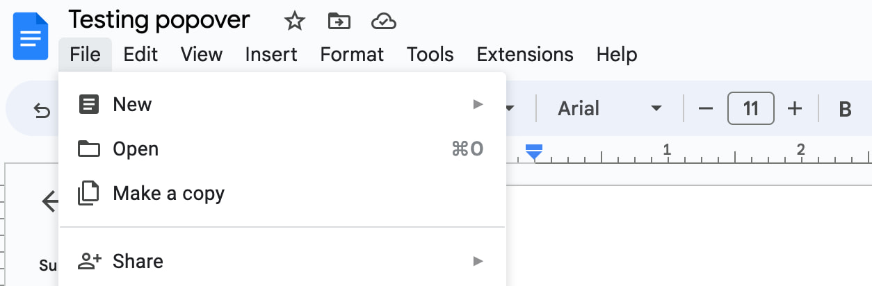 You're building a word processor. The “File” menu is a menu, the options (New, Open, etc) are
 menuitems._
See also: Marco Zehe on the menu role and “Menu control type” in Windows Accessibility Features documentation
Dialogs: the dialog role
A dialog role is what you add when an element is like a smaller window on top of the main web page. It can block interaction with the rest of the page or leave the rest of the page as it is, either way it is somewhat separate from the page, both in purpose and visually.
The <dialog> element implicitly has a dialog role, and comes with dialog methods and behaviours (like you can run element.showModal() to show it as a modal). You can also add the dialog role manually with role="dialog", but then you have to add the behaviours manually too.
A dialog with popover behaviour can be built like this:
<button
  type="button"
  popovertarget="my-dialog">
    Toggle dialog
</button>
<dialog id="my-dialog" popover>
  ...
</dialog>
You see, there's no explicit role attribute, because the dialog role comes with the <dialog> element.
If not using a button with popovertarget, you could open this dialog with script using the showPopover() method that works on any element that is a popover (by having a popover attribute present).
Note: because this specific popover example uses the <dialog> element, two other methods are also available (through the HTMLDialogElement): show() and showModal(). They have slightly different behaviours than showPopover() would. I recommend against using these two methods on dialogs that are popovers. In other words, if you're inclined to use them, you probably don't want the popover attribute, as that attribute's purpose would basically be defeated by show()/showModal() (also, in some cases you might get a console error if you try to run showModal() on a popover). Popover is really for non-modal dialogs; see also my post on dialogs vs popovers).
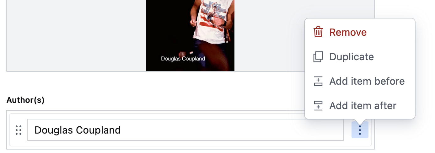
Other examples of elements that could have popover behaviour and a dialog role are:
- teaching UI
- pickers, like for a date, multiple dates, prices
- “mega navs” and other large navigational structures that cover a lot of the page (note: these should not use
role="menu", a navigation with links is semantically different from a menu with buttons)
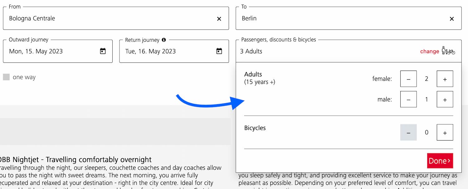 A dialog that allows the user to specify their travel group and amount of bicycles
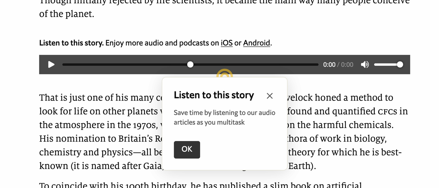 A dialog that teaches what the audio player is for
 A “meganav” that covers other content (note: this is a dialog, not a menu)
Listboxes / autocompletes: the listbox role
A listbox is for elements where the user gets to choose from one or more options, like a <select>. They can exist as single select (user can select one option) or multi select (user can select multiple options).
Listboxes are often part of an autocomplete or combobox widget, they are the part that contains the actual options. Like in this example:
 Select menus also use listboxes to allow users to pick an option from a list
For instance, in the following example, there is a component that pops over the page's content. It contains filter and sorting buttons, as well as a listbox with actual options. The element with popover is probably a dialog (and you could give it a dialog role), while the element that contains options would need a role of listbox:
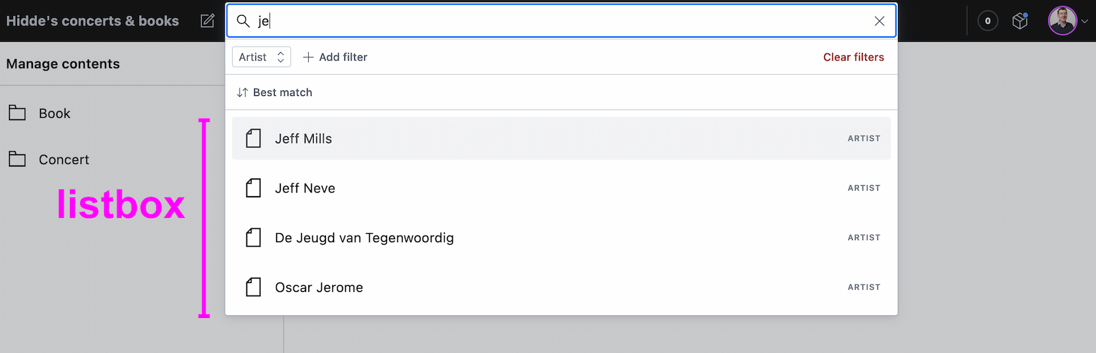 A listbox as part of a combobox
Tooltips/toggletips: tooltip (with caveats) or dialog
In their simplest form, tooltips are like the title element in HTML, that browers display on hover. These browser built-in tooltips are problematic in many ways, including that in most browsers, there is no way to get to the contents of title with just a keyboard. Let's call them “plain text tooltips”. They are often customised by developers, for instance to change their visual styles (currently from scratch, maybe via CSS in the future).
 Plain text tooltips that display on hover or focus of a triggering element, which they describe
Sometimes they are also found underneath input fields, to explain what that input does or what is expected, like some of Scott O'Hara's custom tooltips examples.
These custom “plain text tooltips” are what the tooltip role seems to be meant for. Note that role="tooltip" doesn't do much in terms of screen reader announcements as Sarah Higley explains in Tooltips in the time of WCAG 2.1, though there are cases where ARIA-provided labels and descriptions don't work across browsers and assistive technologies without the role (if they aren't interactive, iframe or img elements and also don't have a landmark or widget role). What is useful for accessibility of that kind of tooltip, going beyond roles for a moment: use aria-describedby to link up a tooltip that describes a thing with that thing, and never place essential content in them. Also ensure that the tooltip (1) stays visible when its content is hovered, (2) is dismissable (with Escape) and (3) persists until hover/focus removed, dismissed or irrelevant (all required to meet WCAG 1.4.13).
My advice would be that whenever tooltips contain more than just plain text, a non-modal dialog would be more appropriate (even if elements with tooltip role were apparently meant to also allow for interactive elements). Non-modal dialog tooltips could contain semantic elements (like a heading) or interactive elements (like a link or a button). In most cases it would be best to display them on click instead of hover + focus, in which case they are really “toggletips”. Of course, if there is interactive content, that also means you'll want to consider focus order.
Conclusion#heading-4
In this post, we've covered some of the most common semantics you could choose to use with the popover behaviour: menu, dialog and listbox, plus looked at using tooltip for plain text tooltips or dialog for tooltips that contain anything more than plain text. Are you building components that don't really fall into any of these categories? I'm curious to learn more, slide in my DMs or email!
List of updates
- 30 April 2024: Reworded the bit about semantics a bit to explain roles as an example of various accessibility semantics.
- 28 April 2024: Removed note on browser support, as popover is now supported in latest versions of all major browsers.
- 17 May 2023: Explained attributes in menu example
- 16 May 2023: Changed example that used <menu> to use role=menu
Comments, likes & shares (103)
Kevin Bauer, Taiyo Totsuka, Ryan Trimble, John Kemp-Cruz, Steven Bassett, Reimar, Ryan DeBeasi, Elly Loel ✨🌱, Chris Burnell, Apple Annie :prami:, Ryan Randall :OpenAccess: :hc:, David Díaz, Adam Stoddard, derek :prami:, Mike-麥-Mai.html 😎, Thomas Beduneau, Vincent Valentin, meduz', Jon, Markus Günther, Kai, maddesigns, Jeff, Martín Baldassarre, Tyler Sticka, Lars Laade, Michelle Barker, Léonie Watson, Jw, Pratik Patel, Jeffrey Yasskin, Timo Tijhof, Scott Jehl, Joe Lanman, Patrick Fulton, Desiree, Evil Jim O’Donnell, matti, Apple Annie :prami:, Mandaris, Noam V., Matthias Ott, McNeely, Vincent Valentin, Sara Soueidan, Roderick Gadellaa, supersole, Html_Entities, Tyler Sticka, GENKI, TonySpegel, Johannes Odland and Veerle liked this
handlerug, Taiyo Totsuka, Steve Faulkner, keithamus, Eric Eggert, Ryan Trimble, Ben Myers 🦖, Steven Bassett, vidak, Adrian Cochrane, Elly Loel ✨🌱, Fronteers, Apple Annie :prami:, Mike-麥-Mai.html 😎, Thomas Beduneau, Florian Schroiff, Jon, Lene Saile, Thomas Steiner :chrome:, Markus Günther, Bhupesh Singh, Tyler Sticka, Léonie Watson, Pratik Patel, Gustav Hansen, aris, Jeroen Zwartepoorte, Sophie, Adrian Cochrane, Fynn Becker, Apple Annie :prami:, Robb, Sasha Chudesnov, Rob Whittaker :thoughtbot:, Patrick Brosset, Bruce Lawson ✅ (quiet time), Jens Grochtdreis, Fynn Becker and Helen Chong :v_lesbian: :v_enby: reposted this
@hdv I am confused by this:
“A menu with popover behaviour can be built with the <menu> element, which implicitly has the menu role:”
The `<menu>` element has no such mapping (it is a list):
https://www.w3.org/TR/html-aam-1.0/#el-menu
You can confirm that in dev tools as well.
I stopped reading there because I want to make sure I am not misunderstanding something critical here. Did you mean to apply a `menu` role and just mistakenly assert that `<menu>` has the unrelated `menu` role?
@aardrian @hdv I think that’s what happened and I didn’t catch it. Darn naming two different things the same name (and, in other circumstances naming the same thing two different names!)
@aardrian My bad, I changed this at the last minute from an example that had role=menu, and apparently shipped that change without confirming in HTML-AAM. I did mean to apply a menu role.
Have just changed it back to be a role=menu example, hopefully that is no longer confusing (or incorrect)
Michelle Barker delivered a really fun & inspiring presentation called Modern CSS Layout is Awesome! She covers all the great innovations of the last few years, and shows how we can use them IRL. When she gets into the container queries demo, things get really fun… :-)
Chris Coyier continues the trend by writing about Modern CSS in Real Life. Chris goes beyond just “what can you do”, but “how you can do it in your day-to-day work”.
And the great Kevin Powell covers a bunch of CSS features with better browser support than you might have thought, including such faves as Custom Properties, Object Fit, Intrinsic and Extrinsic Sizing, Conic Gradients, Logical Properties and much, much more!
Sticking with Kevin for a second, he shares a freaking awesome approach to animating
heightfrom0toauto, with no JS… The first example is a little simple (as a good first demo should be), but the accordion example really shines!And Una Kravits shares another common animation example, transitioning from
display: none; opacity: 0;todisplay: block; opacity: 1;! (This one might still be behind a flag for now, but if it still is, it is coming!)Consider this a Public Service Announcement from @StackBlitz, reminding us that we can customize form element highlights to match our site’s branding with one simple line of CSS:
body {
  /* change the rgb to your brand color */
  accent-color: rgb(112, 70, 112);
}
Zoran Jambor offers a very nice, easy-to-follow Advanced Positioning in CSS Grid tutorial video, including some useful tips for setting up DevTools for debugging.
Zoran also shows how to find all the changes you made while tinkering with a layout or design in DevTools. So handy!
And speaking of DevTools, Patrick Brosset offers DevTools Tips. Currently boasting 150 tips to help with your debugging!
And speaking of Patrick, he also presented Style Recalculation Secrets They Don’t Want You To Know at CSS Day 2023. Always fun to get “insider info”! ;-)
Geoff Graham writes about Writing CSS In 2023: Is It Any Different Than A Few Years Ago?. It’s no secret that CSS has changed a tremendous amount in recent years, and there is much more on the immediate horizon. What are some of your fave changes in how you write CSS?
Joan León shares a collection of Web Perf Snippets that you can use either as part of your CI/CD pipeline or from within DevTools. Handy stuff!
Hidde de Vries helps us understand Positioning anchored popovers. Like the
You might also want to have a glance at Hidde’s related Dialogs and popovers seem similar. How are they different and Semantics and the popover attribute: what to use when? articles.dialogelement, I love using these semantic elements & attributes!Ahmad Shadeed provides some really great examples of creating Conditional CSS with
:hasand:nth-last-childincluding dynamic layouts based on the number children, modal actions, timelines and more.And finally, for anyone that has had the brutal experience of coding HTML emails, you will finally find comfort knowing that
tables are no longer required… There are, of course, still some buggaboos, but nestingtables withintables withintables is no longer one of them…Happy reading,
Atg
Top⇪
Related
One of the premises of the new popover attribute is that it comes with general accessibility considerations “built in”. What does “built in accessibility” actually mean for browsers that support popover?
See also: Scott's post Popping preconceived popover ponderings and Hidde's talk on popovers, and other posts about popover semantics, positioning popovers and the difference with dialogs and other components.
About this postNOTE: except for this note, this whole post was co-written with Scott O’Hara (thanks Scott!). See also Scott's post, popover accessibility and his post Popping preconceived popover ponderings. Whether you're a developer, designer or accessibility specialist, hearing “accessibility is built in” probably makes you want to know what exactly is built-in. For popover, this actually changed quite a bit over time, after discussions at Open UI and with WHATWG. At first, the plan was to introduce a
popupelement with built-in roles. Later, an attribute ended up making more sense (more on that in the post). For that attribute, and thanks to the great effort of Scott and others, some “accessibility guardrails” have now emerged. And they shipped in most browsers. I hope this post helps you understand better what accessibility is “built-in” when you use popover, and what is not.In this post
Accessibility semantics
The “built-in” accessibility of popover is in the addition of guardrails: browsers try to improve accessibility where they can. These guardrails exist mostly in the form of browsers augmenting accessibility semantics. Before we get into what those guardrails are, let's clarify what that term means.
Many features of HTML have some amount of accessibility semantics associated with them - e.g., roles, states and properties. This is information that a web page exposes, which browsers then pass on to platform accessibility APIs. They do this, so that assistive technologies can build UIs around them (see: How accessibility trees inform assistive tech). These semantics are sometimes baked into native HTML elements. For instance, headings and lists have implicit roles (heading and list, respectively). Other elements, like the checkbox input type, have an implicit role as well as additional states and properties. Developers can use HTML elements with such “built-in” semantics. But they can also set, overwrite and augment accessibility semantics more directly in their HTML structure, using WAI-ARIA.
The thing with the popover attribute is that it doesn’t have a built-in role. After all, it’s not an element. Its purpose is to only add “popover behaviour”, as discussed in Popover semantics. In that sense,
popoveris a bit like tabindex or contenteditable. These attributes also add behaviour: tabability and editability behaviours, respectively.A major reason for this choice is that there are a number of components that exhibit popover behaviours. Examples include menus, “toast” messages, sub-navigation lists of links and tooltips. You can use popover on a specific element, then it will get that element's role. Or you can use it with a generic element, and add a
rolethat best matches what you are building.So, while the default role is ‘generally’ not handled by the attribute (more on that later), there are other semantics (properties and states) that the attribute will expose. Browsers can take care of those with some degree of confidence.
What browsers do
There are two semantics that the browser should take care of when you use
popover, and its associatedpopovertargetattribute. Additionally, there is some keyboard focus behaviour that may also be handled automatically, depending on the type of popover you are using.The
aria-expandedstateFirst,
aria-expanded. This state is exposed on the element that invokes the popover, currently limited to buttons (for a variety of reasons that would require a whole other article to talk about - so this is all you get right now). When a popover is invoked by / associated with a button with the popovertarget attribute, the browser will automatically convey whether the popover is in the expanded (rendered) state, or if it is in the collapsed (hidden) state. This is implemented in Edge, Chrome, Firefox and Safari.For the following example, the ‘heyo’ button will automatically convey whether its associated popover list is in the expanded or collapsed state, based on whether the popover list is invoked as a popover.
Note: the state won’t be applied if script, rather than the declarative attribute, does the opening on click of any button (or any other element). Needless to say: it also doesn’t work if there isn’t an invoking button, for instance, and script invokes this popover (because in that case, there isn’t any expanding going on). Additionally, if you force open your popover using CSS display block, then it will not be rendered as a popover - and thus the button will still communicate that the “popover” is in the collapsed state. Also, if you’re doing that - forcing your popover open with CSS - maybe you have some things you need to reconsider with your UI.
The
aria-detailsrelationshipWhen the popover doesn’t immediately follow its invoking button in the accessibility tree, browsers are supposed to create an
aria-detailsrelationship on the popover’s invoking button with its associated popover. At the time of writing, this is implemented in Chrome, Edge and Firefox.For instance, in the following markup snippet an implicit
aria-detailsrelationship will be made with the button that invokes the popover, because the button and the popover are not immediate siblings in the accessibility tree.Similarly, an
aria-detailsrelationship will be made with the next markup snippet too, because even though the popover and its invoking button are siblings, the popover is a previous sibling to the invoking element, and it might not be understood which element is the popover, because it doesn’t immediately follow the element that invoked it.In contrast, the next two examples have no aria-details association because that would be unnecessary. For the first, the popover is the immediate next sibling in the accessibility tree (note divs are generic and often ignored when they do not provide information important to accessibility). For the second, the button is a descendant of the popover, so browsers do not need to tell users that the button they are interacting with is about the context they are within. That’d be silly.
For more information on how
aria-detailsworks, check out the details in the ARIA spec.Note:
aria-detailsis often confused witharia-describedby. That makes sense, “details” and “descriptions” are very similar. However, these two properties expose different information.aria-describedbytakes the associated element’s content, flattens it into a single text string, and exposes that as the ‘description’ or ‘hint’ of the element which the attribute is specified. In contrast,aria-detailsonly informs a user that there is additional information about the current element. That might not seem useful, until you know that screen readers largely provide quick-keys to navigate to and from that associated element which provides the details.At the time of writing, navigating into the referenced content using quick-keys is supported by JAWS and NVDA (release notes), but not VoiceOver.
Here’s a quick demo of that with JAWS 2023 in Edge 124. JAWS lets us jump to the details content if we press
Alt + Ins + D:In NVDA (2023.3.4), tested with Edge 124, it works slightly differently: when you press the shortcut (
NVDA + D), we don't jump to the details content, but it is read out after the shortcut is pressed:(see demo on CodePen; note: announcements and shortcuts depend on the user's settings, versions, etc)
In the following demo, you can see how the
aria-detailsrelationship works between popovers and their invokers (in JAWS 2023 with Edge 124):(video contains screenshot of code, see demo on CodePen)
In summary: the
aria-detailsassociation is not announced by JAWS when we focus the invoking button for the first time. This is because the corresponding popover is hidden, so the association isn't made yet. After we open the popover, JAWS announces the button's “has details” association while it is open, to hear it we navigate away and back. This is also how it works in NVDA, which, in addition, also requires you to switch to forms mode to actually hear the relationship announced.Warning: even if the
aria-detailsassociation is implemented, it may not be completely ironed out in how the UX behaves for people. For instance, there isn't currently a way for users to find out about the details relationship once it is established, like when the popover opened. It requires for the user to move away from the button and return to it, at which point the relationship is announced. Maybe it would be helpful if the browser would fire some kind of event, to let AT like JAWS know that an element representing details has appeared.We mention this not to deter you from using popover or to indicate that anyone is doing something “wrong” here. Rather, this is a relatively new feature that people still need to figure out some of the UX kinks around. Feedback is welcome, and to help ensure the best UX is provided, please reach out to the necessary browsers / AT with your thoughts.
The
grouproleAs mentioned above, popover can be used on any element, including elements that don’t have a built-in role, like
div. But even without a role, it’s likely that the contents of a popover form some kind of meaningful whole. This is why in Chrome, Edge and Firefox, a role ofgroupis automatically added to popovers if they would otherwise have no role, or a role ofgeneric(for instance, divs and spans).The
grouprole is added, so that assistive technology can have the option to expose the boundaries of the popover that is being displayed. This can be important to users, because a popover is a behavior and visual treatment of its content. How is one to know where such content begins or ends if it doesn’t have boundaries to expose?It’s important to know that an unnamed group is often ignored by screen readers. This is because otherwise the Internet would be riddled with unhelpful “group” announcements. (See also why Webkit made the decision to remove list semantics from lists that have been styled to not look like lists. These topics are related). Here though, it again comes down to what assistive technology wants to do. By exposing the group role for the popover, now the element can be named by authors, which will force the group role to be exposed in most cases. Then, if AT decided they want to do something special for popover groups, they now have the opportunity to do so.
Keyboard accessibility
One more aspect of “built-in accessibility” that browsers do for your popover, is take care of some keyboard behaviors.
Moving focus back to invoking element
Edge/Chrome, Firefox and Safari will all return focus to the invoking element when you close the popover (only if you are inside of it). This is useful, because if focus was on an element inside the popover, the default would be to return focus to the start of the document. Various groups of users would get lost, increasingly so on pages with a lot of content. Moving focus back to the invoking element helps ensure people can quickly return to what they were doing, rather than spending time having to re-navigate to where they think they were last.
Popover content in tab order
Desktop browsers also do something else: they add the popover content into the tab order just after the invoking button. Even if that’s not where the popover is in the DOM.
Imagine this DOM structure:
When the popover opens, and you press
Tab, you might think you’d jump to “link 1”, the next interactive element in the DOM. Except, in desktop browsers, you will jump to “link 3” instead. The browser basically moves the popover content’s position in tab order to just after its invoking button. This takes it out of its expected position in the tab order. That improves the user experience, because it is likely that upon opening the popover, users will want to interact with its contents.Keep in mind: browsers adjust the Tab order for instances like this, but they don't adjust the placement of the content in the accessibility tree. This is why the
aria-detailsassociation was implemented. This special Tab order behavior helps ensure logical focus order for keyboard accessibility. However, we should still strive to make sure our popovers come after the invoking element in the DOM.But since there will be times where the exact location of the popover in the DOM may be out of one’s control, this behavior is still quite welcome. For instance, if the popover happens to be far away in the DOM, having to go through the rest of the document before reaching the popover would be a nuisance. It would be highly unexpected and unwanted to have to navigate through all other focusable elements in the DOM, prior to the popover one just opened. WCAG 2.4.3 Focus Order requires focusable elements to receive focus in an order that “preserves meaning and operability”. This special browser Tab restructuring helps ensure that requirement can be met.
What browsers don’t do
We can keep this one short: the browser will not do anything apart from the behaviours listed above. Browsers will not add behaviors based on which elements you use or which role you add to them. The
popoverattribute is merely a first step for us to build new components.Conclusion
The
popoverattribute provides a starting point for building popover-like interactions on the web. Browsers don't magically make your components accessible, that's not a thing. But there are some specific keyboard behaviours included with popover, as well as these semantics:aria-expandedstate and/or set thearia-detailsrelationship on the invoker.grouprole to thepopovercontent if it doesn’t have a role of its own, so that assistive technologies can expose their boundaries.Browser support note: at the time of writing, Safari only sets
List of updatesaria-expanded, notaria-details. It also doesn't add agrouprole fallback.@hdv Hmm yeah I'm building a drawer menu (a la the android hamburger menu). On mobile, I want it to be a overlay (so popover), on desktop it should just move the content to the side. The popover api seemed appropriate because a drawer menu isn't really a dialog and the popover api allows me to keep the same `div` and just switch the popover attribute (instead of having to swap the entire `div` element for a `dialog` )
@rgadellaa hm… thing with <dialog> element is that it comes with a built in role (which would be equivalent to div role=dialog) and with built in behaviours/JS methods (which you can really only get with the <dialog> element), hope that helps
@hdv Haha yeah, thanks! I guess I hoped that elements in the top-layer would not inherit `inert` from the tree where the element is declared (or some way to break out of that inheritance).
I'll try using `dialog`, see how that works.