It’s a common, but fairly easy-to-fix accessibility issue: lack of indicating focus. In this post I will explain what we mean by focus and show you how focus outlines make your site easier to use.
What is focus?
Focus indicators make the difference between day and night for people who rely on them. Let’s first look at what they are, and which people find them useful.
Focus is something that happens between the interactive elements on a page. That’s the first thing you should know. (See the focusable elements compatibility table for a more detailed and nuanced definition.) Interactive elements are elements like links, buttons and form fields: things that users can interact with.

On a page, at any given time, there is one element that has focus. If you’ve just loaded a page, it is probably the document, but once you start to click or tab, it will be one of the aforementioned interactive elements. The currently focused element can be found with document.activeElement.
By default, browsers convey which element currently has focus by drawing an outline around that element. The defaults vary between browsers and platform. With CSS, you can override these defaults, which we’ll get to in a bit.
Who benefits
Focus outlines help users figure out where they are on a page. They show which form field is currently filled in, or which button is about to be pressed. People who use a mouse, might use their cursor for this, but not everyone uses a mouse. For instance, there are many keyboard users: a person with a baby on one arm, people with chronic diseases that prevent the use of a mouse, and of course… developers and other power users. .
Beyond keyboards, there are other tools and input devices that rely on clearly indicated focus, like switches. Focus indication also helps people who have limited attention spans or issues with short term memory, for example if they are filling out a lengthy form.
If the idea of indicating the current element in a website seems weird, consider TV interfaces. Most people use them with a remote control or game controller, and therefore rely on the interface to convey what’s currently selected.
Never remove them
Not everyone likes how focus outlines look, some find them ugly. But then that’s the case with street lights, too. They are unlikely to win design awards, but if you have to walk home in the dark, you are glad they help you see where you are.
Removing focus styles, as some websites do, is as detrimental for keyboard users as removing the mouse cursor would be for mouse users.
Nobody would override the browser’s default cursor, effectively removing the cursor altogether:
body {
  cursor: none; /* you wouldn't do this */
}
So we shouldn’t do this either, which removes the browser’s default outline:
:focus {
  outline: none; /* so, please don't do this */
}
Or, as Laura Carvajal put it at Fronteers 2018:
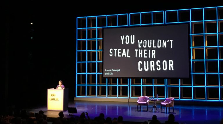
Even if you provide an alternative with something like box-shadow, best set outline to solid transparent, because box-shadow does not play well with high contrast modes.
Good focus indicators
One way to indicate focus is to rely on browser defaults. It works, but I would recommend designing your own focus outlines. This gives you maximum control over how easy they are to see, and lets you integrate them with brand colours or the style of your site. Usually, thicker outlines (from 2px onwards) are better, as they are simply easier to see.
The :focus pseudo class takes CSS rules like any other selector, so you could style it however you like. In some cases a background color or underline could indicate that something is active.
Examples
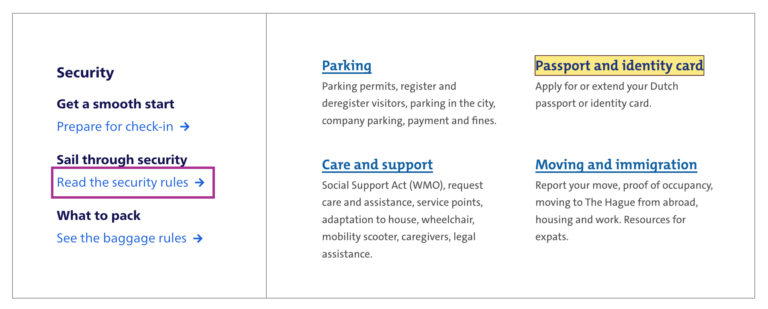
Below are focus outlines as seen on Schiphol.nl and the City of The Hague websites. They make it easy to distinguish in a list of links which one is currently active.
Transitions
Focus outlines do not have to be boring. The outline property can be transitioned with CSS, so why not add a subtle animation? Make it pop!
Contrast
In WCAG 2.1, focus indicators are bound to the same contrast rules as other parts of the content, as per 1.4.11: Non-text contrast. This means a contrast of 3:1 between the outlines and their background is required.
On websites that have both light and dark parts, it is quite common to have a dark and a light focus style. For example, if your focus outline is blue for parts with a white background (for instance, the main content area), you could make it white for parts with a black background (for instance, the footer).
Special cases
Focusing non-interactive elements
As mentioned earlier, focus works on interactive elements. In special cases, it makes sense to focus a non-interactive element, like a <div> , if that element is a piece of expanded content or a modal overlay that was just opened.
Any element can be added to focus order with the tabindex attribute in HTML. Best use it with 0 or -1:
tabindex="0": element can be focused with keyboard and through JavaScripttabindex="-1": element can be focused through JavaScript, but cannot be tabbed to
A tabindex with a number larger than 0 is best avoided, as this sets a preference of where the element goes in the tab order. If you set it for one element, you will have to set and maintain (!) a tabindex value on all interactive elements on the page. See also: It rarely pays to be positive by Scott O’Hara.
Only for keyboard users
If you are a developer and the design team is unwilling to apply bold focus styles, you could propose to show them to users who need them, for instance only to keyboard users.
There are two caveats to this notion of “users who need them”:
- Not all people who rely on focus styles use a keyboard. We mentioned switches earlier, but that’s only one use case. As a general rule, keep in mind that you can’t predict all the ways your visitors choose to browse the web.
- Making focus styles keyboard-only takes away an affordance for mouse users too, as focus also indicates that something is interactive.
For these reasons, we should be careful making decisions about when and how to show focus styles. Luckily, there is a CSS property invented to help us out here: focus-visible. According to the spec, it lets us:
provide clearly identifiable focus styles which are visible when a user is likely to need to understand where focus is, and not visible in other cases
In other words: it aims to let you indicate focus only for people that need it. It is preferable to avoid such heuristics and convey focus rings to everybody, but if you have to, focus-visible is ideal. Especially if the alternative is nothing at all.
Focus styles as keyboard accessibility
A focused element that isn’t highlighted has a big impact on usability for keyboard users. You could make keyboard checks part of your development workflow to ensure that you don’t forget focus indicators. For instance, you could include “Can be used with a keyboard” in your definition of done. This is a check that most people in the team should be able to do before a new feature goes live. As we’ve seen above, focus styles don’t just benefit keyboard users, but keyboard operability is a good way to test them.
When testing, you might find that not all browsers and platforms let you tab through interactive elements by default. Here are some of the most common settings across platforms and browsers:
- macOS: under System Preferences > Keyboard > Shortcuts set ‘Full keyboard access’ to ‘All controls’
- Safari, macOS: in
Safari > Preferences, under ‘Advanced’, check ‘Press Tab to highlight each item on a webpage’ - Chrome: in chrome://settings, under ‘Web content’, check ‘Pressing Tab on a webpage highlights links, as well as form fields’
Summing up
Hopefully this post inspires you to try out your (client’s) site with just a keyboard. Maybe it is a pleasure to use already. If not, perhaps this post convinces you or your team to address the problem and design some on-brand focus indicators. Together we make the web more friendly to users of keyboards, sticks and switches. Together we make the web work for everyone.
Focus outlines are one of many ways to design for accessibility. For more tips on design with accessibility in mind, see Accessibility Information for UI designers on MDN and Tips for designing with accessibility at the W3C.
List of updates
- 5 May 2023: Removed recommendation against using focus-visible without polyfill, as it is now supported across evergreen browsers and safe to use without polyfill.
Many thanks to Erik, Roel, Havi and Asa for proofreading and suggestions.
Comments, likes & shares (14)
Last month, I wrote about fixing common accessibility issues. That post seems to have resonated with people, so I have written up five more fixes you could do to your codebase today. Let's go!
I have tried to make these as hands-on as possible. For each, you'll find a description of what the issue problem, how fixing it helps end users and which team member can take the lead on it.
In my last post, the issues were what WebAIM described as the top 5 isuses in their WebAIM Million project. This time, I have looked into accessibility audit reports I wrote and combined that with what Deque wrote about coverage and the numbers that 200OK took from public data about common issues across the Dutch government websites (taken from the register of accessibility statements).
Missing focus states
If an element on a page is focusable, it needs a focus state. This goes for all interactive elements:
(from: HTML, Interactive content)
It also goes for as well for
divs or other elements that haveclickand keyboard events (but best usebuttons in those cases while you're at it; see below).For all of these, designers can come up with a focused state (ideally this is one thing, eg an outline, that is the same for all elements on the site, so that it's easy to spot when focus moves). Developers can remove any
outline: nones from their stylesheets (if you must undo default outlines, because you're using some other CSS property for outlines, best useoutline-color: transparentinstead so that it doesn't break in High Contrast Mode).Browsers can also ship with a feature that forces focus indication, some do. Users could also use user styles, though no website owner should expect they will, it requires CSS knowledge and a plugin in most browsers these days.
More: Indicating focus to improve accessibility
Missing captions and transcriptions
When you publish how-to videos, vlogs, podcasts, basically anything that has audio and/or video, the content should be available as text, too.
My friend Darice de Cuba has written about how to create podcasts transcripts. Part of this applies to video, too. Captions and transcripts are created for end users with disabilities. They also benefit users who are learning your language and users who want to catch your content but are in public without headphones. Transcripts and captions can even benefit your SEO strategy.
Writing out all recorded content isn't necessarily something you could do today as it can take a bit of time, especially if you have lots of content. I still felt I could include this common issue here, because most teams don't do this themselves and outsource the work to specialised agencies. These are costs you can budget for. If there is too much current content, you could consider starting with future or most popular content?
Project managers can make sure captioning and transcribing are part of any project that includes audio or video. Developers can ensure the CMS has fields for transcripts and captions. Designers can design the UI to allow for full transcript display. Social media managers can produce caption any videos for LinkedIn or Twitter.
Invalid HTML
There used to be a time when websites would proudly display a badge that showed the current page was composed of valid HTML. These badges have disappeared from most websites, but validation is still a sound accessibility strategy.
The HTML of web pages is parsed by lots of tools, like browsers and assistive technologies, if the HTML is invalid it can lead to unexpected bugs. Simon Pieters' Idiosyncrasies of the HTML parser is a great book about this, especially if you want a deep dive into what could possibly go wrong.
Since HTML5, error handling is specified as part of HTML, which should improve unexpected bugs due to invalid HTML, but there are still plenty of accessibility problems you can find by validating your HTML. Did you accidentally nest a
<button>inside of a<a>? The validator will call it out and help you prevent the myriad of problems that could cause.So… developers and test automation engineers can ensure HTML validation is included in tests.
More: validator.nu that allows inputting HTML by URL, file upload or pasting is (can run from command line per instructions in README)
Headings that don't describe their section
In HTML, headings (
h1-h6elements) exist in the context of a section, they are supposed to describe the content that follows them. When I say section, I don't mean specifically content in a<section>(or other “sectioning content”), I mean more generically content that forms a logical part of a page, regardless of which HTML element used.Descriptive headings are useful, because some users access headings in a page as a table of contents. For example, your one page band website could have a “Discography”, “Tickets” and “Merchandise” headings. Your search application could have a filters section with a “Filters” heading. Some websites useheading tags (
h1-h6) to mark up text that's “just” bigger or bolder, which will break the experience for people who navigate by headings, as it will add entries into their navigation that don't describe sections.Content designers can ensure headings describe sections, and that things that don't describe sections aren't marked up as headings. developers can ensure that if there are headings in their front-end components, that they describe content and don't just exist for style reasons.
Can't do all things with just a keyboard
Accordions, tabs, ‘toggletip’ triggers… if your page or app has things that users can click on, they should also be usable with just a keyboard.
Fixing this issue is great for people who can only use a keyboard, and for users with numerous other devices that may or may not be keyboard like (there's some examples in How people with disabilities use the web).
Often, this issue occurs when clickable elements are
divs with aclickhandler. Developers can make sure they use abuttonelement whenever things can be clicked (oraif it navigates to somewhere). Yes, you need some CSS to change the styling to your liking, but this is do-able, it makes it easier for you to get all of the web platform's buttonness in one package and, most importantly, your users will thank you.Wrapping up
So, that's five more common accessibility issue that you could fix in your codebase today. I hope this is helpful to some readers. Should you still have questions about any of these, please feel free to contact me on Twitter (@hdv) or via email.
Thanks to #accessibility in Fronteers Slack and Scott O'Hara for inspiration. Also, thanks to WCAG, which lists all five issues as success criteria.Focus outlines are a great way to improve accessibility. They are traditionally set with the
:focuspseudo class. That still works, but with:focus-visiblewe have a new way to only show focus styles when they make sense. How does that work?The
:focus-visiblepseudo class has been in the works for over seven years and we recently got to a situation where it is now in stable versions of all modern browsers: Chrome/Edge (from 86), Safari (from 15.4) and Firefox (from 85).What is
focus-visibleanyway?The thing is,
:focus-visibleisn't a “indicate focus only to keyboard users” pseudo class, it is “indicate focus when the browser thinks it's right, based on some heuristics”.“When it is right”, what does that even mean? Well, it has to do with when browsers decide to show their default outline. For example, most browsers show an outline when you press a button with a keyboard, but they don't when you click a button with a mouse. In other words, focus styles in browsers only show sometimes, in specific cases. The
:focus-visiblepseudo class is meant to match those cases.This makes
:focus-visiblevery different from:focus, which matches whatever the currently focused element is, regardless of whether it makes sense to highlight it or not. That's why you might see the styles you applied through:focuseven if you click on something with a mouse, a behavior that could leave users confused and causes some developers to turn off highlights completely (but friends don't let friends do this, you would not docursor: noneeither).From CSS Selectors, Level 4, 9.4:
So it lets you target the cases where browsers would normally apply focus styles, and, importantly, it excludes the cases where browsers don't paint their default outline, for instance when the user clicks on a thing with a mouse.
Consequently, browsers apply
:focus-visiblestyles to more non-mouse cases than just keyboard users. Which cases are they?There are lots of devices that are keyboard-like, as Eric Bailey explains in Focusing on focus styles:
Some of these technologies present themselves as keyboards (like braille displays), they could fall under the
focus-visibleumbrella, others (like voice control) are more mouse-like and may not trigger these heuristics. Some assistive technologies also come with their own highlighting, like VoiceOver on iOS and the macOS Switch Control UI.Pointers vs non-pointers
An example (non-normative) in the specification for
:focus-visiblesuggests that:focus-visibleshould apply to interactions “via keyboard or some other non-pointing device”. This made me wonder what the exact difference is between a pointing device and a non-pointing device. The Pointer Events specification has some answers (thanks Bramus!).Basically, there are input methods that can do mouse clicks and input methods that aren't really a mouse but can simulate mouse clicks, like touchscreens and pen input. Pointer Events tries to abstract all of those input methods into a new concept called “pointer”.
The definition of a pointer in that specification:
I haven't found a definition for non-pointer devices, like keyboards, but my best bet at a description would be: non-pointing devices are devices that let you step between the different interactive parts of a user interface. Others also call it “sequential navigation”.
Examples of non-pointer or sequential navigation:
TAB/shift + TABor arrow keys when you use a keyboardFor the sake of completeless, there is also the concept of “spatial navigation”. This is similar to sequential navigation, but you don't just go back and forward—you can go up and down too, like when you select something to watch on a streaming service on your TV.
Input methods differ and overlap
Even with this distinction between pointing devices and non-pointing devices, none of this is very binary. There are users who always use a keyboard or users who never do, but most people will be somewhere in between. They could be switching between a mouse and a keyboard in one browser session, or use devices that allow for multiple input methods. Someone could connect a bluetooth keyboard to until-then touch-only tablet. Switch Control in iOS has both a point mode and an item mode.
And even if you could detect every type of device, people are not the same. You likely have users who use a mouse, but still benefit from seeing what currently has focus: users with low vision and users with cognitive disabilities.
In a comment discussing
focus-visible, Jonathan Avila shares how he switches between modalities:The cool thing about
:focus-visibleis that it allows browsers to be smart about when to show focus styles. Browsers won't just hop into visible focus mode when you press any key, it takes things like using command/control + key combos into account, as Alice Boxhall explains in a recent Igalia Chats episode. The heuristics develop over time, too.Ok, so what now?
This post turned out a little longer than I intended, but what I've tried to capture is what I started with: that and why
:focus-visibleis more than a way to show focus styles just to keyboard users.If you want to hear more about
Thanks to Job van Achterberg, Roel Van Gils, Eric Eggert and Patrick H. Lauke for their feedback and input on earlier drafts.:focus-visiblefrom people who worked on this, the aforementioned recent Igalia Chats episode with Brian Kardell, Alice Boxhall and Rob Dodson covers some of the history and evolution.Having focus styles for any interactive element is crucial on a website. Hidde de Vries:
You don’t have to create your own
:focusstyles in CSS, although you can. By default, browsers apply their own styles to interactive elements. But if you don’t like that look, the temptation is to style your own. So if you do something like this, boom, we’ve got focus styles under our control:(By the way,
outlineis a great friend to focus styles for reasons Manuel Matuzovic gets into.)But by doing this, we’ve also done something else: we’ve made it so when you click (like with a mouse on a desktop computer, otherwise known as a fine pointer) those
:focusstyles apply to the element. This can be highly undesirable, leading to the CEO being all like why does the button change looks when I click it??? Fair enough, CEO, let’s fix it.The trick is using
:focus-visiblewhich is relatively new but has pretty solid browser support. The whole point of it is applying focus styles that apply at all times an element takes focus, except when a fine pointer clicks it. Which is kinda perfect really. But if you’re nervous about going all-in on only using:focus-visible, a way to continue to use:focusstyles too is to wrap them in an@supportsblock like:Fortunately, the browser support for
@supportsand theselector()function is a bit better than:focus-visible, so this buys some additional browser supportPen:
CodePen Embed FallbackThe post Tired of focus styles applying on mouse clicks? :focus-visible is the trick. appeared first on CodePen Blog.
Share this:
Related