The heading structure of a web page is like its table of contents. It gives people who can’t see your page a way to navigate it without reading everything.
To be clear, by ‘heading structure’ in this post, I mean the heading elements in your HTML: <h1> to <h6> . These elements can be strongly intertwined with what they look like, but for our purposes it is the markup that matters.
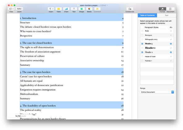
The best analogy I’ve been able to come up with for heading structures, is the feature in Microsoft Word that lets users generate a table of contents automatically. It is used a lot by all kinds of people, in all kinds of environments (in long corporate documents, but also in academia). If you’ve set document headings correctly, it lists all sections and subsections. It even remembers, and updates, which page they are on.
 Example of the automagic table of contents feature in Pages. It even lets you select which heading levels to include!
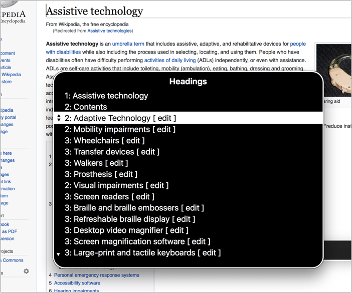
All websites have this too, as a similar feature is built into most screenreaders. In VoiceOver, for example, users can press a button to see a list of all headings and use this to navigate a page. In fact, this is a common way for screenreader users to get around your page without reading everything.
 The headings feature in action on Wikipedia. Note that Wikipedia also lists the headings explicitly, with section numbering.
Only use headings to identify sections
To let users get the best navigate-by-headings experience, only use heading elements for content that actually identifies a section. Ask ‘would this be useful in my table of contents?’, and if the answer is no, best choose a different HTML element. This way, only table of contents material makes it into your heading structure.
For this reason, by the way, I recommend to avoid having headings be part of user generated content (as in: content added not by content specialist, but by users of your site). If you offer Markdown for comments, for example, headings in those comments could mess with the usability of your heading structure.
If you choose something to be a header, make sure it describes the section underneath it. This can be hard to get right, you might have great puns in your headings, or maybe they were written by a SEO expert.
Visually hidden headings
Not all sections have headings, often the visual design makes it clear that something is a distinct piece of content. That’s great, but it doesn’t have to stop a section from also showing up in your table of contents. Hidden headings to the rescue!
A hidden heading is one that is ‘visually hidden’, this is content that is not visual on screen, but it exists in your markup and screenreaders can use it:
<h2 class="visually-hidden">Contact information</h2>
<!-- some content that looks visually a lot like contact
     information, with icons and a receptionist stock
     photo that makes it all very obvious-->
(More about CSS to visually hide)
The heading goes into your virtual table of contents, but it is not visible on screen.
Note that visible headings are much preferred to hidden headings. There are two problems in particular with hidden headings:
- Like with other hidden content, it can easily be forgotten about by your future self or the next team member. Hidden content that is not up to date with the visible content is unhelpful, so it is a bit of a risk.
- Serving slightly different content may cause confusing conversations, for example if an AT user and a sighted user discuss a page and only one of them knows that there is a heading.
‘Don’t skip heading levels’
Although WCAG 2 does not explicitly forbid skipping heading levels, and this is controversial, I would say it is best not to skip heading levels.
If a contract has clause 2.4.2, it would be weird for there not to be a 2.4 — the former is a subclause of the latter. It would be weird for the subclause to exist without the main clause.
The most common reason why people skip headings is for styling purposes: they want the style that comes with a certain heading and that happens to be the wrong level for structural purposes. There are two strategies to avoid this:
- have agreement across the team about how heading levels work
- use
.h1,.h2,.h3classes, so that you can have correct heading levels, but style them however you like
The former is what I prefer, on many levels, but if it is a choice between weird CSS and happy users, that’s an easy one to make.
Automatically correct headings
The outline algorithm mentioned in HTML specifications is a clever idea in theory. It would let you use any headings you’d like within a section of content; the browser would take care of assigning the correct levels. Browsers would determine these levels by looking at ‘sectioning elements’. A sectioning element would open a new section, browsers would assume sections in sections to be subsections, and headings within them lower level headings.
There is no browser implementing the outline algorithm in a way that the above works. One could theoretically have automated heading levels with clever React components. I like that idea, although I would hesitate adding it into my codebases. That leaves us with manually choosing plain old headings level, from 1 to 6.
Conclusion
Heading structures give screenreader users and others a table of contents for our sites. By being conscious of that, we can make better choices about heading levels and their contents.
Comments, likes & shares (3)
and JSConf Budapest liked this
JSConf Budapest reposted this