If you have learned how to use Grid Layout, you might wonder what to use it for. In this post, I will give some use cases where I think Grid will excel.
In the last two weeks I gave two workshops on CSS layout techniques. Heavily inspired by Jen Simmons’s remarkable Grid Layout experiments, I picked three posters that Wim Crouwel designed. Crouwel is a graphic designer that has been making use of grids for a long time, including for all the characters in his New Alphabet typeface. His work is iconic and I was quite excited to see some of it could easily be built for the web using CSS Grid Layout.
I liked how working on non-real world examples played out, as the focus was really on applying all those different properties, rather than writing production-ready code. Old posters are great to try this stuff out on.
After the workshop, Michael asked me what we can use Grid Layout for in the real world, if not for recreating iconic posters from the history of graphic design. I talked to others about this and found various people weren’t sure what to use Grid Layout for in actual websites for clients.
I’m sure we can use it for a lot more than recreating old posters. There definitely are good use cases, so I thought I would make a list of where I believe Grid can help us create cool stuff.
Use cases
To show what’s on offer
Grids are perfect for showcasing things, inspire visitors, communicate to them what kind of stuff we have on offer, in a very broad way.
We can do these things with old-school layout methods. However, using CSS Grids they can look more exciting, it is trivial to make some things appear more prominently than others and it is easier to have the browser deal cleverly and responsively with content differences.
- For an online supermarket: a listing of products with prices, reduced prices, product names
- For a library: a page with reviews of the five books that have recently come out and have great reviews.
- For an airport: an overview of the tax-free shopping available
- For a railway company: a selection of exciting holiday destinations, weekends away, day trips
These are all listing pages that want to inspire people to find stuff, whether it be groceries or books. They can benefit from things only Grid offers.
For one-pagers with a lot of different sections
Many front-end developers will have had to code them if they worked on marketing sites in the past five years: one-page websites in which every section is quite different. They often have lively designs. Lots of differences between sections makes it hard to code systematically.
With Grid Layout you can keep the markup of these sections nice and plain and choose a sensible and consistent source order, while still allowing yourself to go wild creatively on each section.
To display a schedule
We can use grids to display information about what’s happening at a given event, conference. Note that proper markup will be extra important here, as for accessibility reasons we want to make sure the content makes sense without its Grid Layout.
For embedded layouts that fill the entire screen
If you’re building an interface that is supposed to go full screen on some physical product, Grid Layout might be quite a helpful way to distribute space.
A while ago, I built an interface for a Dutch department store that would be used by the cashier when you pay. It had things like your products on and stuff about loyalty card usage. This kind of interface runs full screen in some sort of embedded browser.
Some use cases:
- your digital tv interface
- the self-check-in screen in an airport
- the screen you see when you return books at the library
- a screen that shows information on the next train
With a grid that is based on viewport units (vw/vh) and/or fractions, space distribution and alignment may get a lot easier. (I have to admit, in my case the screen ran a browser that was almost identical to IE7 and the system’s output gave me only tables to work with).
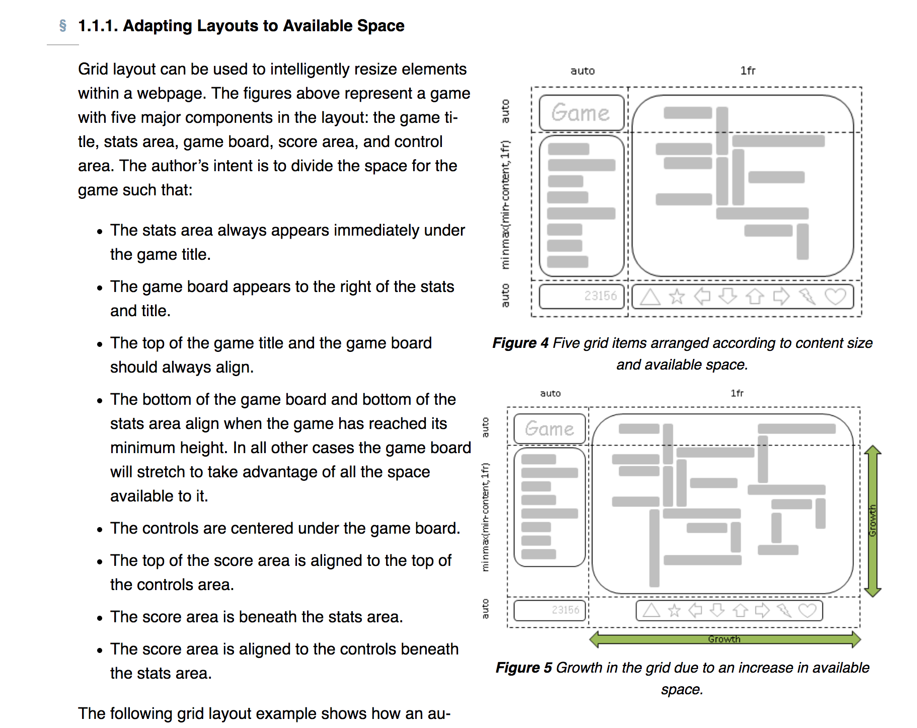
 The Grid Layout Spec has an example of a game that always fits on your screen. The required markup/CSS is ridiculously little.
An example
Imagine we have a grid with cards in it for a supermarket’s weekly offers.
All offers take one spot in the grid using autoplacement. However, some offers are more prominent, and we could make them use two rows:
.offer {
    // regular offer code goes her
}
.offer--prominent {
    grid-row: span 2;
}
I don’t work at a supermarket’s marketing department, so my knowledge of its possible marketing strategies is lacking, but maybe there are other offers. Perhaps one that will expire after this week. This is people’s last chance, so we make it use three columns and two rows.
.offer--last-chance {
    grid-row: span 2;
    grid-column: span 3;
}
This is stuff that is trivial in a Grid Layout and impossible to do so easily and flexibly using traditional methods like display: inline-block;. For those of us who have used floats, inline-block and even tables to do lay-out, using Grid Layout may be a bit of a mental shift. I suspect this applies a lot less to people who learn CSS layout today, as they will start in a reality where the new stuff already exists.
Conclusion
There are plenty of uses cases where Grid Layout would be a sensible implementation choice. I have listed some examples above, but I am sure there are more — please leave a comment or tweet if you have found other ideas.
Comments, likes & shares
No webmentions about this post yet! (Or I've broken my implementation)