There was a time when front-end developers would frown upon (former) print designers that designed for the web. At their usage of ‘perfect’ yet unrealistic content, and their creative ideas that were impossible to build with web tech. If this frowning since has scared print designers away from web design, I hope that they return in 2018. New CSS possibilities are ending the unrealistic content problem and the generic layout problem. It’s a great time to build layouts in CSS!
Problems solved
The unrealistic content problem
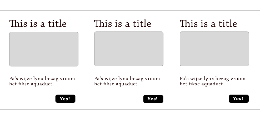
It is now not as common, but I’ve still seen it happen in the past few years. A designer presents a design. The content lines up beautifully, because it is picked to fit perfectly. Headlines that only ever need one line, that sort of thing. It can result in beautiful and balanced visual design. But it doesn’t take many years of front-end experience to know that such designs risk breakage as soon as the template is hooked up to a CMS. The content is updated, and boom, it no longer fits. With new or real content, either the design loses some of its tidiness, or the CMS is set up to force character constraints on content. That leaves the design tidy, but the content inflexible.
 When content for one of the blocks changes, it will not be trivial to line up
Most of these problems have to do with keeping things the same height and doing advanced alignment. These are both requirements that are super easy to do on paper and in design software. Easy to do when making a static comp. I guess. But CSS never had tools for doing this flexibly and with unknown content (table layout excepted).
In the CSS Layout workshop I ran for Fronteers last week, I tried to emphasise that recent updates to CSS mean that the above is soon (or now, actually) no longer an issue. CSS Grid Layout (and flexbox, to some extent) will let us have our cake and eat it, too. We can make things line up or be the same height in a whim, regardless of content. We get flexible units like ch and fr that make it easier to line things up in a way that was always quite sensible, but never quite feasible. Unrealistic content, then, is less of a problem, as we have actual alignment options, rather than CSS trickery.
The defensive design problem
Every so often, contracting for agencies, the designer of a new website would come to me and ask ‘What kind of layout framework are you using? What’s the grid, are we doing Bootstrap or Foundation?’ Sometimes the agency had already listed one of these as a requirement during recruitment. I often found that the in-house developers were used to dictating these kinds of things. Lucky bastards! The reason is probably practical: when producing website after website, it makes sense for a team to start optimising things and have one way of doing grids. When working with contractors, it is useful if that one way is a broadly used open source framework. But it also seems oddly out of order: it can be a lot like solving problems before you have them.
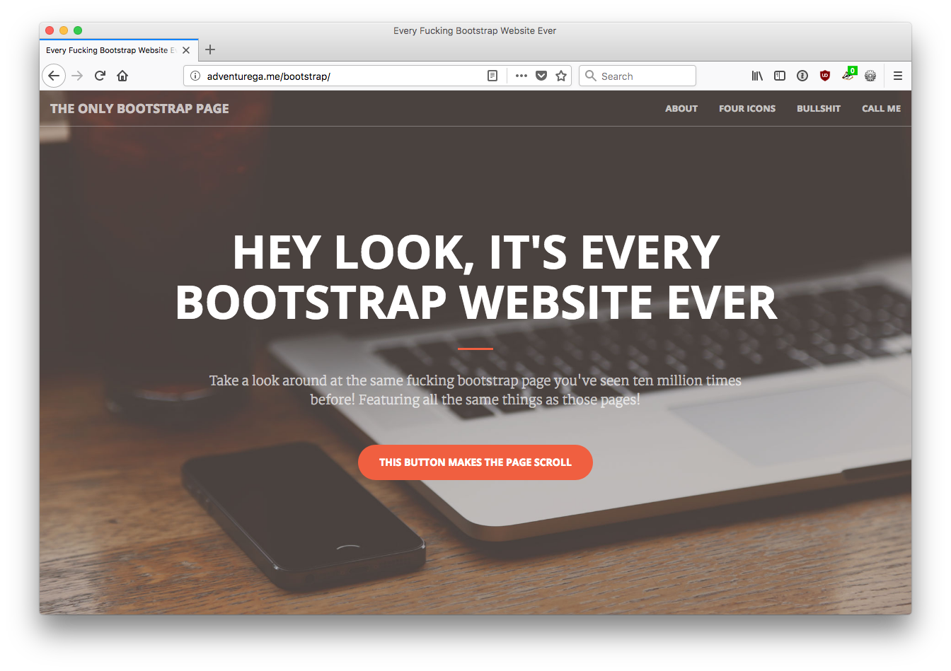
The thing with CSS layout frameworks is that there is a fixed amount of stuff they can do. The things that are generic enough to make it into the framework. They speed up things, and are super helpful for prototyping and even creating production sites. But they don’t just create a generic way of working. They also create a generic look of websites. I’m not the first to conclude that.
 Defensively designed websites tend to look the same
Web design with CSS frameworks in mind is, I think, to design defensively. The approach gives a lot of certainty about whether something can be built, which leads to happiness throughout the team, including product owners.
2018 may be the year that we no longer need to design defensively. Because Grid Layout is here. By ‘here’, I mean in our users’ browsers. In The Netherlands, on average 85% of users use browsers with full or partial (IE11) Grid Layout support.
With CSS Grid Layout, we no longer need frameworks, CSS now is the framework. This is great, we can now solve problems when we have them. With something that is a web standard.
New challenges
There are new challenges, too. The stuff Grid (and flexbox, to some extent) does, can be unexpected to those who have not mastered the spec. That’s probably most of us. They have documented Grid’s behaviour exceptionally well there, but it is perhaps only in real life designs that we will get a feeling of how it all works. For instance, what autoplacement does and how to leverage features like minmax and min-content to get our designs exactly how we want them.
Letting it go
Grid Layout has a lot of ‘leave it to the browser’ kinds of settings. Rather than ‘make this thing 400px wide’, you set things like ‘make it fit roughly between 40 and 60 characters’. More than ever, it is clear that CSS isn’t about exactly specifying what we want.
John Allsopp famously discussed this in A Dao of Web Design, over 17 years ago. He talks about “to suggest the appearance of a page, not to control the appearance of a page”. For this, he says we need to let “go of control”:
It is the nature of the web to be flexible, and it should be our role as designers and developers to embrace this flexibility, and produce pages which, by being flexible, are accessible to all. The journey begins by letting go of control, and becoming flexible.
(Emphasis mine).
“Letting go of control” is about letting the browser decide based on our hints. Browsers are good at this. They have all the knowledge: what device they’re running on, how much space is available, what fonts are available, which settings the user has set, et cetera. But it isn’t necessarily something all web teams like to do, I found.
Communicating flexibility
Even if we as CSS developers have mastered the spec, we still need to be able to communicate and explain the consequences of our code to designers, product owners and stakeholders. This is key. It requires us to explain stuff to the rest of our team. Results that struck us as unexpected will likely strike them even more.
Historically, we’ve seen a lot of website owners like the idea of their websites looking exactly the same everywhere. But it is now clear to most that this is no longer feasible. The case for flexibility has become lots stronger in our current multi-device reality. The internet is on so many devices: fridges, cars and watches with browsers now exist. This reality has powered the responsive design argument, and think it can power the flexible layout argument, too.
Conclusion
So, yes, the web is ready for great graphic design. The flexibility it was invented with has recently flourished with the surge of responsive web design. We now have CSS layout methods that let us embrace flexibility and they have good browser support. Cool experiments are done with CSS Grid Layout.
The case for using flexible layout methods will require clear communication between front-end developers and the rest of the team, as well as in-depth knowledge of these new lay-out tools. But I think we can do this. We’ve done it before with responsive web design, and we can do it again!
Comments, likes & shares (1)
Listed here are 5 recommendations you have to understand in order to make a consistent make money from poker. Solid poker is a proven winning poker strategy, and these 5 recommendations increases your investment returns if used precisely.
Before you begin playing, you’ll want to put up a spending plan and stick to it. The crucial thing is that this budget is something you are able to reduce. As an example, if you determine that the spending plan is $100, you will need to ensure that the increasing loss of $100 won’t impact you materially. This may seem quite simple but lots of seasoned learn poker online players get this blunder and become losing above they can afford.
It helps see just what computer software has been utilized. All pc software used whenever planning to play poker online bonus on the web must certanly be certified and tested by independent parties to make sure that it is going to are realistically and fairly as you are able to.
Flexibility – when you perform on line, it is possible to multi-task. Do whatever else you should do when you play. Care for the laundry, do a little homework, spend your bills. whatever! Of course, you need to consider your play, but online poker offers you that flexibility.
You can’t cheat in the event that you play poker online. Playing only occurs on a digital table, which means you usually do not play face to face in order for them to read your physical response. You have got more choices on how much to try out and where to play since there are a great number of poker rooms open for playing. Nonetheless, obviously, you simply cannot lay without a doubt on a table once you perform . Just what exactly happens is the fact that you make some type of a deposit to your computer software’s cashier in the poker room of your option to possess your potato chips the game while unlike in real on-line poker space or casino poker where you deposit it to a real cashier. If you would like stop the overall game, you can always take out the chips. For withdrawals, check is considered the most widely used form.
One of the best how to exercise your poker game is playing on-line poker. Complete tilt poker on line is a great method to learn to play an improved game of poker and pokerking обзор learn how to be a power poker player. By playing poker online you are going to satisfy and play against more and better poker players. Inevitably you will see more the greater amount of you play. But by reading the knowledge and hearing the specialist poker players out of this site, you may rank faster and work out more cash, fast!
There are literally thousands upon a large number of online gambling enterprises out there looking forward to you to come and sign up together. Not only are you able to play poker, you could play all kinds of other gambling favorites because in the end, it is a casino. There is many of the most popular online casinos by simply using the search engines and lots of these gambling enterprises allow you to play a little at no cost but still provide the chance to win real cash. You will find numerous advantageous assets to playing in an online casino, just what exactly are you looking forward to? Use the internet and check always them down.