Paddings in cards are great, but how about using grids in cards? Using columns and rows for whitespace can give great flexibility, and lets us have optional padding: we can turn it off when we want to.
Note: this is an exploratory post, not something I necessarily recommend to apply to all the things.
A card with padding everywhere
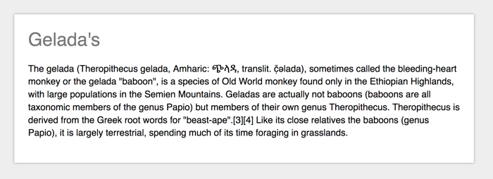
Most card-type components will have a padding set across all dimensions, so that the content does not stick to any of the sides of the box:
.card {
  padding: 1em;
}
An example card with 1em of padding around. Source: Wikipedia - Gelada
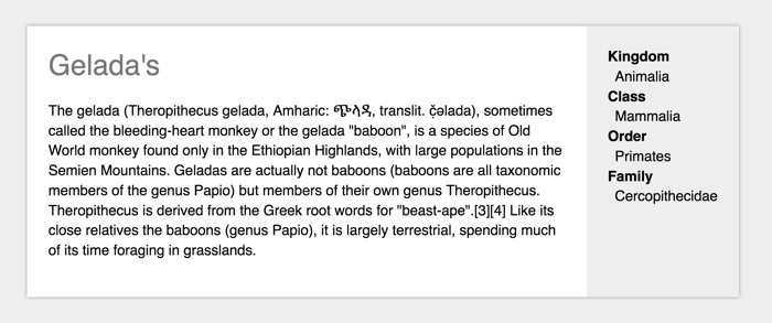
This is a very effective way of doing things, especially with box-sizing set to border-box. But what if you wanted to have something like this:

On the left hand side, the padding works, but on the right hand side, we want the background of the content to stretch to the sides of the box, which will not work if it had a padding. Let’s see if CSS Grid Layout can help!
A card with some padding turned off
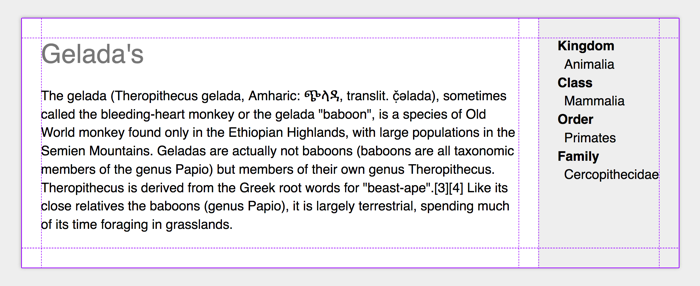
So here’s CSS for a card that looks the same, it has 1em of whitespace all around, but this time it is built with Grid.
.card {
  display: grid;
  grid-template-columns: 1em auto auto 1em;
  grid-template-rows: 1em auto 1em;
}
Grid tracks for padding!
(Example on CodePen, recommended to view with Firefox Grid Inspector)
We create a grid and make the first and last column, as well as the first and last row, exactly 1em. In this example, there is two auto grid track in between, there could be more if you wanted.
When we used padding, that was all we had to do to make the content stay inside the padded area. With grid, we have created an ‘optional padding’ situation so we will have to explicitly place the content inside the padded area.
If we want a piece of content to be in the padded area:
.card__content {
  grid-column: 2 / 3;
  grid-row: 2 / 3;
}
If we want the content to have a background that extends to the boundaries of the box, we position it to take up the first to the last row, and position it to take up space until the last column:
.card__meta {
  grid-row: 1 / 5;
  grid-column: 4 / 6;
  padding: 1.5em;
  background-color: #eee;
}
You could, of course, style .card__meta with negative margins, but I feel that method is less intuitive. I’m curious to hear how people think about using Grid instead.
Thanks Vasilis, who told me it was a popular technique among his students
Comments, likes & shares
No webmentions about this post yet! (Or I've broken my implementation)