The proposed <selectlist> will have powerful styling options and full control over the different parts. In other words, there would be not one, but two levels of customisation. In this post, we'll look at what they are and when they are useful.
<selectlist>, you ask? It's a proposed new HTML element that is like <select>, but fully customisable. Why? Because so many people are building their own selects, from scratch or with libraries, and that should be easier to do. With accessible defaults where possible and by leaving the parts that browsers are good at to the browser (like knowing where to position it, to place it on the top layer or to automatically dismiss it when appropriate (‘light dismiss’)).
For context, <selectlist> is a proposal by the Open UI Community Group. This group was founded to study common components and controls that people build on the web (in design systems, see the component name matrix), and suggest Web Platform features to make it easier to build such controls. Think new HTML elements, CSS features or APIs, as well as things that surface across HTML, CSS and JS.
<selectlist> doesn't ‘exist’ just yet, it is an idea that is being prototyped in Chromium, with other browser engines currently not opposed, but also not implementing it (as far as I'm aware). While you would't use it in projects yet, you can experiment with it in Chrome or Edge Canary with Experimental Web Platform Features flag on, and file issues if something doesn't work as expected or desired. For brevity, this post will refer to it as if it exists, to avoid saying ‘would’ in every sentence.
The anatomy of a <selectlist>#heading-1
The <selectlist> element, as currently prototyped, is a lot like the <select> element that we've had for years. We can use it in a form, users can select an option out of many and their choice becomes part of the data that we process.
But where a <select> comes with free built-in styles that we can't change, <selectlist> consists of some explicitly designed parts that can be changed (more on that a later). Often, the browser built-in styles of a <select> are just fine, sometimes they are not.
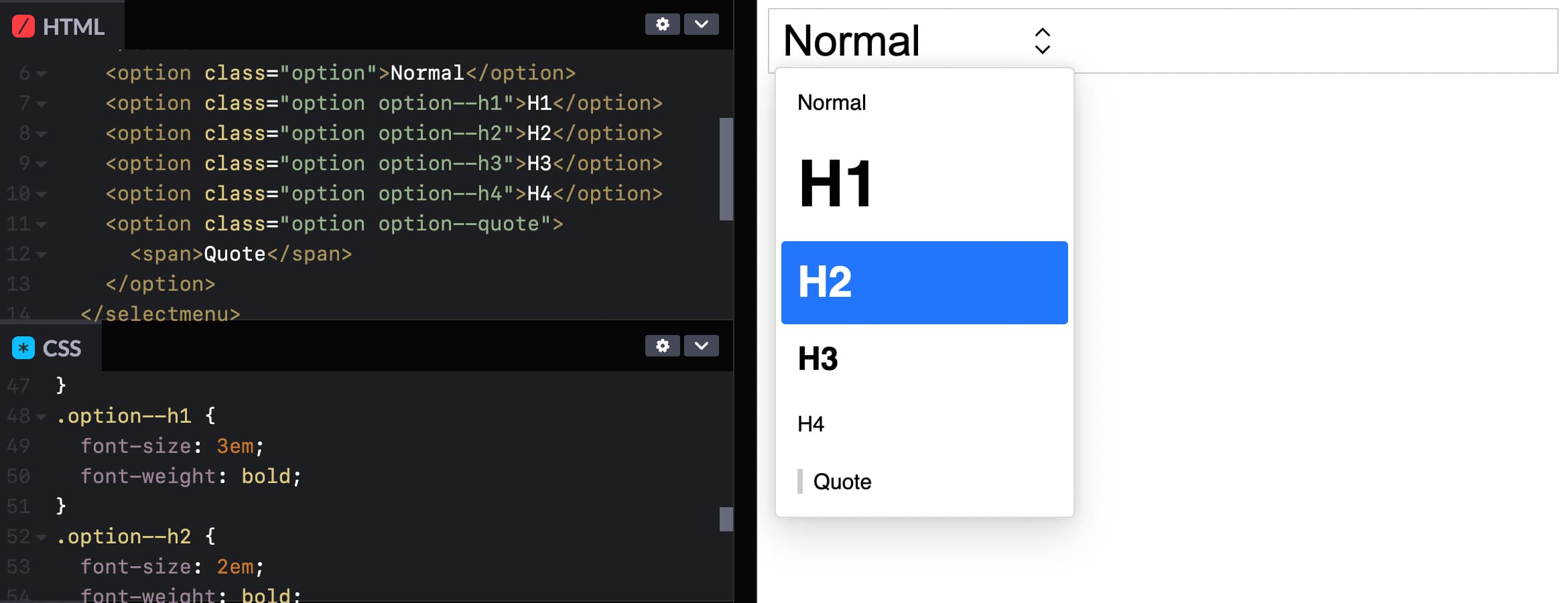
 In Sanity's Portable Text editor, the user can choose text types. Each option is styled like something of that type is commonly styled, and there is some shadows, rounded corners and arrows that a regular
 <select> can't have.
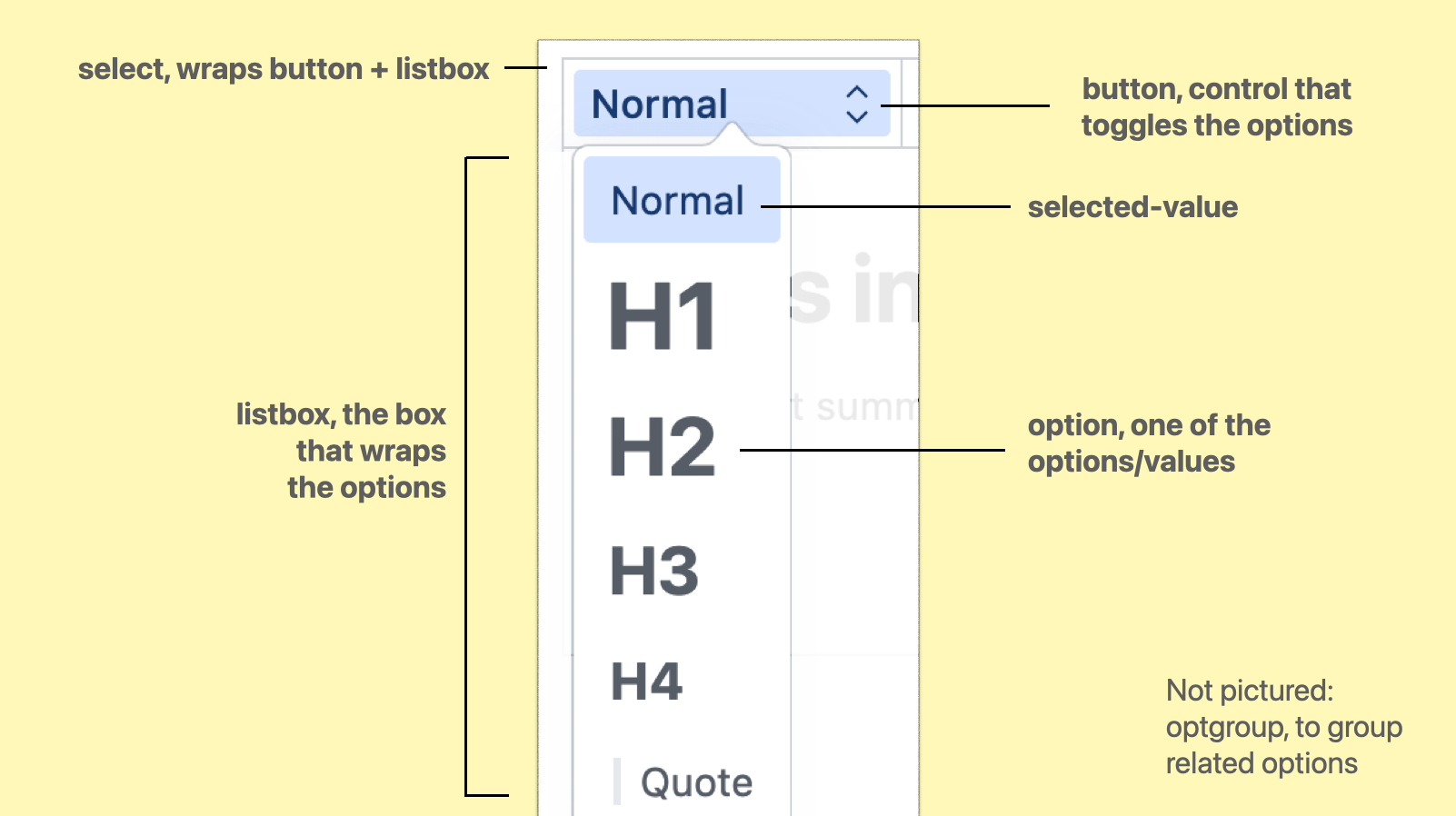
The parts are:
select, the root element, wrapping/containing all the partsbutton, the toggle/button the user activates to open the optionslistbox, the part that is toggled, it wraps the optionsoptgroup, a part that we can optionally use to group related options togetheroption, an actual choice, a value that a user can pickselected-value, the element that displays the currently selected value
(from: Anatomy of the selectmenu)
When using regular <select>s, it is possible to make the button part look however we want. In some browsers, we can also apply some specific styles to options, like background colours.
With <selectlist>, these parts are not just parts in the colloquial sense, they are <part>s in the Web Component sense, meaning that they exist as elements in the shadow tree of the component. Consequently, all of these parts can be changed.
There are two levels to that: the first is to write CSS, where we can use all the power CSS has to offer, the second is to completely replace the DOM structure to what we want or need.
Option 1: CSS#heading-2
In the <selectlist> prototype, the options are part of the (light) DOM like they are in a <select> element, which means we can target them with CSS (and unlike with <select>, our styles will actually get applied).
 You could even give each option its own style! See Codepen (view in Canary with Experimental Web Platform Features flag on)
This is the most basic example of styling a selectmenu: you apply CSS to the options, like you would to any other HTML element.
The other parts of the selectmenu are targeted differently: we'll use a ::part() selector referencing the respective part name.
Deprecation warning: this is currently under discussion; the final implementation will likely use elements and not ::part() to select parts of a selectlist
For example, to style the button:
selectmenu::part(button) {
  // add any button styles
}(Codepen of example with styled options)
To style other parts, you use that part's name instead, for instance ::part(listbox). Just last week, a resolution was passed to also expose the arrow as a part, to allow for easy styling or icon-replacing (part name to be decided).
In case you, like me, had not used the ::part selector, it is part (no pun intended) of the CSS Shadow Parts module.
For background: Web Components can have a light and a shadow DOM. The light DOM is part of the DOM like anything else and can be styled, but the shadow DOM is internal to the element. This a bit like public and private functions. For styling purposes, the CSS Shadow Parts module states that the creator of a Web Component can choose to expose parts of their shadow DOM by names. Developers provide a list of parts (element names) to be exposed, and then the elements can be targeted through ::part(partname). With <selectlist>, we get a browser built in Web Component that has parts exposed (except for option, which is in the light DOM).
This is huge… I mean, being able to throw CSS at the different parts of a selectmenu unlocks a lot of possibilities. Many of us will likely just use it to round some corners, add some shadows, maybe a little color or typography. And that's fine, we never could unless we built or loaded a library for custom selects.
I'm excited about being able to add a few finishing touches to selects, alone. But CSS has numerous powerful features, so that's only the surface. With all of CSS at our fingertips, custom selectmenu styles are probably going to be used in more interesting ways than we can think of now.
Option 2: full control by replacing parts#heading-3
If we need more than ‘just’ styles, it is also possible to replace entire parts with whatever we like. For instance, we could write our own button entirely, and tell the browser to use that instead.
Replacing a part is done with slots. Let's say we created a button with markup of our choice:
<button>select option</button>We can then tell the browser that, actually, we want this to be what the button part is, adding slot="button" and behavior="button":
Deprecation warning: this will probably not work this way in the final implementation
<button
  slot="button"
  behavior="button"
>select option</button>(Codepen of example with replaced button part)
Now, the button will be what's used for the part called ‘button’ (as it is slotted into the right place with slot) and get the browser's select button behavior and accessibility accomodations (set through behavior). We could do the same for the other parts.
We could also do this in JavaScript, with Element.attachShadow(), so that the markup we want to use can live in our JS, and we only need one HTML element at the point of usage rather than one plus a few more for slotting.
But wait… if we're replacing all the parts with our own things, isn't this just like rolling our own selects entirely? Well, yes, it is the advanced option, and usually CSS should suffice. But even if we replace some or many parts, the selectmenu would still get a bunch of things from the browser for free, like positioning, being on the top layer and light dismiss, features that would be hard to impossible to code in JavaScript.
Accessibility risk: avoid unexpected nests#heading-4
There is an important accessibility risk to be aware of for folks planning to replace parts in their selectmenus. Browsers and assistive technologies have certain expectations about what HTML is and does. If we divert from those expectations, we risk causing real problems for end users, which could include controls becoming unusable.
One example is what would happen if we would nest an interactive element like a link or button inside an option. Maybe one of our options has a tooltip? All of this should be avoided, at least for the time being (as far as I understand, this may change when secondary actions become a thing, see also w3c/aria#1440). The reason is: assistive technologies expect just text inside of options, not controls, so this would break badly and it could mean users wouldn't find those buttons or links, or wouldn't be able to interact with them. For this reason, it is strongly recommended to avoid interactive elements inside of options, i.e. do not add links or buttons in options.
Summing up#heading-5
In this post, we looked at two ways to customise the parts of a selectmenu element. We can use CSS, which should cover a large amount of use cases and offer flexibility and room for creativity. Or we can replace entire parts with whatever we would like, the more advanced option that has accessibility risks if not thoroughly checked against specs and implementations. For a lot of the use cases that I see in design systems I have worked on, I feel CSS alone will cover all the needs. And it will do so very elegantly, often in literally a few lines of code.
Again, this is all in the future, the element is just being tested out. But, it may well be that this same pattern of having both CSS and parts-replacement for control customisation will come to other Open UI work, too. Generally, I am a fan of this layered approach. As a developer, I like the principle of being able to make things as simple or complex as I want.
If you want to see more demos, the Microsoft Edge team has built a series of cool <selectlist> demos, when these were published it was still called <selectmenu> (as they note, pushing the limits and some with accessibility issues). You can see and play with these, using Edge or Chrome Canary with Experimental Web Platform Features turned on. These demos include a lot of part replacements, too. If you have feedback, want to follow this work more closely or chime in, head to Open UI issues on GitHub or join us on the Open UI Discord community.
List of updates
- 16 August 2023: Replaced selectmenu with selectlist as per recent Open UI resolution. Added note to say ::part pseudo likely won't be used in favor of elements.
Comments, likes & shares (15)
Evan, Tyler Sticka, Jelv 🎴, Graham, robb, Kir Belevich, Alexander Lehner, CPACC, Heather Migliorisi, Spencer Karges and Elly Loel ✨🌱 liked this
Guillaume Deblock, Curtis Wilcox, Greg Martyn and Alexander Lehner, CPACC reposted this