Two levels of customising <selectmenu>

The proposed <selectmenu> will have powerful styling options and full control over the different parts. In other words, there would be not one, but two levels of customisation. In this post, we'll look at what they are and when they are useful.

<selectmenu>, you ask? It's a proposed new HTML element that is like <select>, but fully customisable. Why? Because so many people are building their own selects, from scratch or with libraries, and that should be easier to do. With accessible defaults where possible and by leaving the parts that browsers are good at to the browser (like knowing where to position it, to place it on the top layer or to automatically dismiss it when appropriate (‘light dismiss’)).

For context, <selectmenu> is a proposal by the Open UI Community Group. This group was founded to study common components and controls that people build on the web (in design systems, see the component name matrix), and suggest Web Platform features to make it easier to build such controls. Think new HTML elements, CSS features or APIs, as well as things that surface across HTML, CSS and JS.

Open UI homepage

<selectmenu> doesn't ‘exist’ just yet, it is an idea that is being prototyped in Chromium, with other browser engines currently not opposed, but also not implementing it (as far as I'm aware). While you would't use it in projects yet, you can experiment with it in Chrome or Edge Canary with Experimental Web Platform Features flag on, and file issues if something doesn't work as expected or desired. For brevity, this post will refer to it as if it exists, to avoid saying ‘would’ in every sentence.

The anatomy of a <selectmenu>

The <selectmenu> element, as currently prototyped, is a lot like the <select> element that we've had for years. We can use it in a form, users can select an option out of many and their choice becomes part of the data that we process.

But where a <select> comes with free built-in styles that we can't change, <selectmenu> consists of some explicitly designed parts that can be changed (more on that a later). Often, the browser built-in styles of a <select> are just fine, sometimes they are not.

example of the parts described in this section, the example is a WYSIWYG style dropdown where the options for heading types have different sizes 
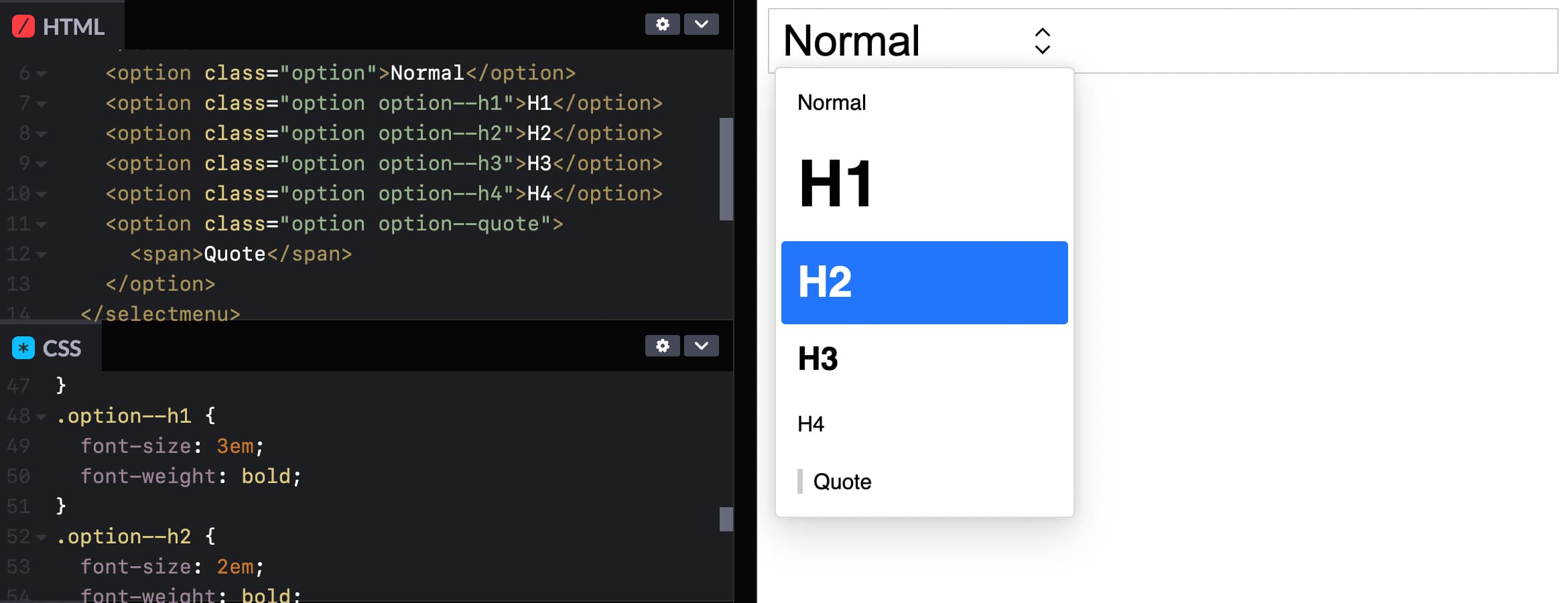
In Sanity's Portable Text editor, the user can choose text types. Each option is styled like something of that type is commonly styled, and there is some shadows, rounded corners and arrows that a regular <select> can't have.
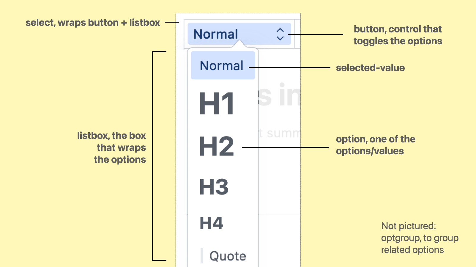
The parts are:

  • select, the root element, wrapping/containing all the parts
  • button, the toggle/button the user activates to open the options
  • listbox, the part that is toggled, it wraps the options
  • optgroup, a part that we can optionally use to group related options together
  • option, an actual choice, a value that a user can pick
  • selected-value, the element that displays the currently selected value

(from: Anatomy of the selectmenu)

When using regular <select>s, it is possible to make the button part look however we want. In some browsers, we can also apply some specific styles to options, like background colours.

With <selectmenu>, these parts are not just parts in the colloquial sense, they are <part>s in the Web Component sense, meaning that they exist as elements in the shadow tree of the component. Consequently, all of these parts can be changed.

There are two levels to that: the first is to write CSS, where we can use all the power CSS has to offer, the second is to completely replace the DOM structure to what we want or need.

Option 1: CSS

In the <selectmenu> prototype, the options are part of the (light) DOM like they are in a <select> element, which means we can target them with CSS (and unlike with <select>, our styles will actually get applied).

Codepen screenshot with <option> elements in HTML, and styles applies by targeting with option--h1, option--h2 as the selector, plus a preview. You could even give each option its own style! See Codepen (view in Canary with Experimental Web Platform Features flag on)

This is the most basic example of styling a selectmenu: you apply CSS to the options, like you would to any other HTML element.

The other parts of the selectmenu are targeted differently: we'll use a ::part() selector referencing the respective part name. For example, to style the button:

selectmenu::part(button) {
  // add any button styles
}

(Codepen of example with styled options)

To style other parts, you use that part's name instead, for instance ::part(listbox). Just last week, a resolution was passed to also expose the arrow as a part, to allow for easy styling or icon-replacing (part name to be decided).

In case you, like me, had not used the ::part selector, it is part (no pun intended) of the CSS Shadow Parts module.

For background: Web Components can have a light and a shadow DOM. The light DOM is part of the DOM like anything else and can be styled, but the shadow DOM is internal to the element. This a bit like public and private functions. For styling purposes, the CSS Shadow Parts module states that the creator of a Web Component can choose to expose parts of their shadow DOM by names. Developers provide a list of parts (element names) to be exposed, and then the elements can be targeted through ::part(partname). With <selectmenu>, we get a browser built in Web Component that has parts exposed (except for option, which is in the light DOM).

This is huge… I mean, being able to throw CSS at the different parts of a selectmenu unlocks a lot of possibilities. Many of us will likely just use it to round some corners, add some shadows, maybe a little color or typography. And that's fine, we never could unless we built or loaded a library for custom selects.

I'm excited about being able to add a few finishing touches to selects, alone. But CSS has numerous powerful features, so that's only the surface. With all of CSS at our fingertips, custom selectmenu styles are probably going to be used in more interesting ways than we can think of now.

Option 2: full control by replacing parts

If we need more than ‘just’ styles, it is also possible to replace entire parts with whatever we like. For instance, we could write our own button entirely, and tell the browser to use that instead.

Replacing a part is done with slots. Let's say we created a button with markup of our choice:

<button>select option</button>

We can then tell the browser that, actually, we want this to be what the button part is, adding slot="button" and behavior="button":

<button 
  slot="button" 
  behavior="button"
>select option</button>

(Codepen of example with replaced button part)

Now, the button will be what's used for the part called ‘button’ (as it is slotted into the right place with slot) and get the browser's select button behavior and accessibility accomodations (set through behavior). We could do the same for the other parts.

We could also do this in JavaScript, with Element.attachShadow(), so that the markup we want to use can live in our JS, and we only need one HTML element at the point of usage rather than one plus a few more for slotting.

But wait… if we're replacing all the parts with our own things, isn't this just like rolling our own selects entirely? Well, yes, it is the advanced option, and usually CSS should suffice. But even if we replace some or many parts, the selectmenu would still get a bunch of things from the browser for free, like positioning, being on the top layer and light dismiss, features that would be hard to impossible to code in JavaScript.

Accessibility risk: avoid unexpected nests

There is an important accessibility risk to be aware of for folks planning to replace parts in their selectmenus. Browsers and assistive technologies have certain expectations about what HTML is and does. If we divert from those expectations, we risk causing real problems for end users, which could include controls becoming unusable.

One example is what would happen if we would nest an interactive element like a link or button inside an option. Maybe one of our options has a tooltip? All of this should be avoided, at least for the time being (as far as I understand, this may change when secondary actions become a thing, see also w3c/aria#1440). The reason is: assistive technologies expect just text inside of options, not controls, so this would break badly and it could mean users wouldn't find those buttons or links, or wouldn't be able to interact with them. For this reason, it is strongly recommended to avoid interactive elements inside of options, i.e. do not add links or buttons in options.

Summing up

In this post, we looked at two ways to customise the parts of a selectmenu element. We can use CSS, which should cover a large amount of use cases and offer flexibility and room for creativity. Or we can replace entire parts with whatever we would like, the more advanced option that has accessibility risks if not thoroughly checked against specs and implementations. For a lot of the use cases that I see in design systems I have worked on, I feel CSS alone will cover all the needs. And it will do so very elegantly, often in literally a few lines of code.

Again, this is all in the future, the element is just being tested out. But, it may well be that this same pattern of having both CSS and parts-replacement for control customisation will come to other Open UI work, too. Generally, I am a fan of this layered approach. As a developer, I like the principle of being able to make things as simple or complex as I want.

If you want to see more demos, the Microsoft Edge team has built a series of cool <selectmenu> demos(as they note, pushing the limits and some with accessibility issues). You can see and play with these, using Edge or Chrome Canary with Experimental Web Platform Features turned on. These demos include a lot of part replacements, too. If you have feedback, want to follow this work more closely or chime in, head to Open UI issues on GitHub or join us on the Open UI Discord community.

Thanks Patrick Brosset for feedback on an earlier draft, Greg Whitworth for the idea.

Comments, likes & shares (107)

Great read Hidde 👏 I'm aiming to write something up on selectmenu in Q3 when some things are ironed 🤞 I'm the Chrome DevRel working on <selectemenu> ftr so it's great to see when an article pops up! 🙌 (No pun intended on the popup 😅)
Thanks! And nice, looking forward to it (can't wait to see what kind of demos you'll do!), hope by then we'll be a bit further along with some of the accessibility work (and testing).
Yes! That's the part I've been holding off for mainly. Was talk of using <outgroup> like the escape hatch for things you want that can't go in <option>. Perhaps a footnote or sort, for example 🤔 Gonna be exciting to see all different things for sure!
good read! added to github.com/Fyrd/caniuse/i… B-) :) seems like neither @mozhacks nor @webkit have positioned themselves, have they? should we query the positions? 🤔
Can `<optgroup>`s be nested? A somewhat contrived example would be for something like a regional flag picker where you pick by continent (Europe), then country (France), then region (Provence).
These are the kind of things I'm trying to push with some of the demos 💯 Haha – Stop giving away my demo ideas Thomas 😅 I literally have that in my tracker for not only country selection, but like, timezone selection across a map etc. Seeing how you can push those things 🧐🤓
According to regular optgroup spec: no, can only contain options (or templates) html.spec.whatwg.org/dev/form-eleme… But since you can put whatever in your own shadow root, you could theoretically make it work (but would need to test well with assistive tech, likely inaccessible by default)
(if that's the spec, that's what AT will expect, and there's little we can change about this expectation without introducing new concepts that then need to get AT adoption (which goes much slower than browser support in my experience))
Yeah, it sounds like it should be possible to make this work, especially if the developer is in control. Looking forward to seeing you all explore our options here!
Yeah, there has been some discussion around what could be allowed, etc. It's interesting to know how this is going to work going forward. The thing is, for anything not "compatible" with a <selectmenu>, there will always be a workaround using a "popup" 🤔
sure, but if it's a thing that doesn't exist in accessibility APIs that would have the same issues
I believe some of those conversations are happening, I guess would not hurt to query if you have a process for that?
I‘d just ask in their respective position repos? :) - github.com/WebKit/standar… - github.com/mozilla/standa…
oh definitely, but as far as I understand there are some issues that aren't invented yet so JS wouldn't help there (like what `aria-actions` could become gist.github.com/smhigley/8dbe6…), hence the console warnings idea (that doc has some cool real world examples too btw)
This thread is saved to your Notion database. Tags: [Selectoption]
Two levels of customising <selectmenu> | hidde.blog hidde.blog/custom-select-…
#CSS #Automated | Two Levels of Customising <selectmenu> hidde.blog/custom-select-…
Two levels of customising <selectmenu> hidde.blog/custom-select-… #webdev #webdesign #CSS
Two levels of customising <selectmenu> | hidde.blog hidde.blog/custom-select-…
Two levels of customising <selectmenu> from @hdv hidde.blog/custom-select-…
🔴 Two levels of customising <selectmenu> by Hidde de Vries @hdv #css #html #webdev #selectmenu hidde.blog/custom-select-…
Two levels of customising <selectmenu> @hdv hidde.blog/custom-select-…
<selectmenu> doesn't exist just yet, it is an idea that is being prototyped in Chromium. You can experiment with it in Chrome or Edge Canary with Experimental Web Platform Features flag on hidde.blog/custom-select-…
Maybe you're thinking of this prototype in Chromium: hidde.blog/custom-select-…
Two Levels of Customising “<selectmenu>”, by @hdv: hidde.blog/custom-select-…
Two levels of customising <selectmenu> hidde.blog/custom-select-…
This would be such a great addition 🤩 hidde.blog/custom-select-…
raycoonline wrote on :

در این مقاله، ساچا گریف سعی می‌کند روندهای آینده CSS را پیش‌بینی کند و نگاهی به برخی ویژگی‌های دور از ذهن و آینده‌نگر CSS می‌اندازد که ممکن است روزی به مرورگر راه پیدا کند.

من نظرسنجی سالانه وضعیت CSS را اجرا می کنم و از توسعه دهندگان در مورد ویژگی ها و ابزارهای CSS که استفاده می کنند یا می خواهند یاد بگیرند می پرسم. نظرسنجی در واقع در حال حاضر باز است، بنابراین برو ببرش!

هدف این نظرسنجی کمک به پیش‌بینی روندهای آینده CSS است و همچنین از داده‌ها توسط فروشندگان مرورگر برای اطلاع‌رسانی نقشه راه استفاده می‌شود.

امسال، Lea Verou به‌عنوان طراح ارشد نظرسنجی وارد میدان شد تا به انتخاب ویژگی‌های CSS کمک کند. اما با وجود اینکه ما بسیاری از ویژگی های جدید و آینده را اضافه کرده ایم (که برخی از آنها مانند تودرتو CSS، حتی هنوز پشتیبانی نمی شوند)، برخی از ویژگی ها آنقدر دور، دور از ذهن و آینده نگر بودند (یا فقط ساخته شده اند!) که ما با وجدان نمی توانستیم آنها را در نظرسنجی لحاظ کنیم.

اما حدس زدن جالب است. بنابراین امروز، بیایید نگاهی به برخی از ویژگی های CSS بیندازیم که ممکن است روزی به مرورگر راه پیدا کند یا نه!

کلیدهای CSS

هک چک باکس CSS برای مدت زیادی وجود داشته است بیش از ده سالو هنوز هم تنها راه برای دستیابی به هر نوع “تغییر افکت” در CSS خالص باقی می ماند (در واقع خودم اخیراً از آن استفاده کردم تغییر زبان در این صفحه).

اما اگر داشتیم چه می شد واقعی ضامن، هر چند؟ اگر بتوانید زبانه‌ها، آکاردئون‌ها و موارد دیگر را بدون نوشتن حتی یک خط کد جاوا اسکریپت مدیریت کنید، چه؟

این دقیقاً همان چیزی است که تب اتکینز و میریام سوزان دارند کلیدهای CSS پیشنهاد می خواهد معرفی کند. این پیشنهاد کاملاً پیچیده است، و تعداد جزئیات و موارد لبه درگیر نشان می دهد که اجرای این امر برای فروشندگان مرورگر چندان بی اهمیت نخواهد بود. اما هی، می توان رویاپردازی کرد، و در واقع، یک اجرای آزمایشی اخیراً در Chrome Canary ظاهر شد!

کلیدهای CSS در حال اجرا در Chrome Canaryکلیدهای CSS در حال اجرا در Chrome Canary. (پیش نمایش بزرگ)

عملکرد سوئیچ CSS

یک روند اصلی در سال‌های اخیر – نه تنها در CSS بلکه در جامعه به طور کلی – این بوده است که ما اغلب کار ضعیفی در ارائه نیازهای جمعیتی متنوع انجام داده‌ایم. از نظر توسعه وب، این به ساخت وب سایت هایی تبدیل می شود که می توانند نه تنها با دستگاه ها و زمینه های مختلف، بلکه با ناتوانی های موقت یا دائمی مختلف مانند کوررنگی یا بیماری حرکت سازگار شوند.

می‌توانید ظاهر و احساس سیستم‌عامل مک را به لطف گزینه‌های دسترسی آن تغییر دهید، و همچنین می‌توانید همین کار را با وب‌سایت‌ها به لطف درخواست‌های رسانه‌ای مانند «ترجیح می‌دهد-حرکت کاهش یافته» یا «ترجیح-رنگ-طرح» انجام دهید.شما می توانید ظاهر و احساس Mac OS را به لطف گزینه های دسترسی آن تغییر دهید و همچنین می توانید همین کار را با وب سایت ها به لطف درخواست های رسانه ای مانند prefers-reduced-motion یا prefers-color-scheme. (پیش نمایش بزرگ)

نتیجه این است که ما اغلب باید این شرایط مختلف را در کد خود هدف قرار دهیم و به آنها واکنش نشان دهیم، و اینجاست که میریام سوزان switch پیشنهاد جلو می آید:

.foo {
  display: grid;
  grid-template-columns: switch(
    auto /
     (available-inline-size > 1000px) 1fr 2fr 1fr 2fr /
     (available-inline-size > 500px) auto 1fr /
   );
}

در حالی که پیشنهاد اولیه بر آزمایش تمرکز دارد available-inline-size به عنوان راهی برای تنظیم طرح های شبکه ای، می توان همین را تصور کرد switch نحوی که برای بسیاری از سناریوهای دیگر نیز به‌عنوان مکملی برای پرسش‌های رسانه و کانتینر استفاده می‌شود.

بیشتر بعد از پرش! ادامه مطلب زیر ↓ پنل ویژگی

تایپوگرافی ذاتی

تایپوگرافی درونی تکنیکی است که توسط اسکات کلوم ابداع شده است که ابزار تنظیم نوع را توسعه داده است تایپتورا. به طور خلاصه، به این معنی است که به جای اینکه به متن یک اندازه خاص بدهید، به آن اجازه دهید اندازه خود را بر اساس ابعاد عنصر حاوی آن تنظیم کند:

به جای اندازه و فاصله گذاری متن برای هر جزء در هر نقطه شکست، به متن دستورالعمل هایی داده می شود تا به مناطقی که در آن قرار داده شده است پاسخ دهد. در نتیجه، تایپوگرافی ذاتی طرح ها را قادر می سازد تا بسیار انعطاف پذیرتر باشند و با ناحیه ای که در آن قرار دارد سازگار شوند. قرار داده شده، با کد بسیار کمتر.

کنترل های تایپوگرافی Typeturaکنترل های تایپوگرافی Typetura. (پیش نمایش بزرگ)

این فراتر از چیزی است که قبلاً کاملاً مفید است ماشین حساب مقیاس نوع اتوپیا می تواند ارائه دهد، زیرا فقط بر اساس ابعاد دید و نه ابعاد کانتینر تطبیق می یابد.

تنها مشکل Typetura این است که در حال حاضر برای کار کردن به یک کتابخانه جاوا اسکریپت نیاز دارد. با این حال، همانطور که اغلب اتفاق می‌افتد، می‌توان تصور کرد که اگر این رویکرد محبوبیت پیدا کند، خواهد شد راه خود را به CSS بومی باز کند زودتر یا دیرتر.

ما می توانیم امروز (یا حداقل به زودی) به بسیاری از این موارد دست پیدا کنیم واحدهای پرس و جو کانتینر، که به شما امکان می دهد در هنگام تعریف واحدها برای هر چیزی در داخل آن، به اندازه ظرف اشاره کنید.

توابع خواهر و برادر

زمانی که می خواهید تعداد زیادی آیتم را بر اساس موقعیت آنها در DOM استایل دهید، در Sass معمول است که حلقه ها را بنویسید. به عنوان مثال، برای تورفتگی تدریجی هر مورد متوالی در یک لیست، می توانید کارهای زیر را انجام دهید:

@for $i from 1 through 10 {
  ul:nth-child(#{$i}) {
    padding-left: #{$i * 5px}
  }
}

سپس معادل 10 اعلان CSS ایجاد می شود. نقطه ضعف آشکار در اینجا این است که شما با ده خط کد مواجه می شوید! همچنین، اگر لیست شما بیش از ده عنصر داشته باشد، چه؟

یک راه حل زیبا که در حال حاضر در دست کار است را sibling-count() و sibling-index() کارکرد. استفاده كردن sibling-index()، مثال قبلی می شود:

ul > li {
  padding-left: calc(sibling-index() * 5px); 
}

این یک راه حل زیبا برای یک نیاز مشترک است!

الگوهای CSS

خیلی وقت پیش، ابزار کوچکی ساختم به نام الگوسازی کنید که به شما امکان می دهد الگوها را بکشید و آنها را به کد base64 صادر کنید تا در کد CSS شما به صورت خطی قرار بگیرند. مفهوم من این بود که به شما اجازه می دادم از الگوهای داخل CSS اما با استفاده کنید CSS Doodle. یوان چوان ایده مخالفی داشت: اگر از CSS استفاده می کردید چه می شد ایجاد کردن الگوها؟

CSS Doodle: یک ابزار فریبنده قدرتمند با یک نحو سادهCSS Doodle: یک ابزار فریبنده قدرتمند با یک نحو ساده. (پیش نمایش بزرگ)

اکنون الگوسازی خالص-CSS مدتی است که وجود دارد (و اخیراً با معرفی بیشتر توضیح داده شده است گرادیان های مخروطی، اما یوان چوان قطعاً مفاهیم کلیدی جدیدی را معرفی کرد که با توانایی تصادفی کردن الگوها یا تعیین آسان یک شبکه شروع می شود.

بدیهی است که CSS Doodle احتمالاً بسیار پیچیده‌تر از API الگوی بومی است که تا به حال نیاز داشته باشد، اما هنوز هم جالب است که تصور کنیم تنها با چند ویژگی متمرکز بر الگوی بیشتر چه کاری می‌توانیم انجام دهیم. این @image پیشنهاد ممکن است گامی در این مسیر باشد، زیرا ابزارهایی را در اختیار شما قرار می دهد تا تصاویر را درست در داخل کد CSS خود تعریف یا تغییر دهید.

نمودارهای بومی HTML/CSS

اکنون ما واقعاً وارد حدس و گمان های وحشیانه شده ایم. در واقع، تا آنجا که من می دانم، هیچ کس دیگری هرگز پیشنهادی در این مورد ارائه نکرده و یا حتی وبلاگ نویسی نکرده است. اما به عنوان فردی که زمان زیادی را صرف کار روی آن می کند تجسم داده ها، من فکر می کنم نمودارهای بومی HTML/CSS شگفت انگیز خواهند بود!

اکنون، اکثر نمودارهایی که در وب با آنها روبرو می شوید با استفاده از SVG یا گاهی اوقات Canvas ارائه می شوند. در واقع، این رویکردی است که ما برای نظرسنجی ها از طریق کتابخانه DataViz استفاده می کنیم نیوو.

مشکل بزرگ با این، این است که نه SVG و نه Canvas واقعا پاسخگو نیستند. شما می توانید آنها را به طور متناسب کاهش دهید، اما نمی توانید همان کنترل دقیقی را که چیزی مانند CSS Grid ارائه می دهد، داشته باشید.

به همین دلیل است که برخی سعی کرده‌اند نمودارهایی را با استفاده از HTML و CSS خالص چیدمان کنند کتابخانه نمودار Charts.css.

Charts.css: ایجاد نمودار فقط با HTML و CSSCharts.css: ایجاد نمودار فقط با HTML و CSS. (پیش نمایش بزرگ)

مشکل اینجاست که وقتی از نمودارهای نوار بلوکی ساده عبور کردید، باید از هک های زیادی و کدهای پیچیده CSS برای رسیدن به آنچه می خواهید استفاده کنید. می تواند کار کند، و کتابخانه ها دوست دارند Charts.css کمک زیادی می کنند، اما به هیچ وجه آسان نیست.

به همین دلیل است که فکر می کنم وجود عناصر نمودار بومی در مرورگر می تواند شگفت انگیز باشد. شاید چیزی شبیه به:

<linechart>
  <series id=”series_a”>
    <point x=”0” y=”2”/>
    <point x=”1” y=”4”/>
    <point x=”2” y=”6”/>
  </series>
  <series id=”series_b”>
    <point x=”0” y=”6”/>
    <point x=”1” y=”4”/>
    <point x=”2” y=”2”/>
  </series>
</linechart>

سپس می‌توانید فاصله، طرح‌بندی، رنگ‌ها و غیره نمودار را با استفاده از CSS قدیمی – از جمله پرسش‌های رسانه و ظرف، کنترل کنید تا نمودارهای خود را در هر موقعیتی خوب جلوه دهید.

البته، این چیزی است که در حال حاضر از طریق مؤلفه های وب امکان پذیر است و بسیاری در حال آزمایش در این مسیر هستند. اما شما نمی توانید سادگی HTML/CSS خالص را شکست دهید.

و همچنین…

در اینجا چند مورد سریع دیگر وجود دارد تا شما را سرپا نگه دارد:

پرس و جوهای سبک کانتینر

شاید قبلاً می‌دانید که کوئری‌های ظرف به شما امکان می‌دهند سبک یک عنصر را بر اساس عرض یا ارتفاع عنصر حاوی آن تعریف کنید. پرس و جوهای سبک ظرف به شما اجازه می دهد همین کار را انجام دهید، اما بر اساس سبک آن کانتینر – حدس زدید -، و در واقع یک پیاده سازی آزمایشی برای آن در Chrome Canary وجود دارد.

مانند جف گراهام اشاره می کند، این می تواند به شکل چیزی شبیه باشد:

.posts {
  container-name: posts;
}

@container posts (background-color: #f8a100) {
  /* Change styles when `posts` container has an orange background */
  .post {
    color: #fff;
  }
}

این کمی شبیه است :has()، اگر :has() به شما امکان می‌دهد بر اساس سبک‌ها و نه فقط ویژگی‌ها و ویژگی‌های DOM انتخاب کنید، که حالا که به آن فکر می‌کنم، ممکن است یکی دیگر از ویژگی‌های جالب باشد!

اعداد تصادفی

افراد برای مدت طولانی سعی کرده اند یک مولد اعداد تصادفی را در CSS شبیه سازی کنند (با استفاده از تکنیک “اصل سیکادا”. و هک های دیگر)، اما داشتن تصادفی داخلی واقعی عالی خواهد بود.

استفاده از تکنیک Cicada Principle برای شبیه سازی الگوهای تصادفیاستفاده از تکنیک “اصل سیکادا” برای شبیه سازی الگوهای تصادفی. (پیش نمایش بزرگ)

آ مولد اعداد تصادفی CSS نه تنها برای الگوسازی، بلکه برای هر زمانی که نیاز دارید طراحی را کمی ارگانیک‌تر کنید، مفید خواهد بود. وجود دارد یک پیشنهاد نسبتاً اخیر که یک نحو برای این پیشنهاد می کند، بنابراین جالب است که ببینیم آیا تصادفی بودن CSS را دریافت می کنیم یا خیر!

انتخابگر مختصات شبکه

اگر می‌توانید آیتم‌های شبکه‌ای را بر اساس موقعیت آنها در طرح‌بندی شبکه‌ای یا فلکس‌باکس هدف‌گیری کنید، چه با طراحی یک سطر یا ستون خاص یا حتی با هدف‌گیری یک آیتم خاص از طریق آن x و y مختصات؟

ممکن است در ابتدا یک مورد خاص به نظر برسد، اما همانطور که ما بیشتر و بیشتر از Grid و Subgrid استفاده می کنیم، ممکن است به روش های جدیدی برای هدف قرار دادن موارد شبکه خاص نیز نیاز داشته باشیم.

استایل فرم بهتر

سبک‌دهی به ورودی‌های فرم به‌طور سنتی چنان دردسرساز بوده است که بسیاری از کتابخانه‌های UI تصمیم می‌گیرند که ورودی فرم بومی را به طور کامل انتزاع کرده و آن را از ابتدا با استفاده از یک دسته از آن بازسازی کنند. divس همانطور که ممکن است تصور کنید، در حالی که این ممکن است به فرم های زیباتر منجر شود، معمولاً به قیمت دسترسی به آن تمام می شود.

و در حالی که اوضاع بهتر شده است، مطمئناً هنوز چیزهای زیادی وجود دارد که می‌توانیم در مورد شکل‌دهی استایل ورودی و به‌طور کلی سبک‌دهی به ویجت‌های بومی بهبود دهیم. جدید <selectmenu> عنصر پیشنهاد در حال حاضر یک شروع عالی در این مسیر است.

متحرک سازی به صورت خودکار

همه ما با این مواجه شده‌ایم: شما می‌خواهید ارتفاع یک عنصر را متحرک کنید 0 خوب، هر چقدر هم که برای نمایش محتویاتش باید بزرگ باشد، و آن وقت است که متوجه می شوید CSS به شما اجازه نمی دهد متحرک سازی کنید یا به auto.

وجود دارد راه حل ها، اما هنوز هم خوب است که این مشکل در سطح مرورگر برطرف شود. برای اینکه این اتفاق بیفتد، ما همچنین باید بتوانیم از آن استفاده کنیم auto داخل calc، مثلا calc(auto / 2 + 200px / 2).

پیش بینی آینده

حالا بیایید برای لحظه ای واقعی باشیم: شانس اجرای هر یک از این ویژگی ها (چه رسد به پشتیبانی در همه مرورگرهای اصلی) بسیار اندک است، حداقل اگر به چند سال آینده نگاه کنیم.

اما باز هم مردم همین فکر را کردند :has() یا تودرتوی CSS بومی، و به نظر می رسد که ما در مسیر خوبی هستیم تا بتوانیم زودتر از این دو – و بسیاری دیگر – در کد خود استفاده کنیم.

پس بیایید پنج سال بعد دوباره بیس را لمس کنیم و ببینیم چقدر اشتباه کردم. تا آن زمان، من به ترسیم مسیر CSS از طریق نظرسنجی های سالانه خود ادامه خواهم داد. و امیدوارم به ما کمک کنید شرکت در نظرسنجی امسال!

با تشکر از Lea Verou و Bramus Van Damme برای کمک به این مقاله.

سرمقاله Smashing
(vf، yk، il)

Related posts:

چگونه می توان با جاوا اسکریپت و بوم سریع یک بازی سرگرم کننده ایجاد کرد Deno را بیاموزید: یک جاوا اسکریپت امن و مدت زمان تایپ اسکریپت با OnlyOffice عملکرد Office را به برنامه وب خود اضافه کنید

Related posts:

  1. شروع پروژه های جدید سریعتر: 10 ابزار ساخت داربست وب
  2. نوشتن پسوند Flarum: ساخت یک زمینه سفارشی
  3. 5 پروژه برای کمک به شما در تسلط بر CSS مدرن
  4. 5 روند طراحی وب برای سال 2021
Adminer wrote on :


In this article, Sacha Greif tries to anticipate future CSS trends and takes a look at some far-fetched and futuristic CSS features that might one day make their way to the browser.

I run the yearly State of CSS survey, asking developers about the CSS features and tools they use or want to learn. The survey is actually open right now, so go take it!

The goal of the survey is to help anticipate future CSS trends, and the data is also used by browser vendors to inform their roadmap.

This year, Lea Verou pitched in as lead survey designer to help select which CSS features to include. But even though we added many new and upcoming features (some of which, like CSS nesting, aren’t even supported yet), some features were so far off, far-fetched, and futuristic (or just plain made-up!) that we couldn’t in good conscience include them in the survey.

But it’s fun to speculate. So today, let’s take a look at some CSS features that might one day make their way to the browser… or not!

CSS Toggles

The CSS checkbox hack has been around for over ten years, and it still remains the only way to achieve any kind of “toggle effect” in pure CSS (I actually used it myself recently for the language switcher on this page).

But what if we had actual toggles, though? What if you could handle tabs, accordions, and more, all without writing a single line of JavaScript code?

That’s exactly what Tab Atkins and Miriam Suzanne’s CSS Toggles proposal wants to introduce. The proposal is quite complex, and the number of details and edge cases involved makes it clear that this will be far from trivial for browser vendors to implement. But hey, one can dream, and in fact, an experimental implementation recently appeared in Chrome Canary!

CSS Toggles running in Chrome CanaryCSS Toggles running in Chrome Canary. (Large preview)

CSS Switch Function

A major trend in recent years — not only in CSS but in society at large — has been recognizing that we’ve often done a poor job of serving the needs of a diverse population. In terms of web development, this translates into building websites that can adapt not only to different devices and contexts but also to different temporary or permanent disabilities such as color blindness or motion sickness.

You can alter the look and feel of Mac OS thanks to its accessibility options, and you can also do the same to websites thanks to media queries such as ‘prefers-reduced-motion’ or ‘prefers-color-scheme’You can alter the look and feel of Mac OS thanks to its accessibility options, and you can also do the same to websites thanks to media queries such as prefers-reduced-motion or prefers-color-scheme. (Large preview)

The result is that we often need to target these different conditions in our code and react to them, and this is where Miriam Suzanne’s switch proposal comes in:

.foo {
  display: grid;
  grid-template-columns: switch(
    auto /
     (available-inline-size > 1000px) 1fr 2fr 1fr 2fr /
     (available-inline-size > 500px) auto 1fr /
   );
}

While the initial proposal focuses on testing available-inline-size as a way to set up grid layouts, one can imagine the same switch syntax being used for many other scenarios as well, as a complement to media and container queries.

More after jump! Continue reading below ↓ Feature Panel

Intrinsic Typography

Intrinsic typography is a technique coined by Scott Kellum, who developed the type-setting tool Typetura. In a nutshell, it means that instead of giving the text a specific size, you let it set its own size based on the dimensions of the element containing it:

Instead of sizing and spacing text for each component at every breakpoint, the text is given instructions to respond to the areas it is placed in. As a result, intrinsic typography enables designs to be far more flexible, adapting to the area in which it is placed, with far less code.

Typetura’s typographic controlsTypetura’s typographic controls. (Large preview)

This goes beyond what the already quite useful Utopia Type Scale Calculator can offer, as it only adapts based on viewport dimensions — not container dimensions.

The only problem with Typetura is that it currently requires a JavaScript library to work. As is often the case, though, one can imagine that if this approach proves popular, it’ll make its way to native CSS sooner or later.

We can already achieve a lot of this today (or pretty soon, at least) with container query units, which lets you reference a container’s size when defining units for anything inside it.

Sibling Functions

It’s common in Sass to write loops when you want to style a large number of items based on their position in the DOM. For example, to progressively indent each successive item in a list, you could do the following:

@for $i from 1 through 10 {
  ul:nth-child(#{$i}) {
    padding-left: #{$i * 5px}
  }
}

This would then generate the equivalent of 10 CSS declarations. The obvious downside here is that you end up with ten lines of code! Also, what if your list has more than ten elements?

An elegant solution currently in the works is the sibling-count() and sibling-index() functions. Using sibling-index(), the previous example would become:

ul > li {
  padding-left: calc(sibling-index() * 5px); 
}

It’s an elegant solution to a common need!

CSS Patterns

A long, long time ago, I made a little tool called Patternify that would let you draw patterns and export them to base64 code to be dropped inline in your CSS code. My concept was to let you use patterns inside CSS but with CSS Doodle. Yuan Chuan had the opposite idea: what if you used CSS to create the patterns?

CSS Doodle: a deceptively powerful tool with a simple syntaxCSS Doodle: a deceptively powerful tool with a simple syntax. (Large preview)

Now pure-CSS pattern-making has been around for a while (and recently got more elaborate with the introduction of conic gradients), but Yuan Chuan definitely introduced some key new concepts, starting with the ability to randomize patterns or easily specify a grid.

Obviously, CSS Doodle is probably far more intricate than a native pattern API would ever need to be, but it’s still fun to imagine what we could do with just a few more pattern-focused properties. The @image proposal might be a step in that direction, as it gives you tools to define or modify images right inside your CSS code.

Native HTML/CSS Charts

Now we’re really getting into wild speculation. In fact, as far as I know, no one else has ever submitted a proposal or even blogged about this. But as someone who spends a lot of their time working on data visualizations, I think native HTML/CSS charts would be amazing!

Now, most charts you’ll come across on the web will be rendered using SVG or sometimes Canvas. In fact, this is the approach we use for the surveys through the DataViz library Nivo.

The big problem with this, though, is that neither SVG nor Canvas are really responsive. You can scale them down proportionally, but you can’t have the same fine-grained control that something like CSS Grid offers.

That’s why some have tried to lay out charts using pure HTML and CSS, like charting library Charts.css.

Charts.css: creating charts with only HTML and CSSCharts.css: creating charts with only HTML and CSS. (Large preview)

The problem here becomes that once you go past simple blocky bar charts, you need to use a lot of hacks and complex CSS code to achieve what you want. It can work, and libraries like Charts.css do help a lot, but it’s not easy by any means.

That’s why I think having native chart elements in the browser could be amazing. Maybe something like:

<linechart>
  <series id=”series_a”>
    <point x=”0” y=”2”/>
    <point x=”1” y=”4”/>
    <point x=”2” y=”6”/>
  </series>
  <series id=”series_b”>
    <point x=”0” y=”6”/>
    <point x=”1” y=”4”/>
    <point x=”2” y=”2”/>
  </series>
</linechart>

You would then be able to control the chart’s spacing, layout, colors, and so on by using good old CSS — including media and container queries, to make your charts look good in every situation.

Of course, this is something that’s already possible through web components, and many are experimenting in this direction. But you can’t beat the simplicity of pure HTML/CSS.

And Also…

Here are a couple more quick ones just to keep you on your toes:

Container Style Queries

You might already know that container queries let you define an element’s style based on the width or height of its containing element. Container style queries let you do the same, but based on that container’s — you guessed it — style, and there’s actually already an experimental implementation for it in Chrome Canary.

As Geoff Graham points out, this could take the form of something like:

.posts {
  container-name: posts;
}

@container posts (background-color: #f8a100) {
  /* Change styles when `posts` container has an orange background */
  .post {
    color: #fff;
  }
}

This is a bit like :has(), if :has() lets you select based on styles and not just DOM properties and attributes, which, now that I think about it, might be another cool feature too!

Random Numbers

People have tried to simulate a random number generator in CSS for a long time (using the “Cicada Principle” technique and other hacks), but having true built-in randomness would be great.

Using the Cicada Principle technique to simulate random patternsUsing the ‘Cicada Principle’ technique to simulate random patterns. (Large preview)

A CSS random number generator would be useful not just for pattern-making but for any time you need to make a design feel a little more organic. There is a fairly recent proposal that suggests a syntax for this, so it’ll be interesting to see if we ever get CSS randomness!

Grid Coordinates Selector

What if you could target grid items based on their position in a grid or flexbox layout, either by styling a specific row or column or even by targeting a specific item via its x and y coordinates?

It might seem like a niche use case at first, but as we use Grid and Subgrid more and more, we might also need new ways of targeting specific grid items.

Better Form Styling

Styling form inputs has traditionally been such a pain that many UI libraries decide to abstract away the native form input completely and recreate it from scratch using a bunch of divs. As you might imagine, while this might result in nicer-looking forms, it usually comes at the cost of accessibility.

And while things have been getting better, there’s certainly still a lot we could improve when it comes to forming input styling and styling native widgets in general. The new <selectmenu> element proposal is already a great start in that direction.

Animating To Auto

We’ve all run into this: you want to animate an element’s height from 0 to, well, however big it needs to be to show its contents, and that’s when you realize CSS doesn’t let you animate or transition to auto.

There are workarounds, but it would still be nice to have this fixed at the browser level. For this to happen, we’ll also need to be able to use auto inside calc, for example calc(auto / 2 + 200px / 2).

Predicting The Future

Now let’s be real for a second: the chances of any of these features being implemented (let alone supported in all major browsers) are slim, at least if we’re looking at the next couple of years.

But then again, people thought the same about :has() or native CSS nesting, and it does look like we’re well on our way to being able to use those two — and many more — in our code sooner than later.

So let’s touch base again five years from now and see how wrong I was. Until then, I’ll keep charting the course of CSS through our yearly surveys. And I hope you’ll help us by taking this year’s survey!

Thanks to Lea Verou and Bramus Van Damme for their help with this article.

Smashing Editorial
(vf, yk, il)


Source link

On this article, Sacha Greif tries to anticipate future CSS traits and takes a take a look at some far-fetched and futuristic CSS options that may in the future make their strategy to the browser.

I run the yearly State of CSS survey, asking builders concerning the CSS options and instruments they use or need to be taught. The survey is definitely open proper now, so go take it!

The objective of the survey is to assist anticipate future CSS traits, and the information can also be utilized by browser distributors to tell their roadmap.

This yr, Lea Verou pitched in as lead survey designer to assist choose which CSS options to incorporate. However though we added many new and upcoming options (a few of which, like CSS nesting, aren’t even supported but), some options had been to this point off, far-fetched, and futuristic (or simply plain made-up!) that we couldn’t in good conscience embody them within the survey.

Nevertheless it’s enjoyable to invest. So immediately, let’s check out some CSS options that may in the future make their strategy to the browser… or not!

CSS Toggles

The CSS checkbox hack has been round for over ten years, and it nonetheless stays the one strategy to obtain any type of “toggle effect” in pure CSS (I really used it myself not too long ago for the language switcher on this page).

However what if we had precise toggles, although? What when you may deal with tabs, accordions, and extra, all with out writing a single line of JavaScript code?

That’s precisely what Tab Atkins and Miriam Suzanne’s CSS Toggles proposal desires to introduce. The proposal is kind of advanced, and the variety of particulars and edge instances concerned makes it clear that this can be removed from trivial for browser distributors to implement. However hey, one can dream, and in reality, an experimental implementation recently appeared in Chrome Canary!

CSS Toggles operating in Chrome Canary. (Large preview)

CSS Change Operate

A serious development in recent times — not solely in CSS however in society at massive — has been recognizing that we’ve usually finished a poor job of serving the wants of a various inhabitants. When it comes to net growth, this interprets into constructing web sites that may adapt not solely to completely different units and contexts but in addition to completely different momentary or everlasting disabilities reminiscent of colour blindness or movement illness.

You can alter the look and feel of Mac OS thanks to its accessibility options, and you can also do the same to websites thanks to media queries such as ‘prefers-reduced-motion’ or ‘prefers-color-scheme’You possibly can alter the appear and feel of Mac OS because of its accessibility choices, and it’s also possible to do the identical to web sites because of media queries reminiscent of prefers-reduced-motion or prefers-color-scheme. (Large preview)

The result’s that we frequently want to focus on these completely different situations in our code and react to them, and that is the place Miriam Suzanne’s switch proposal is available in:

.foo 
  show: grid;
  grid-template-columns: swap(
    auto /
     (available-inline-size > 1000px) 1fr 2fr 1fr 2fr /
     (available-inline-size > 500px) auto 1fr /
   );

Whereas the preliminary proposal focuses on testing available-inline-size as a strategy to arrange grid layouts, one can think about the identical swap syntax getting used for a lot of different eventualities as properly, as a complement to media and container queries.

Extra after bounce! Proceed studying under ↓ Feature Panel

Intrinsic Typography

Intrinsic typography is a way coined by Scott Kellum, who developed the type-setting device Typetura. In a nutshell, it signifies that as an alternative of giving the textual content a particular measurement, you let it set its personal measurement based mostly on the size of the aspect containing it:

As a substitute of sizing and spacing textual content for every part at each breakpoint, the textual content is given directions to answer the areas it’s positioned in. Consequently, intrinsic typography allows designs to be way more versatile, adapting to the world during which it’s positioned, with far much less code.

Typetura’s typographic controlsTypetura’s typographic controls. (Large preview)

This goes past what the already fairly helpful Utopia Type Scale Calculator can supply, because it solely adapts based mostly on viewport dimensions — not container dimensions.

The one downside with Typetura is that it presently requires a JavaScript library to work. As is commonly the case, although, one can think about that if this method proves common, it’ll make its way to native CSS in the end.

We are able to already obtain numerous this immediately (or fairly quickly, not less than) with container query units, which helps you to reference a container’s measurement when defining items for something inside it.

Sibling Features

It’s frequent in Sass to put in writing loops if you need to model a lot of gadgets based mostly on their place within the DOM. For instance, to progressively indent every successive merchandise in an inventory, you might do the next:

@for $i from 1 by way of 10 
  ul:nth-child(#$i) 
    padding-left: #$i * 5px
  

This is able to then generate the equal of 10 CSS declarations. The apparent draw back right here is that you find yourself with ten strains of code! Additionally, what in case your checklist has greater than ten components?

A chic answer presently within the works is the sibling-count() and sibling-index() functions. Utilizing sibling-index(), the earlier instance would turn out to be:

ul > li 
  padding-left: calc(sibling-index() * 5px); 

It’s a chic answer to a typical want!

CSS Patterns

A protracted, very long time in the past, I made a bit device known as Patternify that may allow you to draw patterns and export them to base64 code to be dropped inline in your CSS code. My idea was to allow you to use patterns inside CSS however with CSS Doodle. Yuan Chuan had the alternative thought: what when you used CSS to create the patterns?

CSS Doodle: a deceptively powerful tool with a simple syntaxCSS Doodle: a deceptively highly effective device with a easy syntax. (Large preview)

Now pure-CSS pattern-making has been around for a while (and not too long ago bought extra elaborate with the introduction of conic gradients), however Yuan Chuan undoubtedly launched some key new ideas, beginning with the flexibility to randomize patterns or simply specify a grid.

Clearly, CSS Doodle might be way more intricate than a local sample API would ever have to be, but it surely’s nonetheless enjoyable to think about what we may do with only a few extra pattern-focused properties. The @image proposal is perhaps a step in that course, because it offers you instruments to outline or modify pictures proper inside your CSS code.

Native HTML/CSS Charts

Now we’re actually stepping into wild hypothesis. In truth, so far as I do know, nobody else has ever submitted a proposal and even blogged about this. However as somebody who spends numerous their time engaged on data visualizations, I believe native HTML/CSS charts can be wonderful!

Now, most charts you’ll come throughout on the net can be rendered utilizing SVG or generally Canvas. In truth, that is the method we use for the surveys by way of the DataViz library Nivo.

The massive downside with this, although, is that neither SVG nor Canvas are actually responsive. You possibly can scale them down proportionally, however you may’t have the identical fine-grained management that one thing like CSS Grid presents.

That’s why some have tried to put out charts utilizing pure HTML and CSS, like charting library Charts.css.

Charts.css: creating charts with only HTML and CSSCharts.css: creating charts with solely HTML and CSS. (Large preview)

The issue right here turns into that when you go previous easy blocky bar charts, you have to use numerous hacks and complicated CSS code to attain what you need. It could actually work, and libraries like Charts.css do assist so much, but it surely’s not straightforward by any means.

That’s why I believe having native chart components within the browser could possibly be wonderful. Possibly one thing like:

<linechart>
  <collection id=”series_a”>
    <level x=”0” y=”2”/>
    <level x=”1” y=”4”/>
    <level x=”2” y=”6”/>
  </collection>
  <collection id=”series_b”>
    <level x=”0” y=”6”/>
    <level x=”1” y=”4”/>
    <level x=”2” y=”2”/>
  </collection>
</linechart>

You’d then have the ability to management the chart’s spacing, format, colours, and so forth by utilizing good previous CSS — together with media and container queries, to make your charts look good in each state of affairs.

After all, that is one thing that’s already doable by way of net parts, and plenty of are experimenting on this course. However you may’t beat the simplicity of pure HTML/CSS.

And Additionally…

Listed here are a pair extra fast ones simply to maintain you in your toes:

Container Fashion Queries

You may already know that container queries allow you to outline a component’s model based mostly on the width or top of its containing aspect. Container style queries allow you to do the identical, however based mostly on that container’s — you guessed it — model, and there’s really already an experimental implementation for it in Chrome Canary.

As Geoff Graham points out, this might take the type of one thing like:

.posts 
  container-name: posts;


@container posts (background-color: #f8a100) 
  /* Change types when `posts` container has an orange background */
  .put up 
    colour: #fff;
  

It is a bit like :has(), if :has() lets you choose based mostly on types and never simply DOM properties and attributes, which, now that I give it some thought, is perhaps one other cool function too!

Random Numbers

Individuals have tried to simulate a random quantity generator in CSS for a very long time (utilizing the “Cicada Principle” technique and other hacks), however having true built-in randomness can be nice.

Using the Cicada Principle technique to simulate random patternsUtilizing the ‘Cicada Principle’ approach to simulate random patterns. (Large preview)

A CSS random quantity generator can be helpful not only for pattern-making however for any time you have to make a design really feel a bit extra natural. There’s a fairly recent proposal that implies a syntax for this, so it’ll be attention-grabbing to see if we ever get CSS randomness!

Grid Coordinates Selector

What when you may goal grid gadgets based mostly on their place in a grid or flexbox format, both by styling a particular row or column and even by concentrating on a particular merchandise through its x and y coordinates?

It’d appear to be a distinct segment use case at first, however as we use Grid and Subgrid an increasing number of, we would additionally want new methods of concentrating on particular grid gadgets.

Higher Kind Styling

Styling kind inputs has historically been such a ache that many UI libraries resolve to summary away the native kind enter fully and recreate it from scratch utilizing a bunch of divs. As you may think, whereas this may lead to nicer-looking types, it often comes at the price of accessibility.

And whereas issues have been getting higher, there’s definitely nonetheless so much we may enhance in terms of forming enter styling and styling native widgets normally. The brand new <selectmenu> element proposal is already a terrific begin in that course.

Animating To Auto

We’ve all run into this: you need to animate a component’s top from 0 to, properly, nonetheless huge it must be to indicate its contents, and that’s if you understand CSS doesn’t allow you to animate or transition to auto.

There are workarounds, however it might nonetheless be good to have this mounted on the browser degree. For this to occur, we’ll additionally want to have the ability to use auto inside calc, for instance calc(auto / 2 + 200px / 2).

Predicting The Future

Now let’s be actual for a second: the possibilities of any of those options being applied (not to mention supported in all main browsers) are slim, not less than if we’re wanting on the subsequent couple of years.

However then once more, folks thought the identical about :has() or native CSS nesting, and it does appear to be we’re properly on our strategy to with the ability to use these two — and plenty of extra — in our code earlier than later.

So let’s contact base once more 5 years from now and see how flawed I used to be. Till then, I’ll preserve charting the course of CSS by way of our yearly surveys. And I hope you’ll assist us by taking this year’s survey!

Due to Lea Verou and Bramus Van Damme for his or her assist with this text.

Smashing Editorial
(vf, yk, il)